Objective: plot the comparison of total Facebook spend between image and video creatives for a small sample of DTC brands.
The original piece without any visualization (e.g. tabulated data) can be found here but the main takeaway:
Though it can be tempting to go all in on video assets, I intend to use this data as added inspiration to continue investing in and testing Images.
Load modules
import pandas as pd
import numpy as np
import matplotlib.pyplot as plt
import seaborn as sns

sns.set(style='darkgrid')
Encode data
labels = ['brand', 'total_spend', 'pct_image_spend', 'image_cpa', 'pct_video_spend', 'video_cpa']

df = [['Brand 1', 1880000, 17, 773, 83, 805],
  ['Brand 2', 1630000, 57, 350, 44, 463],
  ['Brand 3', 1610000, 34, 179, 66, 188],
  ['Brand 4', 1300000, 12, 132, 88, 169],
  ['Brand 5', 1230000, 63, 46, 37, 40],
  ['Brand 6', 800000, 15, 22, 85, 24],
  ['Brand 7', 690000, 7, 120, 93, 127],
  ['Brand 8', 590000, 87, 18, 13, 28],
  ['Brand 9', 400000, 3, 47, 97, 0.63],
  ['Brand 10', 230000, 24, 48, 75, 114],
  ['Brand 11', 220000, 20, 25, 80, 21],
  ['Brand 12', 180000, 40, 57, 59, 51],
  ['Brand 13', 170000, 3, 47, 95, 59],
  ['Brand 14', 120000, 13, 17, 90, 13]]

df = pd.DataFrame(df)

df.columns = labels
Define function
We will use this simple method to categorize the brands and their different ad spend levels on Facebook.
def sl_threshold(total_spend):
    if total_spend >= 1e6:
        return 'More than $1M'
    elif total_spend < 5e5:
        return 'Less than $500K'
    else:
        return '\$500K - \$1M'

df['Spend Level'] = df['total_spend'].apply(sl_threshold)
Plot data
plt.figure(figsize=(15,10))

# SCATTERPLOT
ax = sns.scatterplot(data=df, x='pct_video_spend', y='pct_image_spend',
                      hue='Spend Level')

# TEXT LABELS
for i, text in enumerate(df.brand):
    ax.annotate(text, (df.pct_video_spend[i], df.pct_image_spend[i]))

# SIMULATE FOR ABLINE
abline_plot = np.linspace(0.0, 100, 100)
plt.plot(abline_plot, abline_plot, color='gray', linestyle='--')
plt.plot(abline_plot, abline_plot+50, color='salmon', linestyle=':')
plt.plot(abline_plot, abline_plot-50, color='salmon', linestyle=':')

# GRAPH DETAILS
plt.xlabel('Video Spend (%)')
plt.ylabel('Image Spend (%)')
plt.xlim(0,100);
plt.ylim(0,100);
plt.subplots_adjust(top = 0.94)
plt.suptitle('Facebook: spend distribution by asset type (n=14)'
              , x=0.12, horizontalalignment='left', fontsize=15)
plt.figtext(0.9, 0.04, 'by: @eeysirhc', horizontalalignment='right')

plt.show()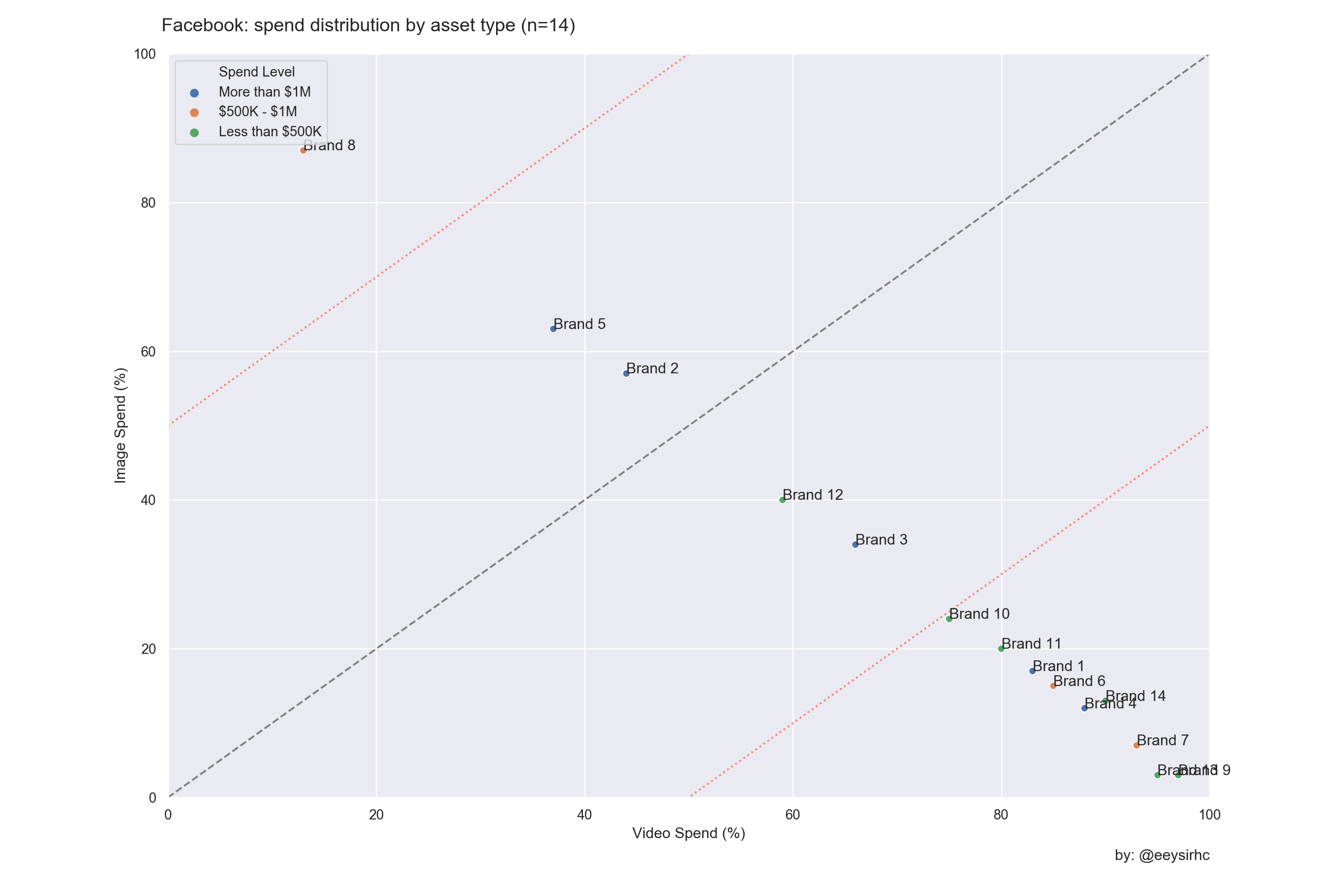
Note: we have three brands (2,5,8) above the dotted gray line which means the majority of their Facebook spend is focused on Image assets as opposed to Video creatives. Also, Brand #8 is our outlier that over-indexes on Image since it sits past the upper red line in our graph.