Wildfires are raging across California (again).
Always knew I would end up in hell but I imagined it was more of a spontaneous combustion type of event rather than a gradual descent into the infernal #everythingisfine pic.twitter.com/gl6otozX6f
— Christopher Yee (@Eeysirhc) September 8, 2020
What I noticed over the years of “doom watching” is how the news only report on tabulated data. They lacked any sort of visualization to underscore the impact of these fires.
Curiosity got the best of me so I searched around the CAL FIRE website and found a JSON endpoint for their incident data. The following code reveals how I created a graph in #rstats and used it as my first submission to the r/dataisbeautiful subreddit.
Load libraries
library(tidyverse)
library(lubridate)
library(scales)
library(jsonlite)
library(gghighlight)
Download data
wildfires_raw <- fromJSON("https://www.fire.ca.gov/umbraco/api/IncidentApi/List?inactive=true",
                  flatten = TRUE) %>% as_tibble()
Parse data
wildfires <- wildfires_raw %>%
  select(Name, County, Location, AcresBurned, IsActive,
         StartedDateOnly, ExtinguishedDateOnly) %>%

  # REMOVE INCORRECT DATA
  filter(AcresBurned <= 100e6,
         StartedDateOnly >= '2000-01-01') %>%

  # CONVERT VARIABLES TO DATE FORMAT
  mutate(StartedDateOnly = date(StartedDateOnly),
         ExtinguishedDateOnly = case_when(ExtinguishedDateOnly == "" ~ as.character(StartedDateOnly),
                                          TRUE ~ as.character(ExtinguishedDateOnly)),
         ExtinguishedDateOnly = date(ExtinguishedDateOnly))

# COMPUTE CUMULATIVE TOTAL
wildfires_parsed <- wildfires %>%
  mutate(year = year(StartedDateOnly),
         day_index = yday(StartedDateOnly)) %>%
  arrange(year, day_index) %>%
  group_by(year) %>%
  mutate(cumulative_acresburned = cumsum(AcresBurned)) %>%
  ungroup()

# DIFFERENCE CALCULATION FOR GRAPH
calc <- wildfires_parsed %>% filter(day_index == 256,
                                    year == 2020 | year == 2018) %>%
  select(cumulative_acresburned)
burned_calc <- round(100 * (calc[2,] / calc[1,] - 1),2) %>% pull()
Plot chart
wildfires_parsed %>%
  ggplot(aes(day_index, cumulative_acresburned, color = factor(year))) +
  geom_point() +
  geom_line() +
  gghighlight(year >= 2016) +
  expand_limits(y = 0) +
  scale_y_continuous(labels = comma_format(),
                     limits = c(0, 3e6)) +
  scale_color_brewer(palette = 'Set1', direction = -1) +
  labs(x = "Day of Year", y = "Cumulative Acres Burned", color = NULL,
       title = "California Wildfires: cumulative acres burned since 2003",
       subtitle = paste0("+", burned_calc, "% increase compared to the next highest year on the same day"),
       caption = "by: @eeysirhc\nsource: CAL FIRE") +
theme_minimal() 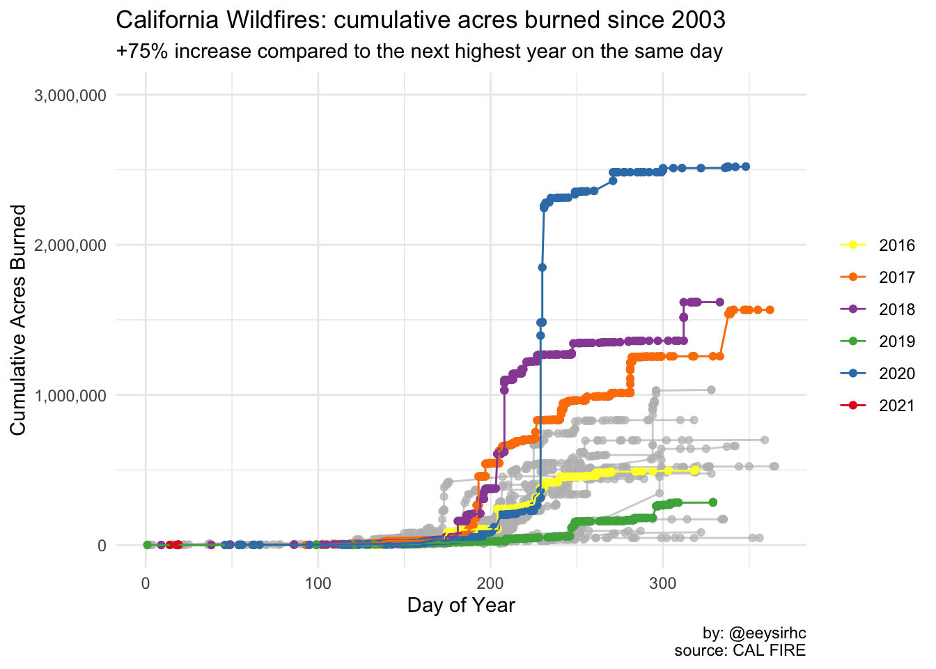
Top 20 California wildfires
I did not submit the one below but including it here to highlight how 2020 now accounts for 25% of California’s most devastating fires in the last two decades.
wildfires %>%
  arrange(desc(AcresBurned)) %>%
  top_n(20, AcresBurned) %>%
  mutate(year = year(StartedDateOnly)) %>%
  select(Name, year, AcresBurned) %>%
  mutate(Name = reorder(Name, AcresBurned)) %>%
  ggplot(aes(Name, AcresBurned, fill = factor(year))) +
  geom_col() +
  gghighlight(year >= 2016) +
  coord_flip() +
  labs(fill = NULL, x = NULL, y = "Total Acres Burned",
       caption = "by: @eeysirhc\nsource: CAL FIRE") +
  scale_x_discrete(labels = function(x) str_wrap(x, width = 45)) +
  scale_y_continuous(labels = comma_format()) +
  scale_fill_brewer(palette = 'Set1', direction = -1) +
  theme_minimal()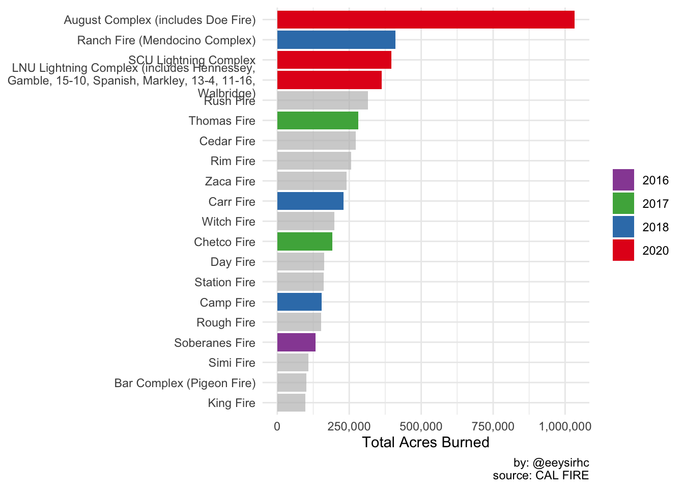
Future work
- Use the {gganimate} package to rank the top 20 fires over time with a racing bar chart
- Build an interactive Shiny app which features a map, incident status, and other information
- Determine if wildfires are taking longer to extinguish than before by using survival analysis
For the last bullet point I contacted CAL FIRE over Twitter and email - waiting for some data corrections before I complete the survival regression.
correction: n(data_issues) most likely greater than 27
— Christopher Yee (@Eeysirhc) September 11, 2020
below is sample of fires burning 200+ days but less than 50 acres (n=99)
anyways, more than happy to help collate, sanitize, etc. the public dataset pic.twitter.com/hw9b2DyEyF