I abhor tabulated data for a number of reasons:
Quite difficult on the human eye to spot trends
Puts a burden on the end user to spend extra time digesting the information
True insights get lost because the devil is in the details
In fact, individuals who join Square’s SEO team (I’m hiring by the way) are required to read this book on how to visualize data before making any presentations - an SEO bible, if you will.
Which is why when I saw Eli publish this article summarizing top marketing words in Linkedin job titles, I found it the perfect opportunity to build upon the data he gathered. So, what does that look like?
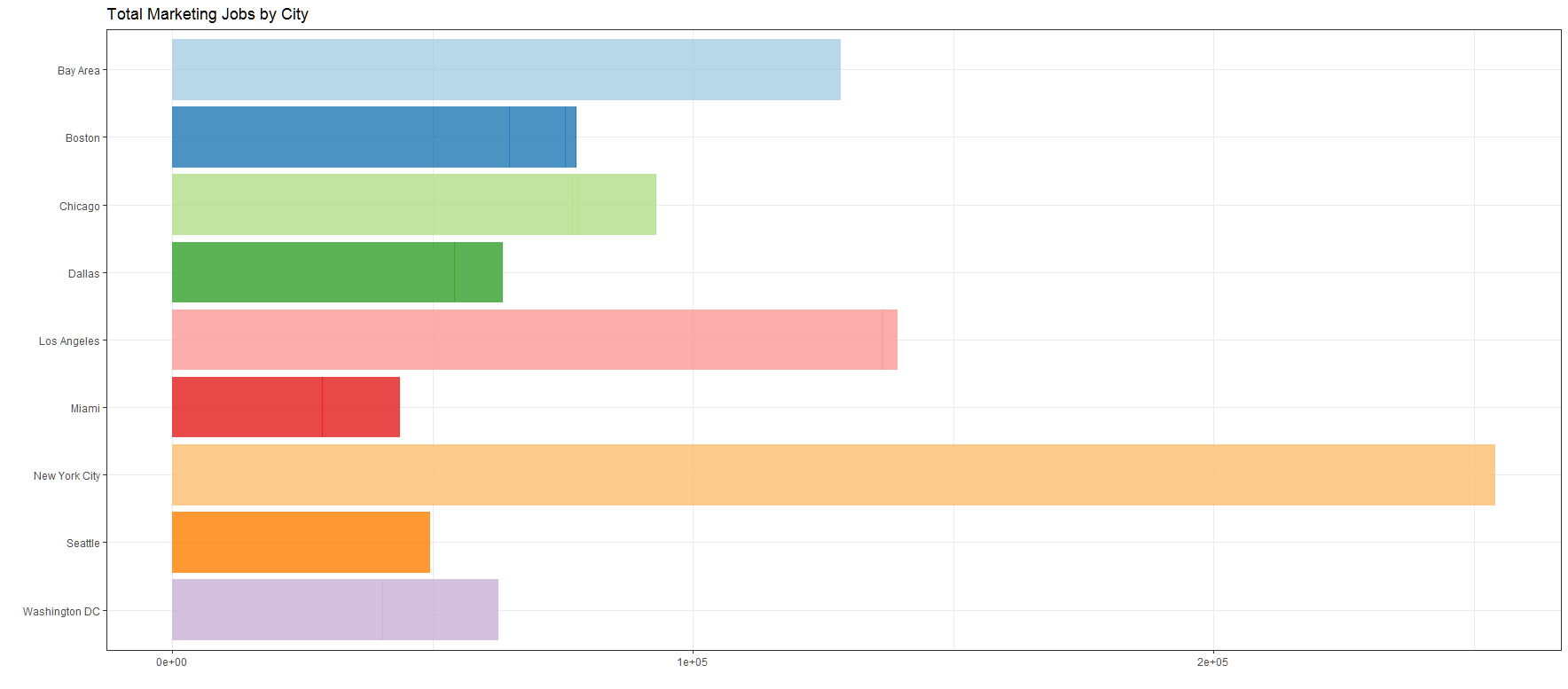
In terms of total job postings by city, NYC comes out on top followed by Los Angeles and a close third in the San Francisco Bay Area.
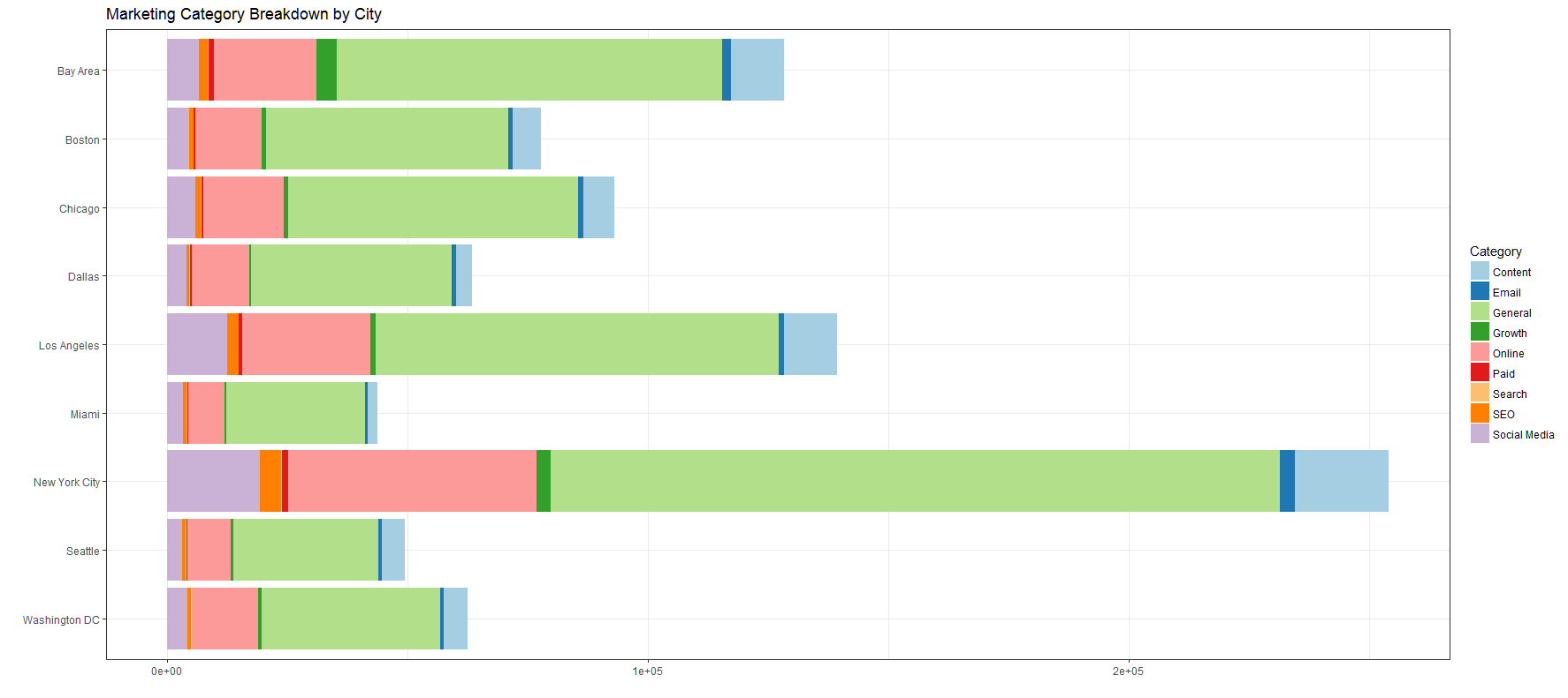
The previous chart only tells us how many marketing jobs are in each city but not the composition of the respective markets. Taking that data and breaking it down into categories reveal an overwhelming majority fall under the “General” & “Online” segments (you can reference Eli’s article for definitions).
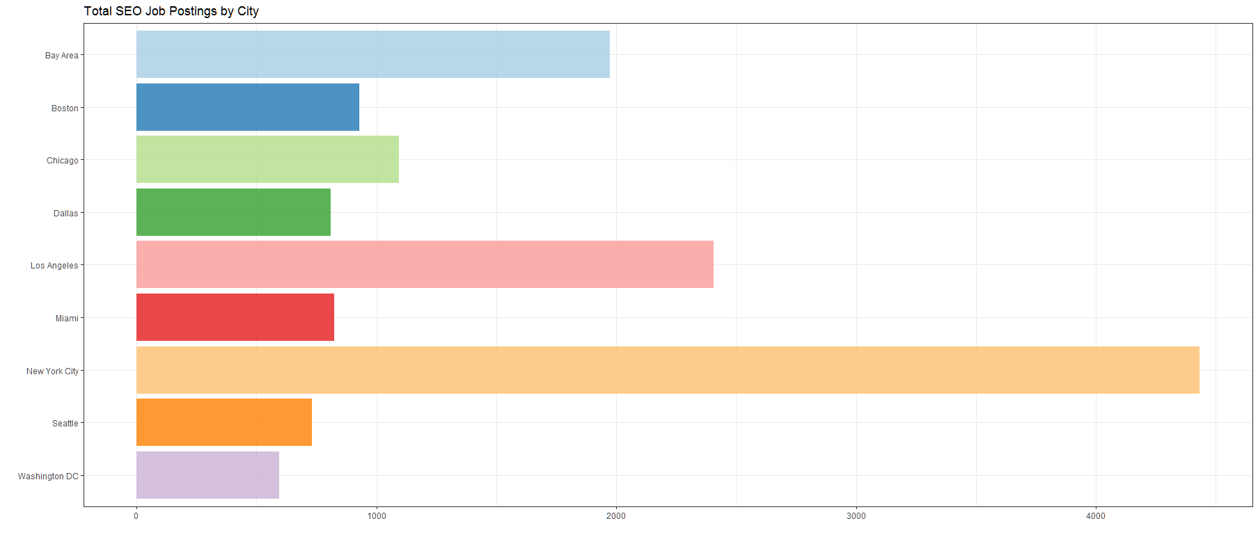
When it comes to population comparisons though, you want to examine relative values rather than absolute because higher population cities will naturally have more job postings. For example, if we pulled data for top SEO postings by city, we’ll see that NYC, LA and San Francisco Bay Area still come out on top - doesn’t reveal any new insights.
However, when we plot the data on a relative scale for specialized disciplines (exclude “General” & “Online” segments), the San Francisco Bay Area, Los Angeles and Seattle are neck and neck with NYC lagging slightly behind. What this potentially indicates is despite New York City having more total job postings than any other market, they’re primarily focused on listing jobs with “General” or “Online” in it….a fairly broad, non-specialized category.
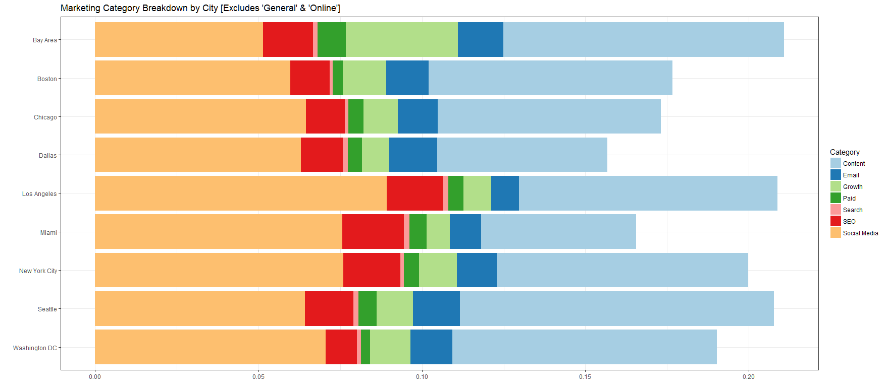
Stacked bar charts are pretty but there’s still a problem: it’s difficult to compare the different categories aside from the one located at the base. How does Miami compare to Dallas for postings with “Email” in the job title? You can definitely measure your computer monitor with a ruler but that’s inefficient so let’s continue to dive into the data and compare each job category at the city level.
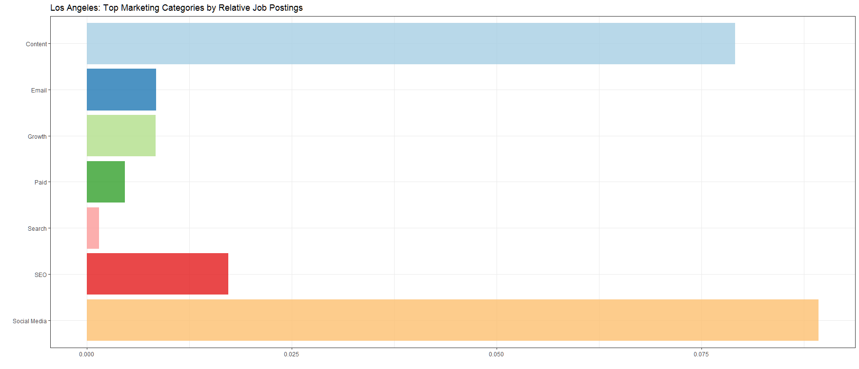
For Los Angeles, the data highlights relatively more job postings for the “Social Media” category than “Content” - is this a symptom of the high concentration of media & entertainment folks in the region?
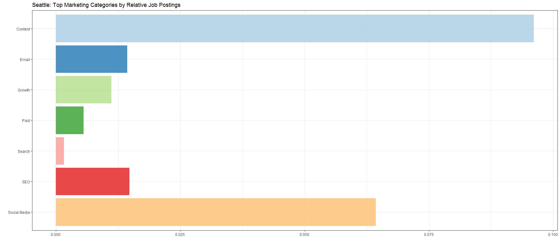
Seattle over-indexes in the number of job postings for the “Content” segment - does this mean Moz, a content marketing heavy company, has a strong influence in the area and ultimately impacts the types of marketing jobs (and titles) companies are looking for?
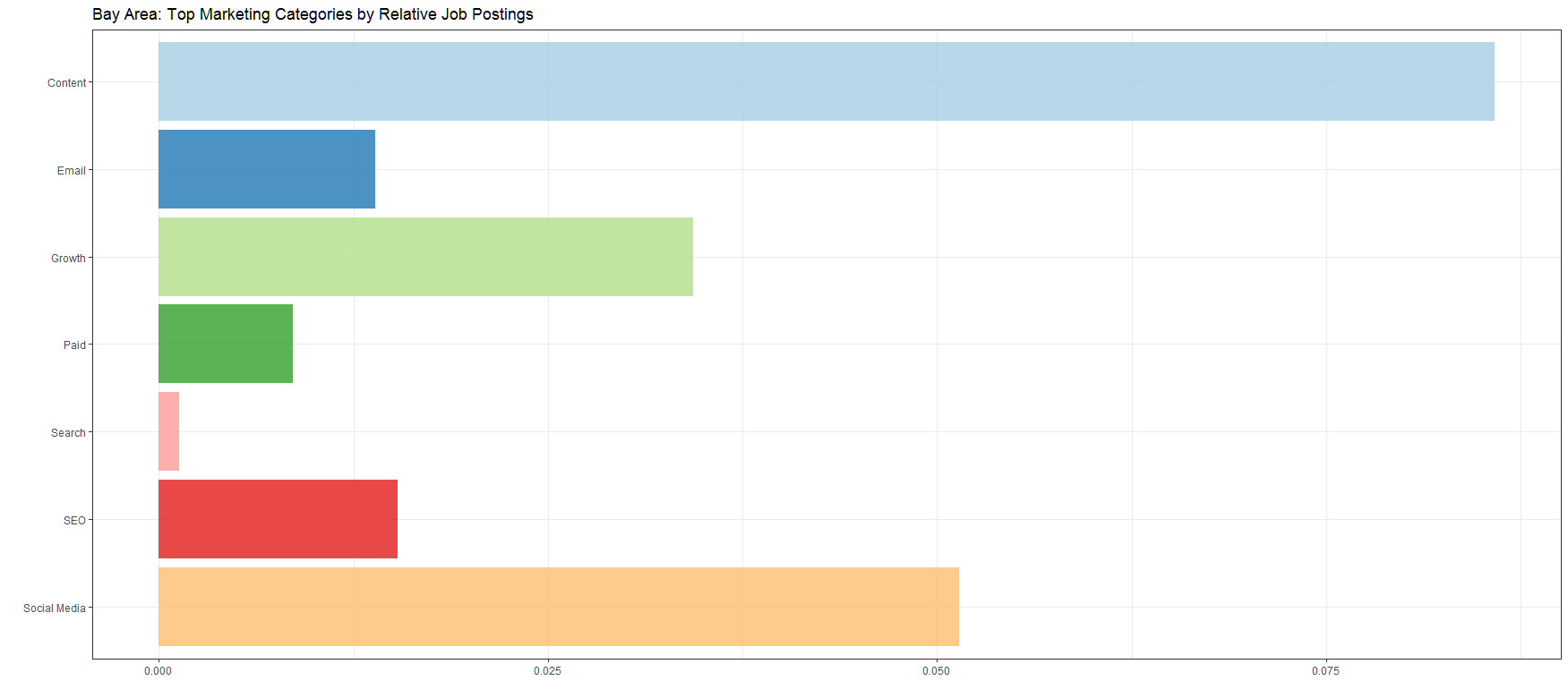
As Eli mentioned in his article, there’s a high affinity for “Growth” in the job title for San Francisco than any other market - probably a result of all the focus on growth hacking/marketing by Silicon Valley startups in the peninsula.
I don’t have answers on any of the aforementioned questions, especially since it’s skewed toward Linkedin, but they’re definitely interesting enough to dig deeper based on the existing data set to understand broader job trends in marketing.
At the end of the day, I can’t stress enough on the importance of data visualization to summarize information, reduce cognitive load and generate insights that would otherwise be hidden in the data.