I like to browse company career pages once in awhile to see what positions they have open. In my opinion, this provides a glimpse into what they are investing in for the next few years.
Hopper is one company which stands out but the reason I am writing this is a puzzle they included in the job description:
At Hopper, every dataset tells a story. Do you have what it takes to decipher the clues? bit.ly/2q6U8dq
Let’s see if we can try to solve this riddle!
Load data
library(tidyverse)

puzzle <- read.csv("https://raw.githubusercontent.com/Eeysirhc/random_datasets/master/hopper_data_puzzle.csv", header=FALSE) %>% as_tibble()
Exploratory analysis
Let’s do a quick spot check of our data by pulling out a random sample:
puzzle %>%
  sample_n(10) %>%
knitr::kable()| V1 | V2 |
|---|---|
| 0.7751583 | 0.1542435 |
| 0.5861845 | 2.2767995 |
| 0.4620096 | 0.8691373 |
| 0.9149191 | 0.2936743 |
| 0.7342932 | -1.2255946 |
| 0.5656839 | -1.7397774 |
| 0.7964042 | 0.1523343 |
| 0.7746243 | -1.7503209 |
| 0.3971497 | 2.1136286 |
| -0.0598545 | 0.6470721 |
This is a tough one - no labeled column headers with a total of 1,024 rows.
I am wondering if there is any correlation between our two variables?
cor(puzzle)## V1 V2
## V1 1.0000000 -0.2477049
## V2 -0.2477049 1.0000000So, there is an inverse relationship but it is quite weak.
With a lack of information, at this point I want to see if we can identify any visual relationships.
puzzle %>%
  ggplot(aes(V1, V2)) +
  geom_point(alpha = 0.1, color = 'steelblue', size = 3) +
  theme_minimal(base_size = 10)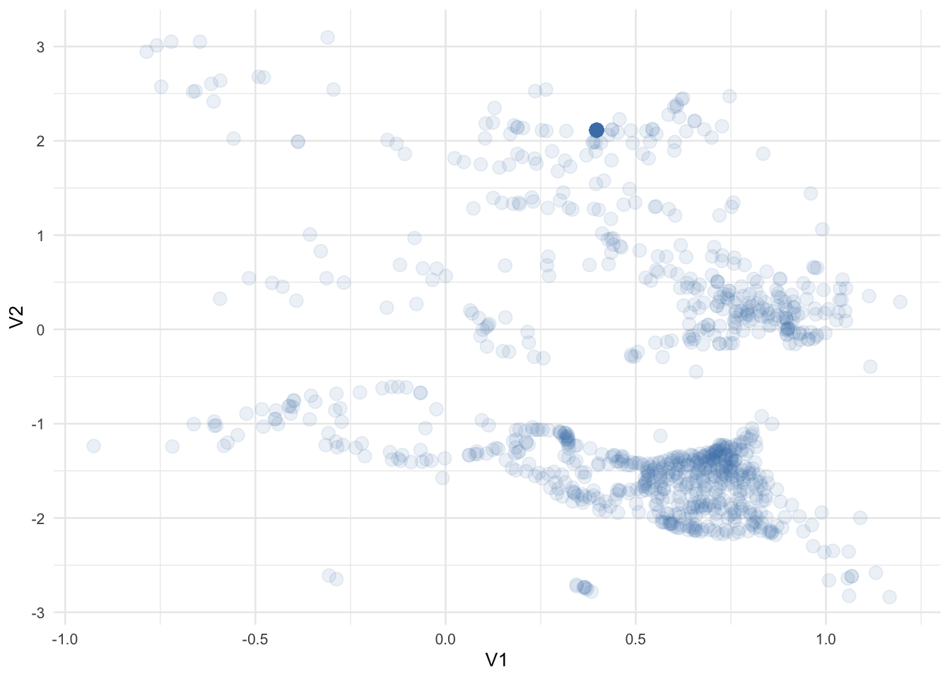
It appears we have some data points grouped together but what catches my eye is around V1(0.40),V2(2.10) - it has a concentration of points indicated by its relatively higher gradient.
puzzle %>%
  ggplot(aes(V1, V2)) +
  geom_point(alpha = 0.1, color = 'steelblue', size = 3) +
  geom_point(x = 0.397, y = 2.11, color = 'red', pch = 1, size = 10) +
  theme_minimal(base_size = 10)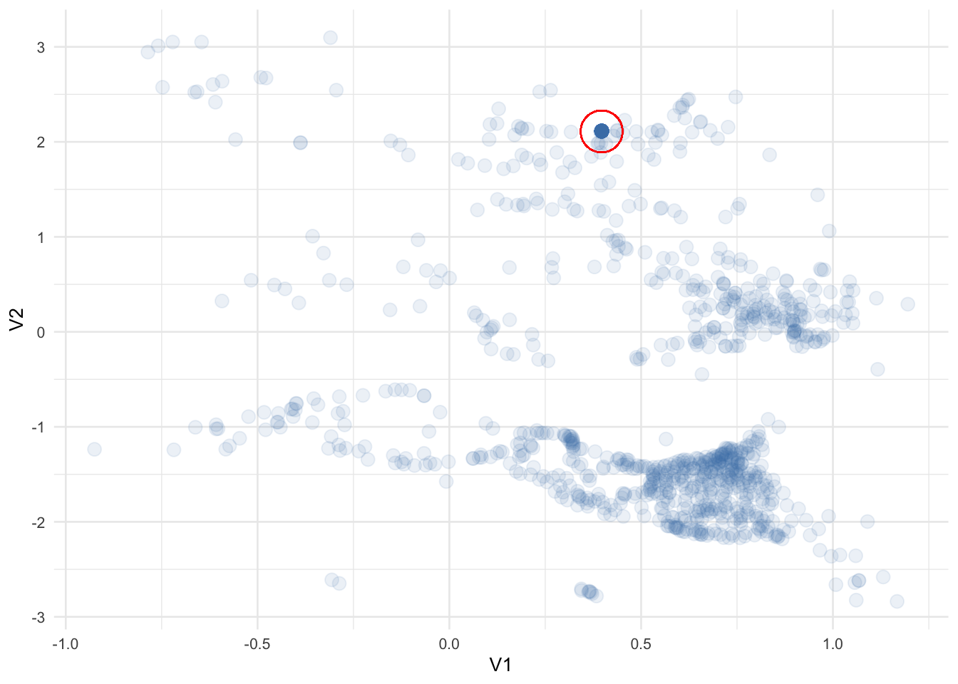
How many times does that specific point show up in our data?
puzzle %>%
  group_by(V1, V2) %>%
  count(sort = TRUE) %>%
  ungroup() %>%
  mutate(pct_total = 100 * (n / sum(n)))
## # A tibble: 912 x 4
## V1 V2 n pct_total
## <dbl> <dbl> <int> <dbl>
## 1 0.397 2.11 101 9.86
## 2 -0.388 1.99 2 0.195
## 3 -0.0659 -0.673 2 0.195
## 4 0.0618 -1.33 2 0.195
## 5 0.637 -1.44 2 0.195
## 6 0.690 0.0478 2 0.195
## 7 0.714 0.249 2 0.195
## 8 0.715 0.503 2 0.195
## 9 0.720 -0.152 2 0.195
## 10 0.745 0.409 2 0.195
## # … with 902 more rowsApproximately 10% of the total dataset - I wonder why? Are they duplicates? Bad data?
For now, let’s put that aside and incorporate some structure to our messy data.
KNN Clustering
I prefer to keep things simple so let’s use a common unsupervised machine learning algorithm called K-Nearest Neighbors.
library(broom)

set.seed(20200206)

puzzle_knn <- kmeans(puzzle, centers = 15, nstart = 30)

# SUMMARY DATA
puzzle_knn_summary <- tidy(puzzle_knn)

# JOIN BACK TO ORIGINAL DATAFRAME
puzzle_clusters <- augment(puzzle_knn, puzzle)
We can now whip everything together in a fancy #rstats plot:
ggplot() +
  geom_point(data = puzzle_clusters, aes(V1, V2, color = .cluster),
             alpha = 0.1, size = 3) +
  geom_text(data = puzzle_knn_summary, aes(V1, V2, color = cluster, label = cluster),
            size = 8, hjust = -1) +
  theme_minimal(base_size = 10) +
  theme(legend.position = 'none')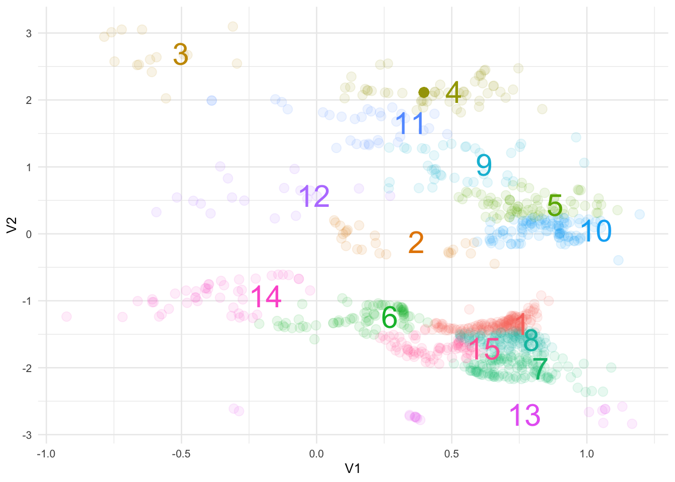
Not too bad.
It also looks like we can further segment these groups by drawing some axes to indicate a Cartesian coordinate system:
ggplot() +
  geom_point(data = puzzle_clusters, aes(V1, V2, color = .cluster),
             alpha = 0.1, size = 3) +
  geom_text(data = puzzle_knn_summary, aes(V1, V2, color = cluster, label = cluster),
            size = 8, hjust = -1) +
  geom_hline(yintercept = 0) +
  geom_vline(xintercept = 0) +
  theme_minimal(base_size = 10) +
  theme(legend.position = 'none')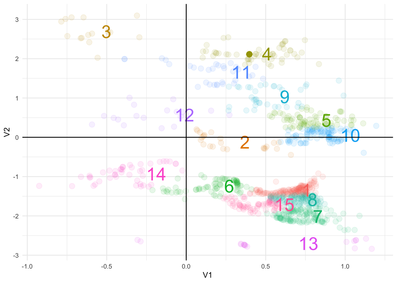
Finally, we don’t have a lot of context but Hopper is a travel booking app so let’s just go out on a limb and assume the data is % change by price to conversions.
Note: it only occurred to me after completing this the above may not be true otherwise we would see more data in the top-left quadrant (unless, of course, this was intentional)
library(scales)

ggplot() +
  geom_point(data = puzzle_clusters, aes(V1, V2, color = .cluster),
             alpha = 0.1, size = 3) +
  geom_text(data = puzzle_knn_summary, aes(V1, V2, color = cluster, label = cluster),
            size = 8, hjust = -1) +
  geom_hline(yintercept = 0) +
  geom_vline(xintercept = 0) +
  scale_x_continuous(labels = percent_format()) +
  scale_y_continuous(labels = percent_format()) +
  theme_minimal(base_size = 10) +
  theme(legend.position = 'none') +
  labs(x = "% Change in Price", y = "% Change in Conversions")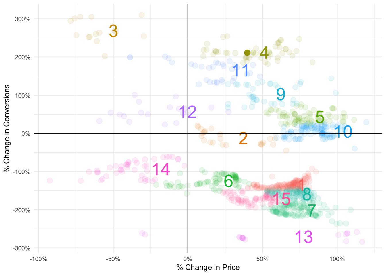
Now we are getting somewhere!
Summary
- We were able to parse out 15 different performing segments from our data
- We know there is a -0.25 correlation between our two variables
- For the majority of cases conversions will decrease if there is an increase in pricing
- Conversely, a decrease in price will lead to an increase in conversions (ex: clusters 3 and 12)
- The bottom left quadrant where cluster 14 is located illustrates how conversions decreased for this group even if they are exposed to a price drop
- What should be interesting to Hopper are clusters 4, 9 and 11
- With a price increase these cohorts exhibit higher conversions
- Is it the destination? A specific airline or hotel? Messaging? Or a new feature on the app?
- Difficult to interpret without the full context but that is where I would dive deeper to further improve the product
Statistical modeling
Just for fun, let’s train and build a simple machine learning model to predict future conversion behavior given the change in price.
Reminder: we are making a huge leap of faith in assuming the data is % price change to % conversion change
Before feeding in our data we need to encode our clusters because the numerical values are not an indicator of performance.
For example, being in cluster 15 is not better than being in cluster 1 - these were randomly assigned from our KNN algorithm.
library(caret)

# ONE HOT ENCODE OUR CLUSTERS
dummy <- dummyVars(" ~ .cluster", data = puzzle_clusters)
df_dummy <- data.frame(predict(dummy, puzzle_clusters))

# JOIN BACK TO ORIGINAL DATAFRAME
puzzle_processed <- cbind(puzzle_clusters, df_dummy) %>%
  select(-.cluster) %>%
  as_tibble()
Then conduct a quick spot check on the correlation between variables:
library(corrplot)

corrplot(cor(puzzle_processed), method = 'color',
         tl.col = 'black', diag = FALSE)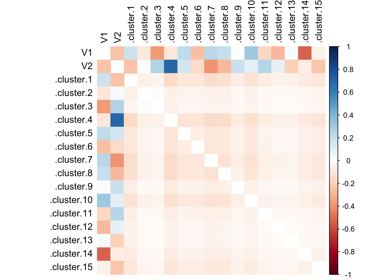
Cluster 4 with a whopping correlation coefficient of ~0.80!
The final step before model training is to parse out the control vs test data:
# CREATE INDEX FOR 75/25 SPLIT
puzzle_index <- createDataPartition(puzzle_processed$V2,
                                    p = 0.75, list = FALSE)

# TRAINING DATA
puzzle_train <- puzzle_processed[puzzle_index, ]

# TESTING DATA
puzzle_test <- puzzle_processed[-puzzle_index, ]

control <- trainControl(method = "repeatedcv",
                        number = 10, repeats = 10, savePredictions = TRUE)
At this point we can utilize various off-the-shelf machine learning algorithms like random forest, XGBoost, SVM, etc.
For our use case, I’ll just start with a linear and multiple linear regression.
linear_model <- train(V2 ~ V1, data = puzzle_train, method = "lm",
             trControl = control,
             tuneGrid = expand.grid(intercept = FALSE),
             metric = "Rsquared")

summary(linear_model)
##
## Call:
## lm(formula = .outcome ~ 0 + ., data = dat)
##
## Residuals:
## Min 1Q Median 3Q Max
## -2.9058 -1.1396 -0.7366 1.1874 3.1421
##
## Coefficients:
## Estimate Std. Error t value Pr(>|t|)
## V1 -0.89630 0.08533 -10.5 <2e-16 ***
## ---
## Signif. codes: 0 '***' 0.001 '**' 0.01 '*' 0.05 '.' 0.1 ' ' 1
##
## Residual standard error: 1.457 on 767 degrees of freedom
## Multiple R-squared: 0.1258, Adjusted R-squared: 0.1246
## F-statistic: 110.3 on 1 and 767 DF, p-value: < 2.2e-16R^2 value of 0.1174 is quite low.
Let’s try the multiple linear regression route where we incorporate all the KNN clusters we identified earlier in this post.
multiple_model <- train(V2 ~ ., data = puzzle_train, method = "lm",
             trControl = control,
             tuneGrid = expand.grid(intercept = FALSE),
             metric = "Rsquared")

summary(multiple_model)
##
## Call:
## lm(formula = .outcome ~ 0 + ., data = dat)
##
## Residuals:
## Min 1Q Median 3Q Max
## -0.64841 -0.08383 -0.01160 0.08305 0.44917
##
## Coefficients:
## Estimate Std. Error t value Pr(>|t|)
## V1 0.0004141 0.0362785 0.011 0.99090
## .cluster.1 -1.3406857 0.0278300 -48.174 < 2e-16 ***
## .cluster.2 -0.0960933 0.0347745 -2.763 0.00586 **
## .cluster.3 2.6726441 0.0449253 59.491 < 2e-16 ***
## .cluster.4 2.1250598 0.0200804 105.828 < 2e-16 ***
## .cluster.5 0.4284229 0.0350870 12.210 < 2e-16 ***
## .cluster.6 -1.2387135 0.0203136 -60.979 < 2e-16 ***
## .cluster.7 -2.0055076 0.0304859 -65.785 < 2e-16 ***
## .cluster.8 -1.5791816 0.0297159 -53.143 < 2e-16 ***
## .cluster.9 1.0336609 0.0334047 30.944 < 2e-16 ***
## .cluster.10 0.0353526 0.0349705 1.011 0.31238
## .cluster.11 1.6348023 0.0284861 57.389 < 2e-16 ***
## .cluster.12 0.5577467 0.0390217 14.293 < 2e-16 ***
## .cluster.13 -2.7031648 0.0425496 -63.530 < 2e-16 ***
## .cluster.14 -0.9317604 0.0278197 -33.493 < 2e-16 ***
## .cluster.15 -1.7249327 0.0260267 -66.276 < 2e-16 ***
## ---
## Signif. codes: 0 '***' 0.001 '**' 0.01 '*' 0.05 '.' 0.1 ' ' 1
##
## Residual standard error: 0.1424 on 752 degrees of freedom
## Multiple R-squared: 0.9918, Adjusted R-squared: 0.9916
## F-statistic: 5692 on 16 and 752 DF, p-value: < 2.2e-16R^2 value of 0.992! That seems too good to be true and we may actually be overfitting somewhere.
Let’s verify the relative weights for the features in our model:
ggplot(varImp(multiple_model)) + geom_col(fill = 'steelblue') + theme_minimal()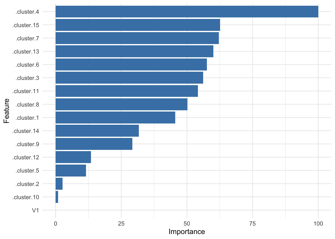
It’s good to see cluster 4 is still right there at the top!
To wrap things up, we’ll use both models to predict values from the unseen test set and visualize in a plot.
linear <- predict(linear_model, puzzle_test)
multiple <- predict(multiple_model, puzzle_test)

puzzle_test %>%
  select(V1, V2) %>%
  cbind(linear, multiple) %>%
  as_tibble() %>%
  rename(actual = V2) %>%
  gather(key, value, actual:multiple) %>%
  ggplot(aes(V1, value, color = key)) +
  geom_point(alpha = 0.5) +
  geom_hline(yintercept = 0) +
  geom_vline(xintercept = 0) +
  theme_minimal(base_size = 10) +
  theme(legend.position = 'top') +
  labs(x = "% Change in Price", y = "% Change in Conversions", color = NULL) +
  scale_x_continuous(labels = percent_format()) +
  scale_y_continuous(labels = percent_format()) +
  scale_color_brewer(palette = 'Set1')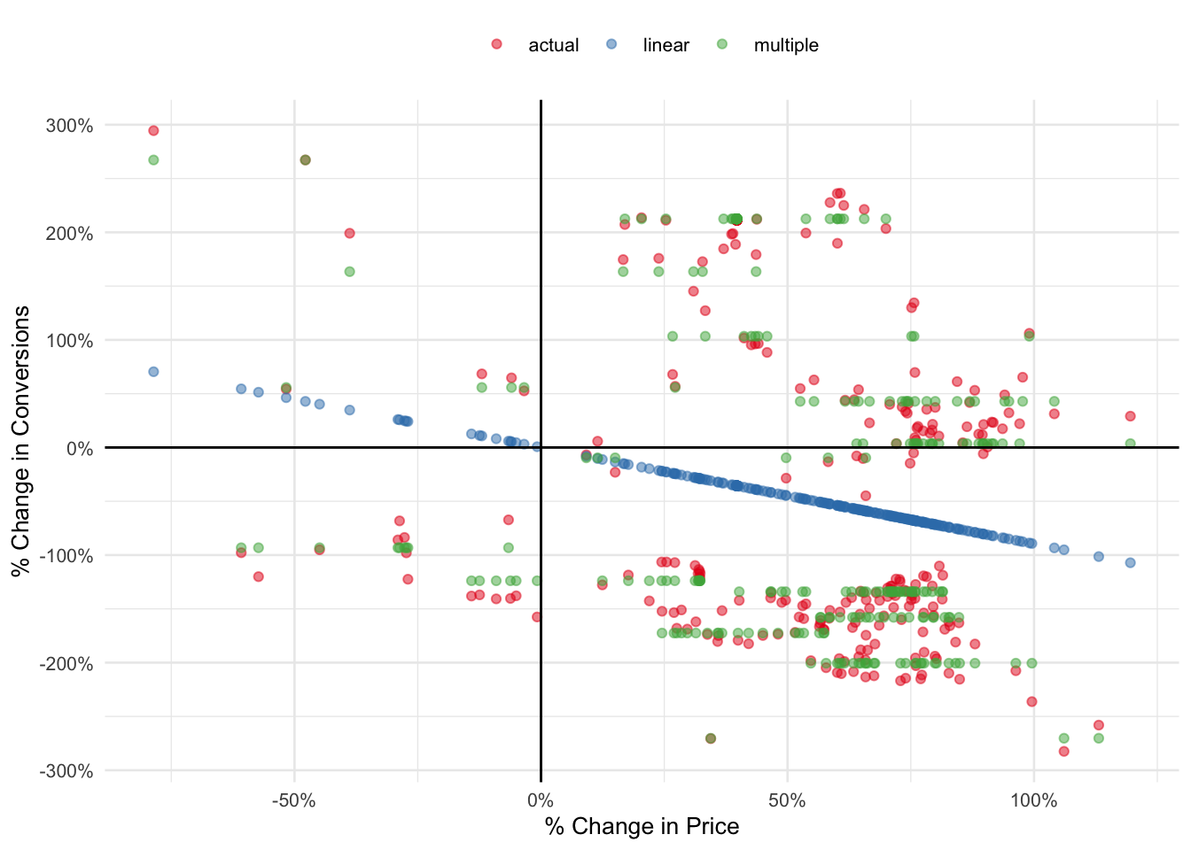
This doesn’t look half bad if I may say so myself!
Although inaccurate, our linear regression model was able to capture the inverse relationship between price and conversions.
The multiple regression version is definitely a step up from the former but it has room for improvement. With a little parameter tuning it’s possible to further increase the overall accuracy of our model.
Answer
…LOL…
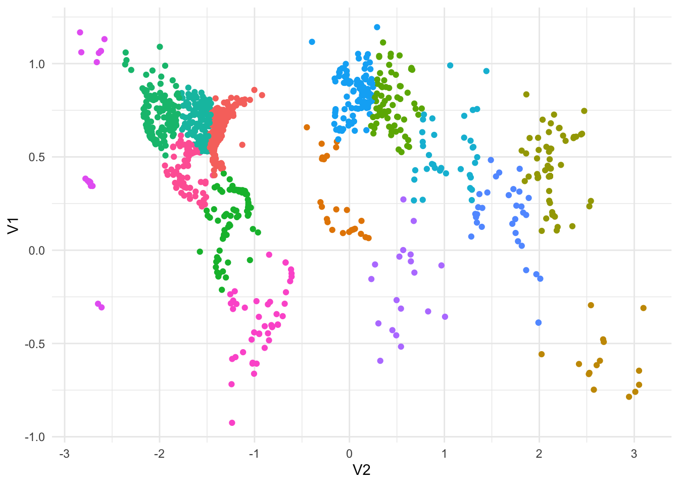
puzzle_clusters %>%
  ggplot(aes(V1, V2, color = .cluster)) +
  geom_point() +
  coord_flip() +
  theme_minimal() +
  theme(legend.position = 'none')