Follow along with the full code here
A number of people have approached me over the years asking for materials on how to use R to draw insights from their search engine marketing data. Although I had no reservations giving away that information (with redactions) it was largely reserved for internal training courses at my previous companies.
This guide is long overdue though and is meant to address a few things on my mind:
- The explosion of MOOC is great but I have never completed a single course. This is due to the fact I get bored very easily and not working with data I am personaly invested in.
- While we are inundated with data, certain industries (such as SEO) see a contraction from key players - most notably Google. It is unfortunate and the sands will continue to shift in that direction but we should leverage the information we already have (or create new sources).
- I am a firm believer that everyone should learn how to build something (online or offline). Personally, it has helped me appreciate a different way of thinking and framing problems into fairly solvable answers.
I hope that by pulling your own dataset straight from Google Search Console and seeing the results with a few lines of code it will encourage you to dive deeper into the world of #rstats.
Setup
Download base R
You can get that here.
Download RStudio
This is the IDE (Integrated Development Environment) we’ll be using to write and execute our R code which can be downloaded here.
Install packages
Once you’re up and running with RStudio we’ll need a few nifty packages to do a majority of the heavy lifting for us.
install.packages('tidyverse')           # DATA MANIPULATION AND VISUALIZATION ON STEROIDS
install.packages('scales')              # ASSISTS WITH GRAPHICAL FORMATTING
install.packages('lubridate')           # PACKAGE TO WRANGLE TIME SERIES DATA
install.packages('searchConsoleR')      # INTERACT WITH GOOGLE SEARCH CONSOLE API
devtools::install_github("dgrtwo/ebbr") # EMPIRICAL BAYES BINOMIAL ESTIMATION
install.packages('prophet')             # FORECASTING PACKAGE BY FACEBOOK
Side note: you don’t need to do this step again.
Load packages
Let’s fire up some of the packages we just installed.
library(tidyverse)
library(searchConsoleR)
library(scales)
library(lubridate)
Configure your working directory
For those of you completely new to any type of programming language you can also run this command.
setwd("~/Desktop")Any work you save will automatically go to your desktop so you won’t have to figure out where it all went later.
We are now ready for the fun stuff!
Get the data
Authenticiation
Run the command below and your browser will pop up a new window prompting for a login and access to your Google account.
scr_auth()Website parameters
The next step is letting the API know what data we want so you’ll need to change the following parameters.
website <- "https://www.christopheryee.org/"
start <- Sys.Date() - 50            # YOU CAN CHANGE THE LOOKBACK WINDOW HERE
end <- Sys.Date() - 3               # MINUS 3 DAYS TO SHIFT WINDOW ON MISSING DATES
download_dimensions <- c('date', 'query')
type <- c('web')
Side note: In the past you could do a full year but my big mouth tweeted about it and the next day Google added a throttle to their API.
need daily GSC data for #SEO analytics? now is probably a good time as any to pick up R and write a few lines of code :)
— Christopher Yee (@Eeysirhc) December 8, 2018
p.s. package defaults to 5k rows per day so pulling last 365 days will net you around 1.8M rows for any given website pic.twitter.com/QbSBRJHr4K
Assign data to variable
data <- as_tibble(search_analytics(siteURL = website,
                                   startDate = start,
                                   endDate = end,
                                   dimensions = download_dimensions,
                                   searchType = type,
                                   walk_data = "byDate"))
Save file to CSV
We want to save our results to a CSV so we don’t have to worry about pinging the GSC API again.
data %>%
  write_csv("gsc_data_raw.csv")
In the event you lose your session and need to start over you can run the following command to pick up where you left off.
data <- read_csv("gsc_data_raw.csv")Process the data
Let’s take a peek at the data to see what we are working with (I had to anonymize for client confidentiality reasons so please use your imagination here).
data## # A tibble: 240,000 x 6
## date query clicks impressions ctr position
## <date> <chr> <dbl> <dbl> <dbl> <dbl>
## 1 2019-03-06 keyword_id_4082 55715 136191 0.409 1.01
## 2 2019-03-06 keyword_id_1846 11822 26945 0.439 1.01
## 3 2019-03-06 keyword_id_464 2502 15580 0.161 2.19
## 4 2019-03-06 keyword_id_3144 1499 3424 0.438 1
## 5 2019-03-06 keyword_id_6093 1262 4186 0.301 1.00
## 6 2019-03-06 keyword_id_7183 1220 3184 0.383 1.06
## 7 2019-03-06 keyword_id_5089 1060 2631 0.403 1.01
## 8 2019-03-06 keyword_id_10489 910 4190 0.217 1.24
## 9 2019-03-06 keyword_id_9977 623 1774 0.351 1.04
## 10 2019-03-06 keyword_id_11077 596 10284 0.0580 3.80
## # … with 239,990 more rowsParse brand terms
Assuming all goes well, it’s very likely some of your top keywords will come from branded terms. Let’s clean this up so we don’t inadvertently skew the data in any given direction.
data_brand <- data %>%      # EDIT BELOW TO EXCLUDE YOUR OWN BRAND TERMS
  mutate(brand = case_when(grepl("your_brand_term|brand_typo|more_brands", query) ~ 'brand',
                           TRUE ~ 'nonbrand'))
## # A tibble: 240,000 x 7
## date query clicks impressions ctr position brand
## <date> <chr> <dbl> <dbl> <dbl> <dbl> <chr>
## 1 2019-03-06 keyword_id_4082 55715 136191 0.409 1.01 brand
## 2 2019-03-06 keyword_id_1846 11822 26945 0.439 1.01 brand
## 3 2019-03-06 keyword_id_464 2502 15580 0.161 2.19 nonbrand
## 4 2019-03-06 keyword_id_3144 1499 3424 0.438 1 brand
## 5 2019-03-06 keyword_id_6093 1262 4186 0.301 1.00 brand
## 6 2019-03-06 keyword_id_7183 1220 3184 0.383 1.06 brand
## 7 2019-03-06 keyword_id_5089 1060 2631 0.403 1.01 brand
## 8 2019-03-06 keyword_id_10489 910 4190 0.217 1.24 nonbrand
## 9 2019-03-06 keyword_id_9977 623 1774 0.351 1.04 brand
## 10 2019-03-06 keyword_id_11077 596 10284 0.0580 3.80 nonbrand
## # … with 239,990 more rowsNow that we know what is brand vs nonbrand we can visualize how clicks from organic search looks like over time.
data_brand %>%
  group_by(date, brand) %>%
  summarize(clicks = sum(clicks)) %>%
  ggplot() +
  geom_line(aes(date, clicks, color = brand)) +
  scale_y_continuous(labels = scales::comma_format()) +
  theme_bw() +
  labs(x = NULL,
       y = 'Clicks')
## `summarise()` has grouped output by 'date'. You can override using the `.groups` argument.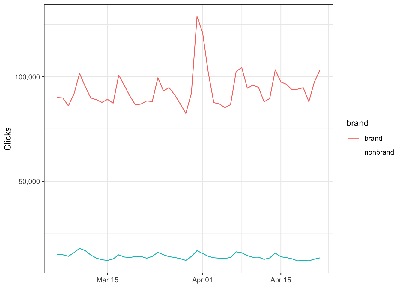
Segment by product
You can also segment by product types (or even landing pages if you grabbed that data) so let’s put everything togther in a new variable…
data_clean <- data %>%
  mutate(product_type = case_when(grepl("shoe", query) ~ 'shoes',
                             grepl("sweater", query) ~ 'sweaters',
                             grepl("shirt", query) ~ 'shirt',
                             grepl("pants", query) ~ 'pants',
                             grepl("sock", query) ~ 'socks',
                             TRUE ~ 'other'),
         brand = case_when(grepl("your_brand_term", query) ~ 'brand',
                           TRUE ~ 'nonbrand'))
…and then plot it.
data_clean %>%
  group_by(date, product_type) %>%
  summarize(clicks = sum(clicks)) %>%
  filter(product_type != 'other') %>%     # EXCLUDING 'OTHER' TO NORMALIZE SCALE
  ggplot() +
  geom_line(aes(date, clicks, color = product_type)) +
  scale_y_continuous(labels = scales::comma_format()) +
  theme_bw() +
  labs(x = NULL,
       y = 'Clicks')
## `summarise()` has grouped output by 'date'. You can override using the `.groups` argument.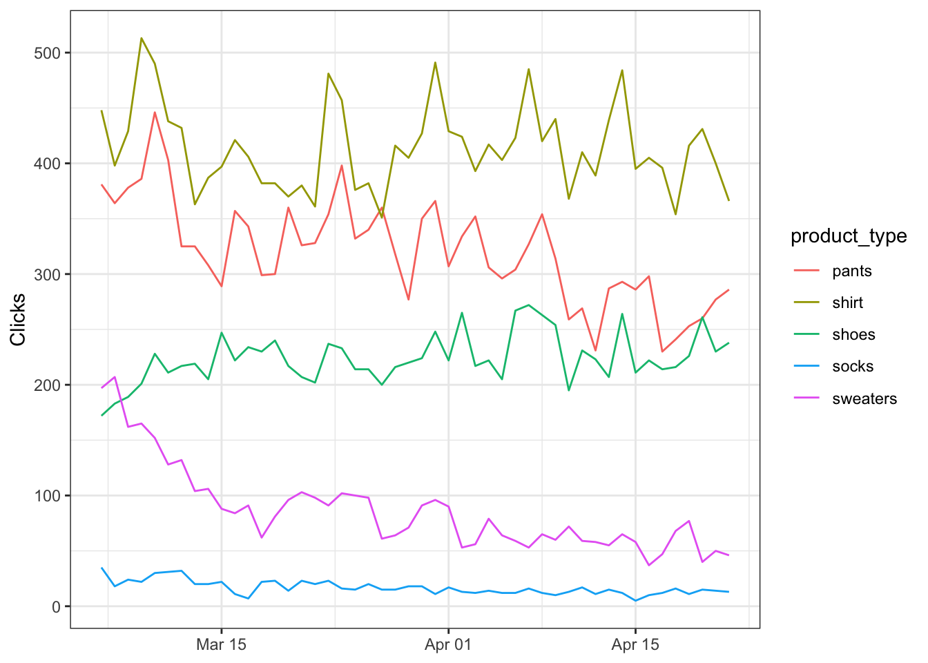
Summarizing data
What if we just want the aggregated metrics by product type?
data_clean %>%
  group_by(product_type) %>%
  summarize(clicks = sum(clicks),
            impressions = sum(impressions),
            position = mean(position)) %>%
  mutate(ctr = 100 * (clicks / impressions)) %>%      # NORMLALIZE TO 100%
  arrange(desc(product_type))
## # A tibble: 6 x 5
## product_type clicks impressions position ctr
## <chr> <dbl> <dbl> <dbl> <dbl>
## 1 sweaters 4141 123896 6.49 3.34
## 2 socks 807 41758 9.32 1.93
## 3 shoes 10755 32084 2.54 33.5
## 4 shirt 19870 342510 8.46 5.80
## 5 pants 15377 378068 6.07 4.07
## 6 other 5125347 24931729 4.52 20.6Exploratory data analysis
Now that we have our cleaned dataset it’s recommended to explore it a little. The best way is to visualize our data and we can do this ridiculously easy with R.
Understanding the distribution
We can use histograms to check on the spread of our observations.
data_clean %>%
  ggplot() +
  geom_histogram(aes(ctr), binwidth = 0.01) +
  scale_x_continuous(labels = percent_format()) +
  scale_y_continuous(labels = comma_format()) +
  labs(x = 'Click-through Rate',
       y = 'Count') +
  theme_bw()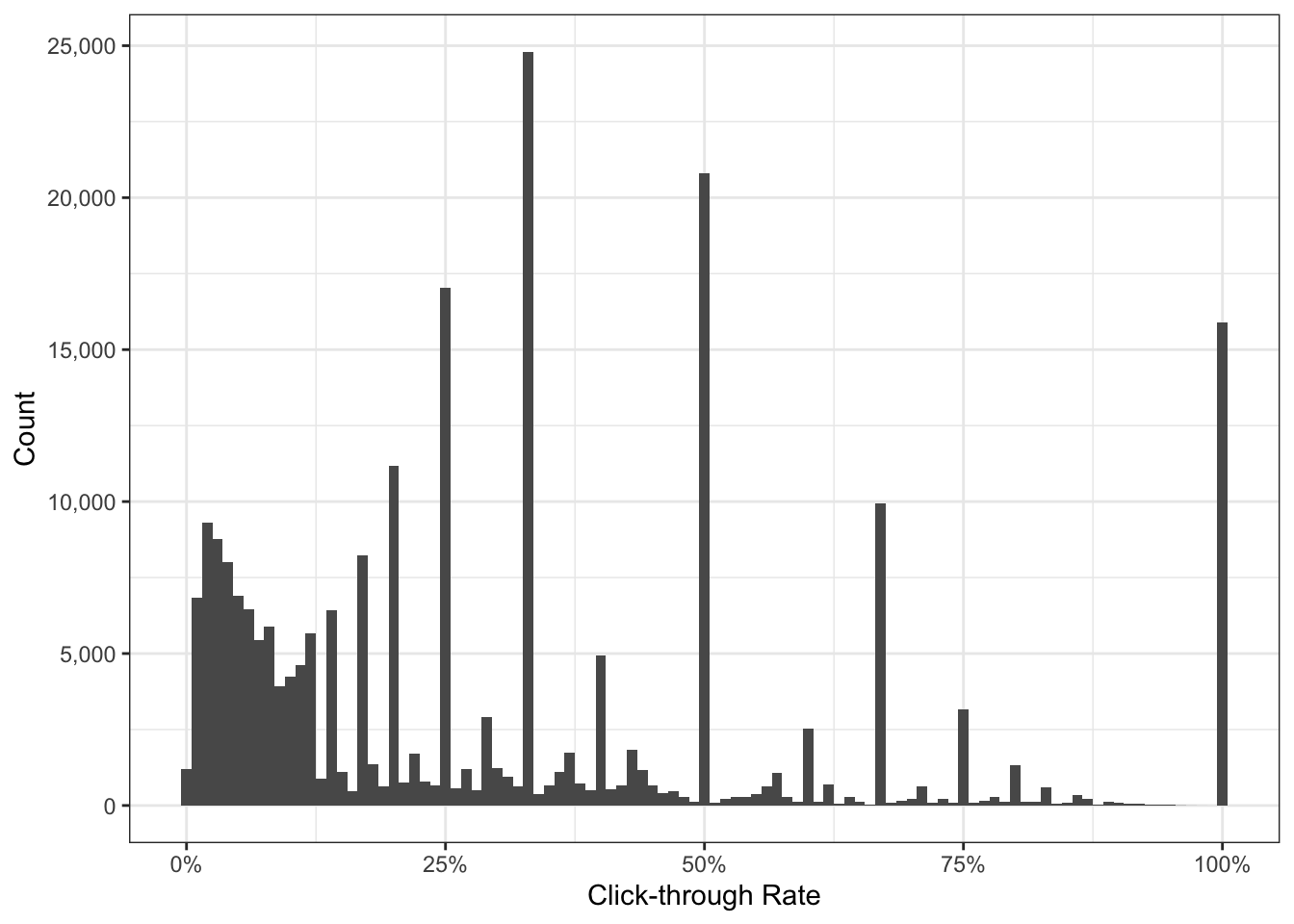
What immediately jumps out are the counts with CTR greater than 25%. What could be the reason for this?
Luckily with a minor change to our original code we can see this is attributed to branded queries.
data_clean %>%
  ggplot() +
  geom_histogram(aes(ctr, fill = brand), binwidth = 0.01) +   # ADD FILL = BRAND
  scale_x_continuous(labels = percent_format()) +
  scale_y_continuous(labels = comma_format()) +
  labs(x = 'Click-through Rate',
       y = 'Count') +
  theme_bw()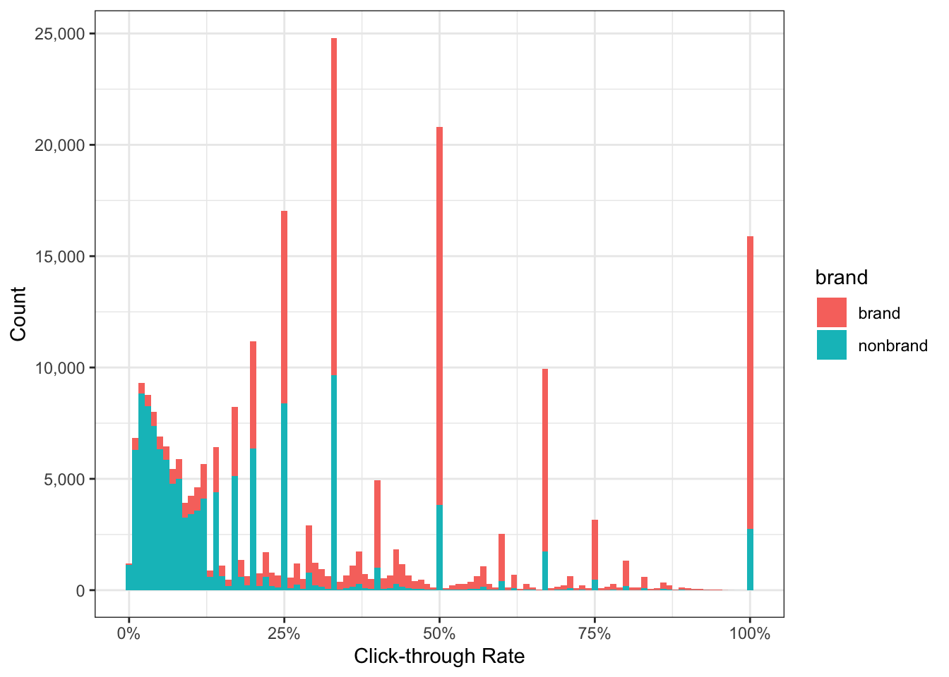
We can be more precise with the cumulative distribution function to describe what percentage of branded CTR falls above or below a given threshold.
data_clean %>%
  ggplot() +
  stat_ecdf(aes(ctr, color = brand)) +
  scale_x_continuous(labels = percent_format()) +
  scale_y_continuous(labels = percent_format()) +
  labs(x = 'Click-through Rate',
       y = NULL) +
  theme_bw()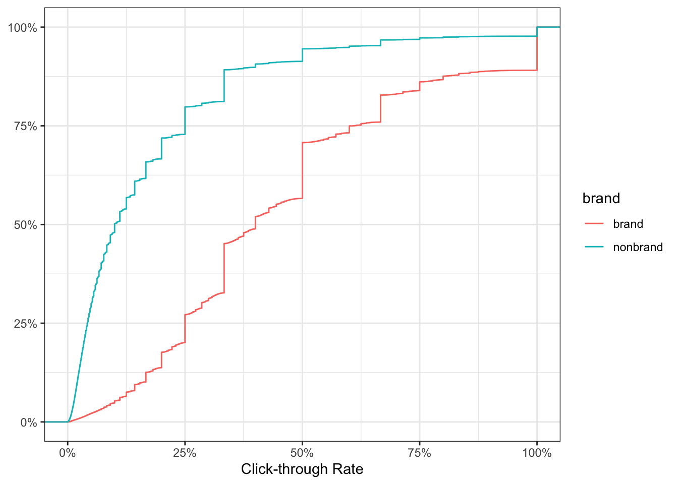
The chart above tells us for brand, 50% of the keywords have CTR of 40% or more. Conversely, 50% of nonbrand keywords have CTR less than 10%.
Segmenting your data in this fashion will help peel back those layers to obtain deeper insights about the data you will be working with.
Correlations
And just for fun because why not.
# install.packages("corrplot")
library(corrplot)

# COMPUTE
corr_results <- data_clean %>%
  select(clicks:position) %>%
  cor()

# PLOT CORRELOGRAM
corrplot(corr_results, method = 'color',
         type = 'upper', addCoef.col = 'black',
         tl.col = 'black', tl.srt = 45,
         diag = FALSE)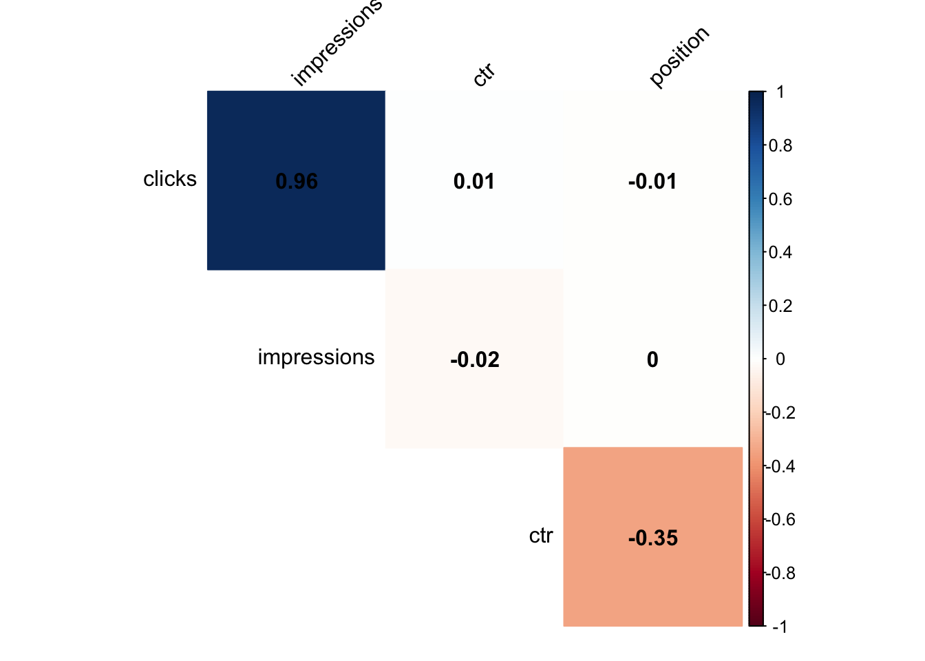
Click-through rate (CTR) benchmarking
Using CTR curves to forecast search traffic is a horrible idea for a number of reasons:
- Seasonality is hidden behind aggregated data
- It can’t account for irregular traffic spikes
- You need to make a coherent decision on date windows (2 weeks vs 2 years ago)
- It requires the end user to have a “known” keyword list and its associated search volume data but completely falls short on all the “unknown” long-tail
In spite of this, it still has its place in making performance comparisons between keywords or determining your search marketing opportunity.
Opportunity = (Total Search Demand * Position #1 CTR) - Total Search Demand
With that out of the way let’s use boxplots to visualize CTR by position and ensure we capture as much of the original data as possible.
# CREATE VARIABLE
avg_ctr <- data_clean %>%
  group_by(query) %>%
  summarize(clicks = sum(clicks),
            impressions = sum(impressions),
            position = median(position)) %>%
  mutate(page_group = 1 * (position %/% 1)) %>% # CREATE NEW COLUMN TO GROUP AVG POSITIONS
  filter(position < 21) %>%         # FILTER ONLY FIRST 2 PAGES
  mutate(ctr =  100*(clicks / impressions)) %>%     # NORMALIZE TO 100%
  ungroup()

# PLOT OUR RESULTS
avg_ctr %>%
  ggplot() +
  geom_boxplot(aes(page_group, ctr, group = page_group)) +
  labs(x = "SERP Position",
       y = "Click-through Rate (%)") +
theme_bw() 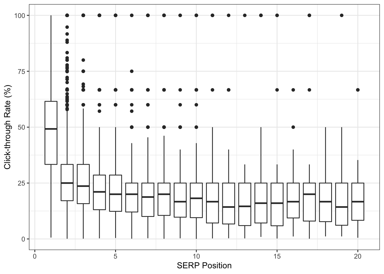
We have quite a bit of statistical outliers across all SERP positions! It is very likely these 100% CTR are due to keywords driving 1 click from 1 impression. Unfortunately, this low volume data skews our averages much higher but we also don’t want to remove them.
Estimating CTR with empirical Bayes
One approach to handle our “small data” problem is by shrinking the CTR to get it closer to an estimated average. You can read more about empirical Bayes estimation here (one source of inspiration over the years).
library(ebbr)

bayes_ctr <- data_clean %>%
  group_by(query) %>%
  summarize(clicks = sum(clicks),
            impressions = sum(impressions),
            position = median(position)) %>%
  mutate(page_group = 1 * (position %/% 1)) %>%
  filter(position < 21) %>%
  add_ebb_estimate(clicks, impressions) %>%     # APPLY EBB ESTIMATION
  ungroup()
## Warning: `data_frame()` is deprecated as of tibble 1.1.0.
## Please use `tibble()` instead.
## This warning is displayed once every 8 hours.
## Call `lifecycle::last_warnings()` to see where this warning was generated.So what happened?
Even though keyword_id_10001 has a raw CTR of 100% (5 clicks from 5 impressions), we moved its estimated CTR down to 66% when comparing itself with the entire dataset.
## # A tibble: 29,310 x 5
##    query            clicks impressions raw_ctr fitted_ctr
##    <chr>             <dbl>       <dbl>   <dbl>      <dbl>
##  1 keyword_id_1          2           6  0.333      0.322
##  2 keyword_id_10        51        4190  0.0122     0.0125
##  3 keyword_id_100        3           5  0.6        0.458
##  4 keyword_id_1000      14          33  0.424      0.410
##  5 keyword_id_10000      6          12  0.5        0.445
##  6 keyword_id_10001      5           5  1          0.663
##  7 keyword_id_10002     68          80  0.85       0.820
##  8 keyword_id_10003      6          13  0.462      0.420
##  9 keyword_id_10004     73         246  0.297      0.297
## 10 keyword_id_10005      1           2  0.5        0.365
## # … with 29,300 more rows
As we learn more about the keyword the shrinkage becomes less prominent and gets closer to the “true” click-through rate.
## # A tibble: 10 x 5
##    query            clicks impressions raw_ctr fitted_ctr
##    <chr>             <dbl>       <dbl>   <dbl>      <dbl>
##  1 keyword_id_31702     87         181  0.481      0.476
##  2 keyword_id_16358    261        1105  0.236      0.237
##  3 keyword_id_20596    181       10973  0.0165     0.0166
##  4 keyword_id_9922     225         676  0.333      0.333
##  5 keyword_id_4147     344         999  0.344      0.344
##  6 keyword_id_10615     59         173  0.341      0.340
##  7 keyword_id_3273      67          91  0.736      0.715
##  8 keyword_id_3998      99         295  0.336      0.335
##  9 keyword_id_28468     71        1288  0.0551     0.0561
## 10 keyword_id_1104      61         187  0.326      0.326
In other words, we are estimating CTR at the keyword level based on its performance rather than an aggregated version at the domain level.
Now let’s compare our two datasets.
bayes_ctr %>%
  select(page_group, bayes_ctr = .fitted, avg_ctr = .raw) %>%
  gather(bayes_ctr:avg_ctr, key = 'segment', value = 'ctr') %>%
  ggplot() +
  geom_boxplot(aes(page_group, ctr, fill = segment, group = page_group)) +
  facet_grid(segment~.) +
  scale_y_continuous(labels = percent_format()) +
  theme_bw() +
  labs(x = "SERP Position",
       y = "Click-through Rate")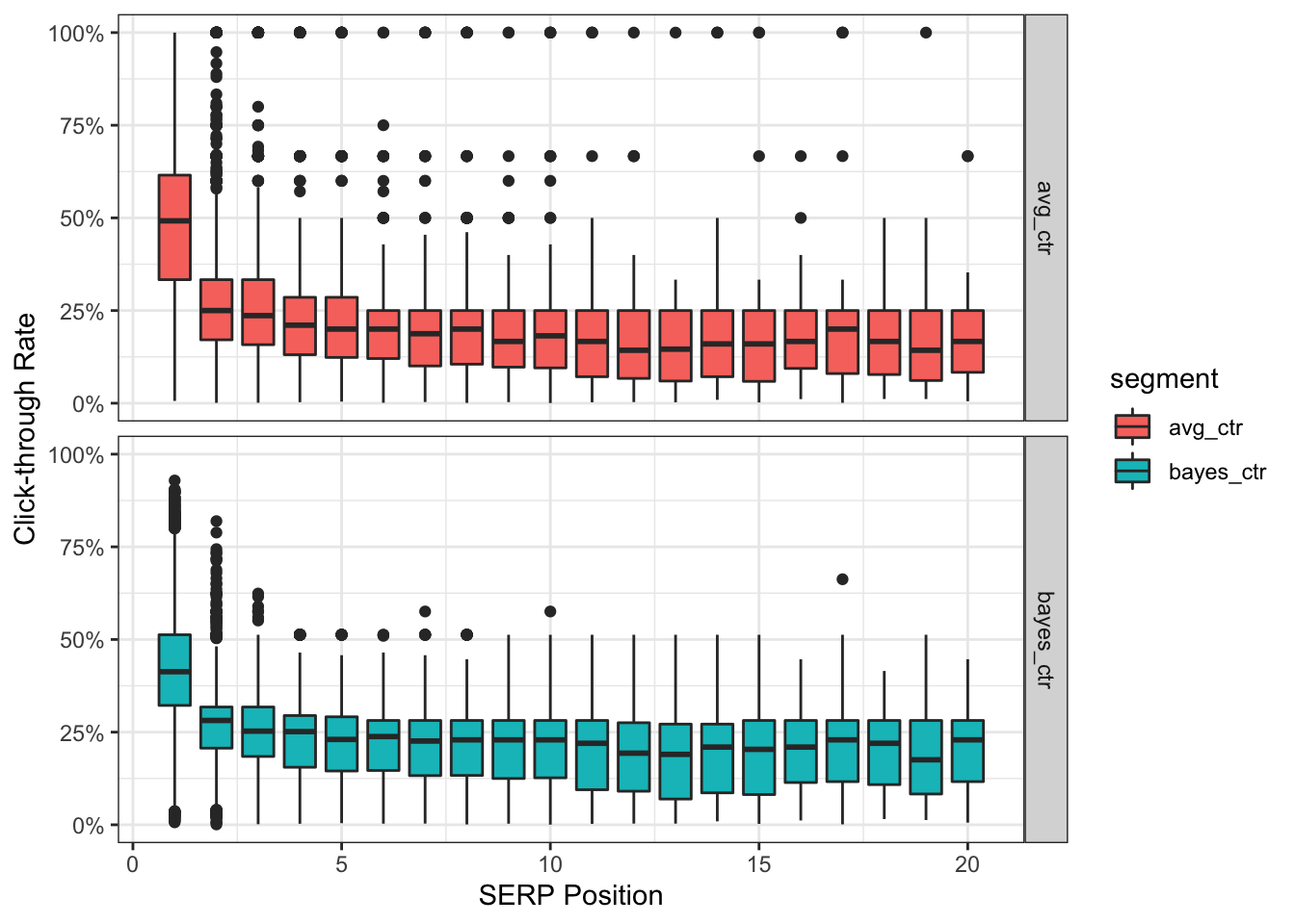
Notice anything different? The bottom bayes_ctr panel has no data points sitting at the extremes of 100% CTR. We also have 0% CTR inching slightly higher to align with the position’s empirical average.
Furthermore, as a result of moving closer to the estimated average, the mean CTR for position #1 is now 42.7% instead of 49.6%.
bayes_ctr %>%
  filter(page_group == 1) %>%
  select(avg_ctr = .raw, bayes_ctr = .fitted) %>%
  summary()
## avg_ctr bayes_ctr
## Min. :0.006116 Min. :0.006647
## 1st Qu.:0.333333 1st Qu.:0.322136
## Median :0.492063 Median :0.413047
## Mean :0.495679 Mean :0.426594
## 3rd Qu.:0.615385 3rd Qu.:0.512752
## Max. :1.000000 Max. :0.928946But wait - there’s more!
With R we can also visualize the same chart above with the addition of breaking it down by the segments we created earlier.
For example, this is what it would look like for some of our product types.
# APPLY EBB ESTIMATE
bayes_product <- data_clean %>%
  group_by(query, product_type) %>%
  summarize(clicks = sum(clicks),
            impressions = sum(impressions),
            position = median(position)) %>%
  mutate(page_group = 1 * (position %/% 1)) %>%
  filter(position < 21) %>%
  add_ebb_estimate(clicks, impressions) %>%
  ungroup()
## `summarise()` has grouped output by 'query'. You can override using the `.groups` argument.# VISUALIZE RESULTS
bayes_product %>%
select(page_group, product_type, bayes_ctr = .fitted, avg_ctr = .raw) %>%
gather(bayes_ctr:avg_ctr, key = 'segment', value = 'ctr') %>%
filter(product_type != 'socks', product_type != 'shoes', product_type != 'other') %>%
ggplot() +
geom_boxplot(aes(page_group, ctr, fill = segment, group = page_group)) +
facet_grid(product_type~segment) +
scale_y_continuous(labels = percent_format()) +
theme_bw() +
labs(x = "SERP Position",
y = "Click-through Rate")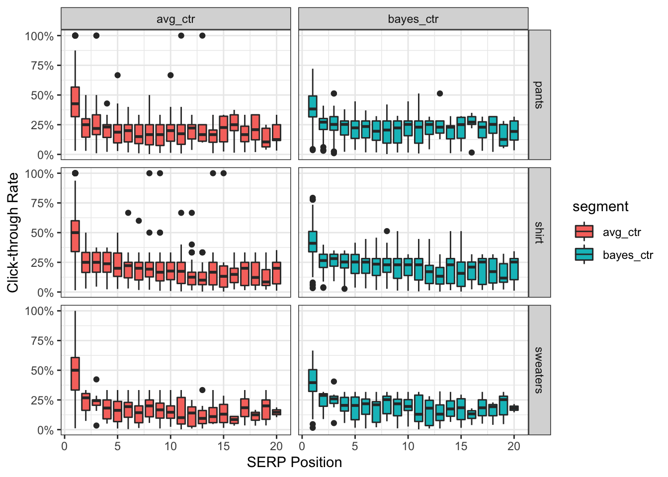
Combining results
The last step is merging our estimated CTR by position to our keyword level data.
# CREATE INDEX
bayes_index <- bayes_ctr %>%
  select(page_group, bayes_ctr = .fitted, avg_ctr = .raw) %>%
  group_by(page_group) %>%
  summarize(bayes_benchamrk = mean(bayes_ctr))

# JOIN DATAFRAMES
bayes_ctr %>%
  select(query:impressions, page_group, avg_ctr = .raw, bayes_ctr =.fitted) %>%
  left_join(bayes_index)
## # A tibble: 29,310 x 7
## query clicks impressions page_group avg_ctr bayes_ctr bayes_benchamrk
## <chr> <dbl> <dbl> <dbl> <dbl> <dbl> <dbl>
## 1 keyword_id_1 2 6 7 0.333 0.322 0.208
## 2 keyword_id_10 51 4190 4 0.0122 0.0125 0.226
## 3 keyword_id_1… 3 5 1 0.6 0.458 0.427
## 4 keyword_id_1… 14 33 2 0.424 0.410 0.270
## 5 keyword_id_1… 6 12 1 0.5 0.445 0.427
## 6 keyword_id_1… 5 5 1 1 0.663 0.427
## 7 keyword_id_1… 68 80 1 0.85 0.820 0.427
## 8 keyword_id_1… 6 13 2 0.462 0.420 0.270
## 9 keyword_id_1… 73 246 1 0.297 0.297 0.427
## 10 keyword_id_1… 1 2 1 0.5 0.365 0.427
## # … with 29,300 more rowsWe now have the final dataset to use and determine if a keyword is above or below a given performance threshold.
Forecasting search traffic
Predicting the future is hard. There is an entire field of academic research out there focused on this specific topic.
However, this guide I will demonstrate one out-of-the-box method with R using Prophet, Facebook’s forecasting package.
I leave it up to you, the reader, to decide if this is the right approach for your business and how to fine tune the parameters of the model (disclaimer: I use it in various capacities).
Note: you should have more than 365 days of click data for this section
For illustrative purposes though we’ll use our existing (limited) dataset and attempt to forecast nonbrand organic search traffic.
Clean and parse data
library(prophet)

data_time_series <- data_clean %>%
  filter(brand == 'nonbrand') %>%
  select(ds = date,
         y = clicks) %>%    # RENAME COLUMNS AS REQUIRED BY PROPHET
  group_by(ds) %>%
  summarize(y = sum(y))
Build forecasting model
m <- prophet(data_time_series)
future <- make_future_dataframe(m, periods = 30)  # CHANGE PREDICTION WINDOW HERE
forecast <- predict(m, future)

plot(m, forecast)   # DEFAULT VISUALIZATION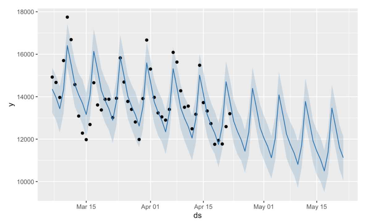
That chart is pretty nasty so let’s clean this up a bit before we decide to share it with others.
Combine with original data
forecast <- forecast %>% as.tibble()    # TRANSFORM INTO TIDY FORMAT

forecast$ds <- ymd(forecast$ds)     # CHANGE TO TIME SERIES FORMAT

forecast_clean <- forecast %>%
  select(ds, yhat, yhat_upper, yhat_lower) %>%
  left_join(data_time_series) %>%
  rename(date = ds,
         actual = y,
         forecast = yhat,
         forecast_low = yhat_lower,
         forecast_high = yhat_upper)    # RENAMING FOR HUMAN INTERPRETATION
Plot forecast
forecast_clean %>%
  ggplot() +
  geom_point(aes(date, actual), color = 'steelblue') +
  geom_line(aes(date, actual), color = 'steelblue') +
  geom_ribbon(aes(date, ymin = forecast_low, ymax = forecast_high),
              fill = 'salmon', alpha = 0.2) +
  scale_y_continuous(labels = comma_format()) +
  expand_limits(y = 0) +
  labs(x = NULL,
       y = "Organic Search Traffic") +
  theme_bw()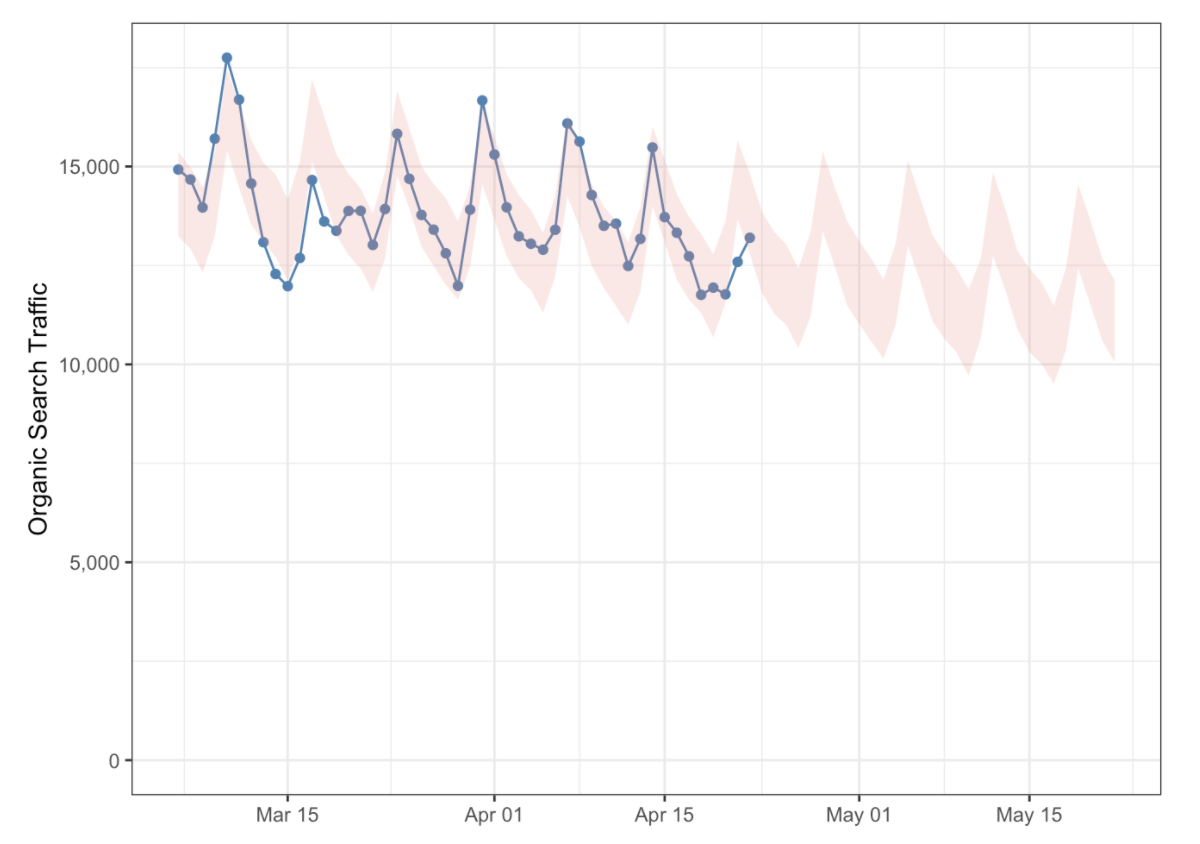
Wrapping up
In this quick start guide I attempted to showcase an end-to-end pipeline using R and the various functions associated with the language. We were able to fetch, parse, explore, visualize, model, and ultimately communicate these results.
By interacting with your own dataset from Google Search Console I hope it has piqued your interest in R in some way, shape or form. Please don’t hesitate to use this as a foundation for future knowledge.
Feedback is always appreciated and I would love to see what you come up with!