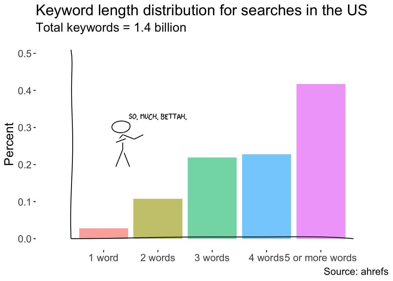
I came across this tweet and its corresponding graph a few days ago:
Did you know? 🧐
— Tim Soulo (@timsoulo) February 21, 2019
1‐word keywords account for only 2.8% of all the keywords people search for in the United States. pic.twitter.com/GXdfttn3jk
I love ahrefs and all but it’s 2019 - WHY ARE WE STILL USING PIE CHARTS?!
I’ll spare my opinion since there is already a ton of literature out but here’s a few to get started:
- The Five Stages of Grief Over the Death of Pie Charts
- Think before you pie chart
- Death to pie charts
- When should you use a pie chart? Almost never
- Save the pies for dessert
In any case, I decided this would be the best time to try out the xkcd R package and reconstruct the chart into something more sensible for human beings to interpret.