I stumbled upon an interesting poll last week…
SEO folks. When you reference “a long tail query” do you mean:
— Will Critchlow (@willcritchlow) May 14, 2019
(Trying again - deleted last poll as I phrased it ambiguously. Sorry.)
…and was amazed by the sheer number of incorrect responses.
Ever the skeptic, I wanted to make sure this was a real phenomenon despite the 1.2K survey responses.
Using Monte Carlo simulation we find there is a 100% chance the polling differences between the three groups are statistically significant (see notes for conjugate priors).
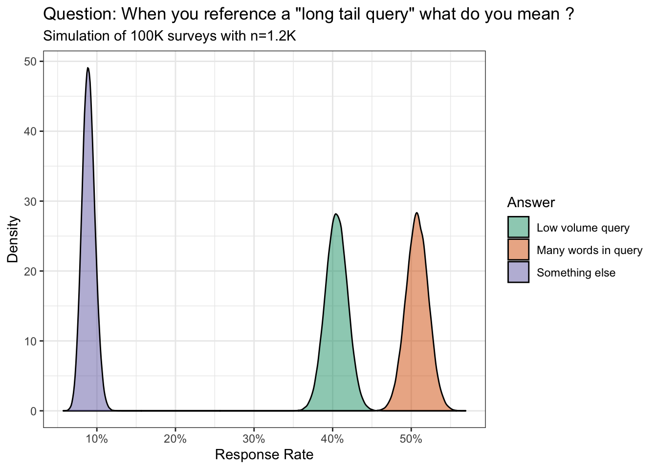
However, I have yet to see hard evidence from any of the two dominant perspectives. The many words in keyword group use Google to find a bunch of images from the Cretaceous period of the internet. The low volume query bunch just finger wag and talk down to the (misinformed) majority.
This compels me to ask: regardless of your response, how would you present your point of view to visually replicate the theory of the long tail curve (logarithmic)?
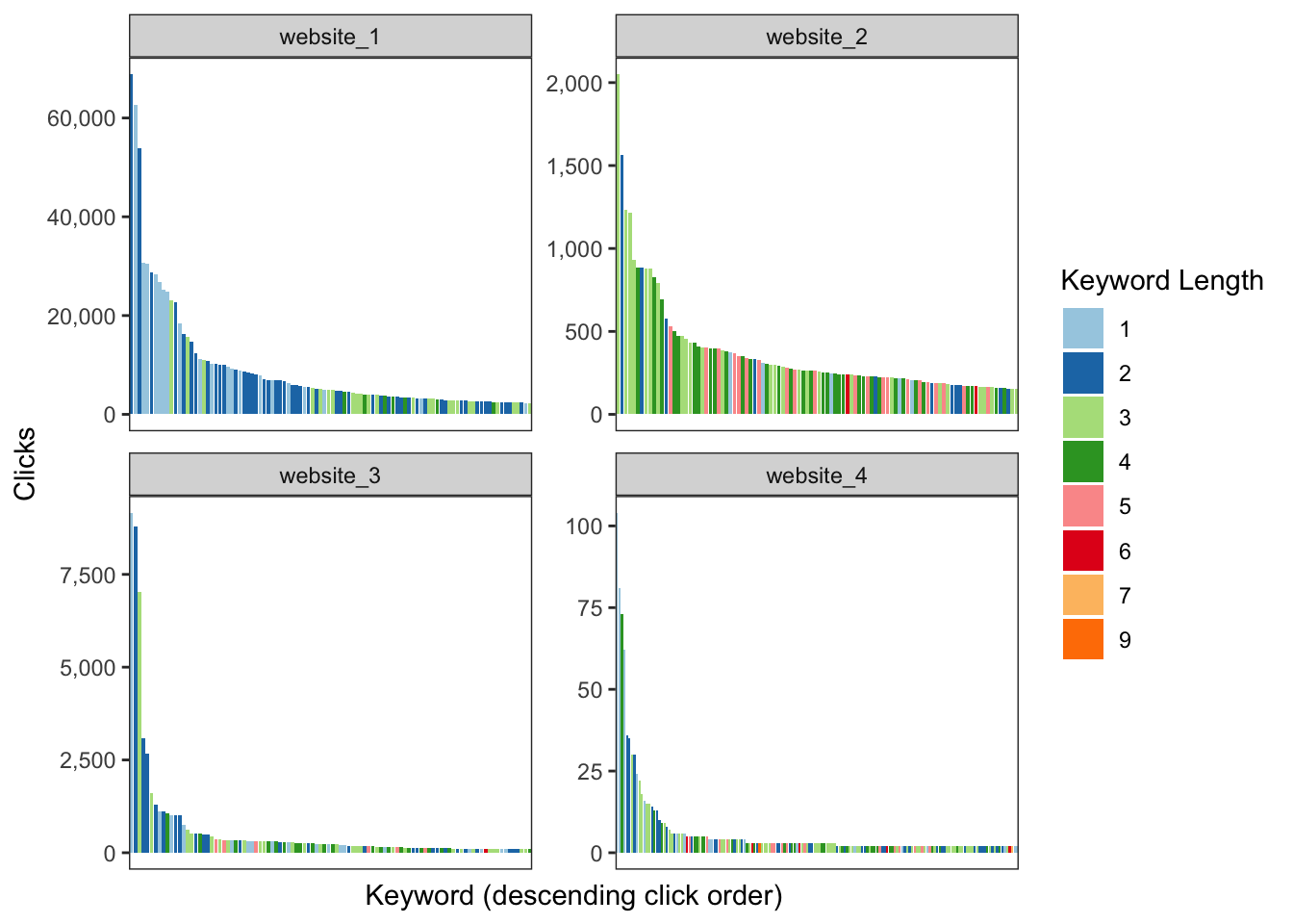
With this post I intend to answer that question by using real world Google Search Console data from four websites with varying levels of organic search traffic. You can also play with the anonymized dataset here.
Long tail: many words in query
This cohort states there is a linear relationship between the length of the keyword and search volume.
Thus, a 1-word search query will have more search volume than a 2-word search query; a 2-word search query will have more volume than a 3-word search query; and so on and so on.
If I were to take that definition we can then visualize it as the following:
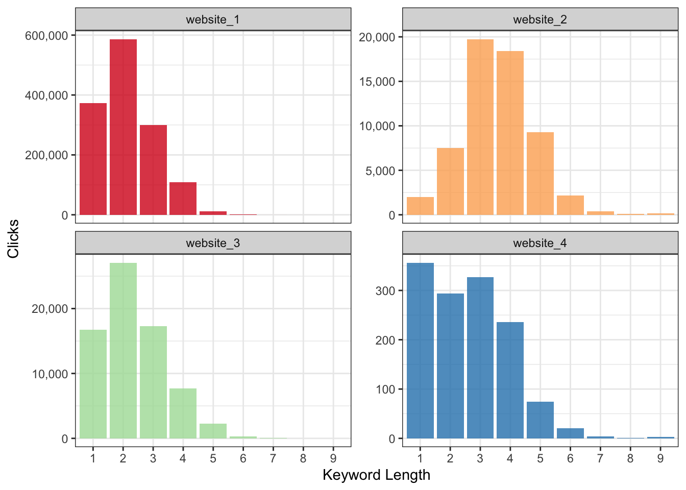
Odd - this does not look like the long tail demand curve we have come to know and love.
Perhaps what we want is the total count in each query length bucket rather than actual search volume?
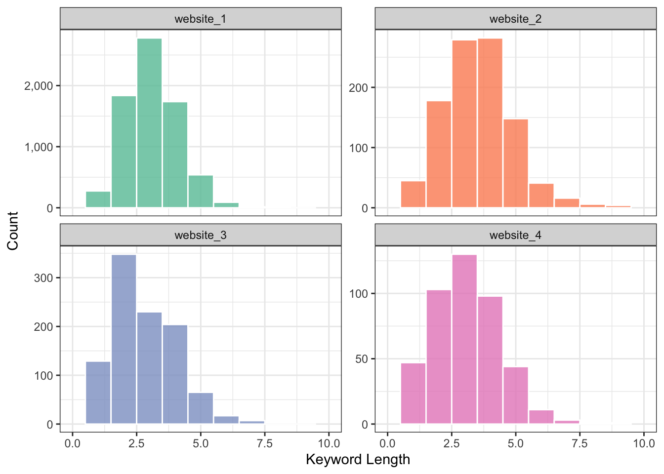
Not even close.
Long tail: low volume query
Here’s the wikipedia definition:
…a long tail of some distributions of numbers is the portion of the distribution having a large number of occurrences far from the “head” or central part of the distribution. The distribution could involve popularities, random numbers of occurrences of events with various probabilities, etc…
This can be put into practice by taking every keyword then sort by descending order based on total clicks (a.k.a. popluarity). Afterwards, we can use the cumulative distribution function for each keyword per website to illustrate the power law in action (80% of traffic comes from 20% of the keywords).
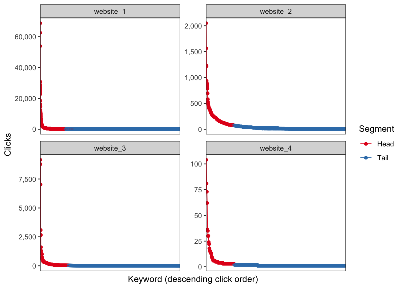
Winner winner chicken dinner.
tl;dr
The long tail is defined by search query volume.
Bonus
And of course, this wouldn’t be a data visualization blog post if I wasn’t able to show clicks and keyword length on the same logarithmic chart ;]
Notes
I used a weak prior with the assumption that most respondents would choose the correct answer:
- Low volume query with Beta(14,6)
- Many words query with Beta(7,13)
- Something else with Beta(1,19)
Example of what our simulation would look like with 100 responses:
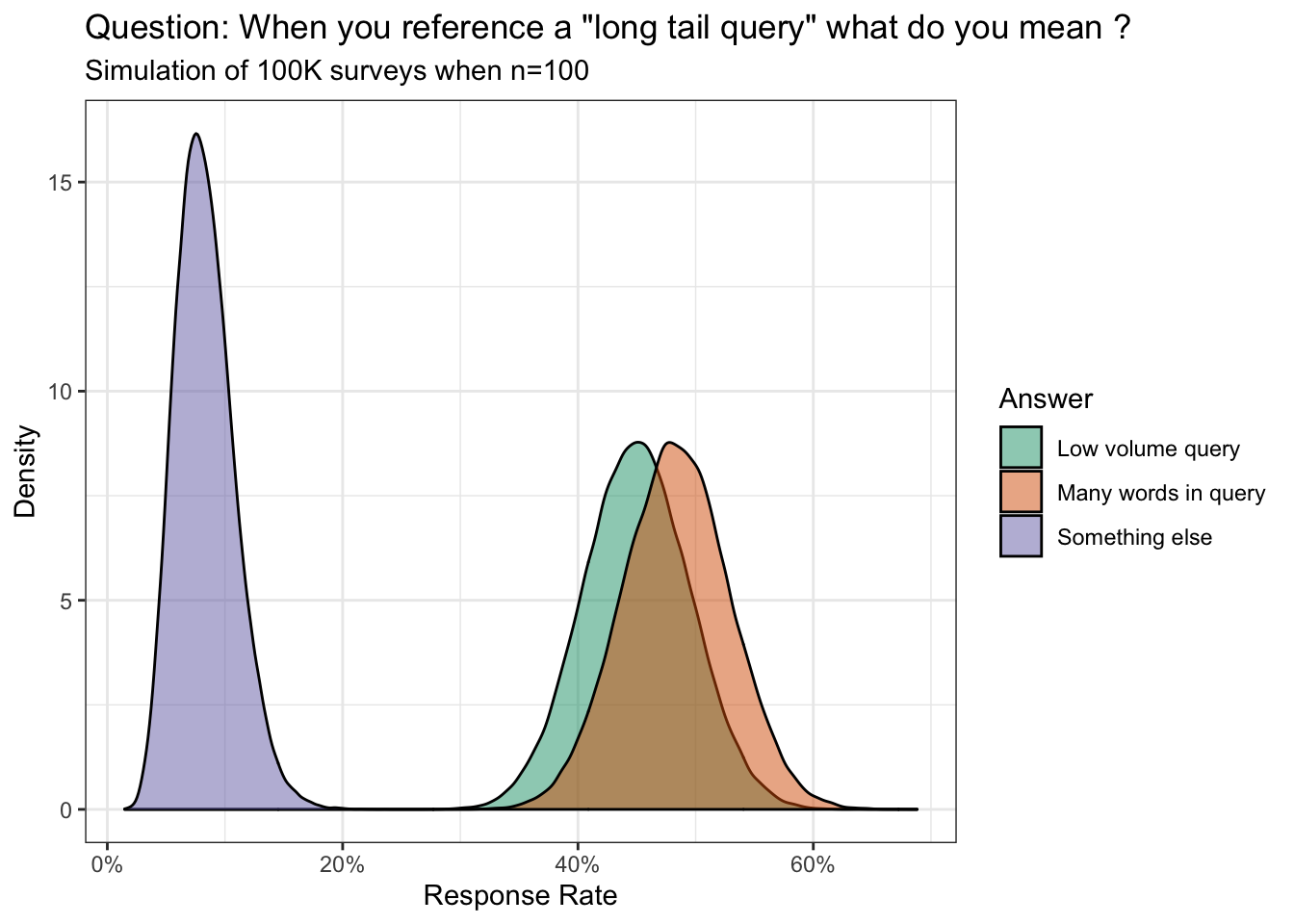
Probability many words in query is greater than low volume query cohort (%):
## [1] 69.946Soapbox
What this means to me is the industry is still plagued by bad advice where popularity (via the conference circuit, twitter, etc.) equates to domain knowledge. We have “leaders” who hear a few fancy words then bastardize the meaning without fully understanding the concepts. Any critique is immediately shut down.
On the other side of the aisle are the very enthusiastic newcomers who want to learn everything. However, misinformation and mistakes continue to linger in the annals of the search results which trickle down to the next generation of SEO. They take in all information as gospel…never questioning or thinking critically.
I don’t know what the appropriate solution is but it’s worth mentioning here so we can at least hold ourselves to a higher standard - elevating everyone else in the process.