Goal of #makeovermonday is to transform some of my #rstats articles and visualizations to their python equivalent.
Original plot for this #tidytuesday dataset can be found here.
Load modules
import pandas as pd
import seaborn as sns
import matplotlib.pyplot as plt
Download and parse data
df_raw = pd.read_csv("https://raw.githubusercontent.com/rfordatascience/tidytuesday/master/data/2019/2019-03-05/jobs_gender.csv",
      sep=',', error_bad_lines=False, index_col=False, dtype='unicode')

# FILTER ONLY FOR 2016
df_raw = df_raw[df_raw['year']=='2016']

df_raw = df_raw[['major_category', 'total_earnings_male', 'total_earnings_female',
               'total_earnings', 'total_workers', 'workers_male', 'workers_female']]

# REMOVE NULL VALUES
df_raw = df_raw.dropna()
Clean data
Need to transform our data from objects to numerical values.
# PULL OUT MAJOR CATEGORIES
df_categories = pd.DataFrame(df_raw.iloc[:, 0])

# CONVERT EVERYTHING ELSE TO INTEGERS
df_values = pd.DataFrame(df_raw.iloc[:, 1:7].astype(int))

# COMBINE DATAFRAMES
df = pd.concat([df_categories, df_values], axis=1)
Calculate weighted differences
# MALE AVERAGE DIFF
df['male_diff'] = (((df['total_earnings_male'] / df['total_earnings']) - 1) * df['workers_male'] ) / df['total_workers']
# FEMALE AVERAGE DIFF
df['female_diff'] = (((df['total_earnings_female'] / df['total_earnings']) - 1) * df['workers_female'] ) / df['total_workers']
# SELECT VARIABLES FOR PLOTTING
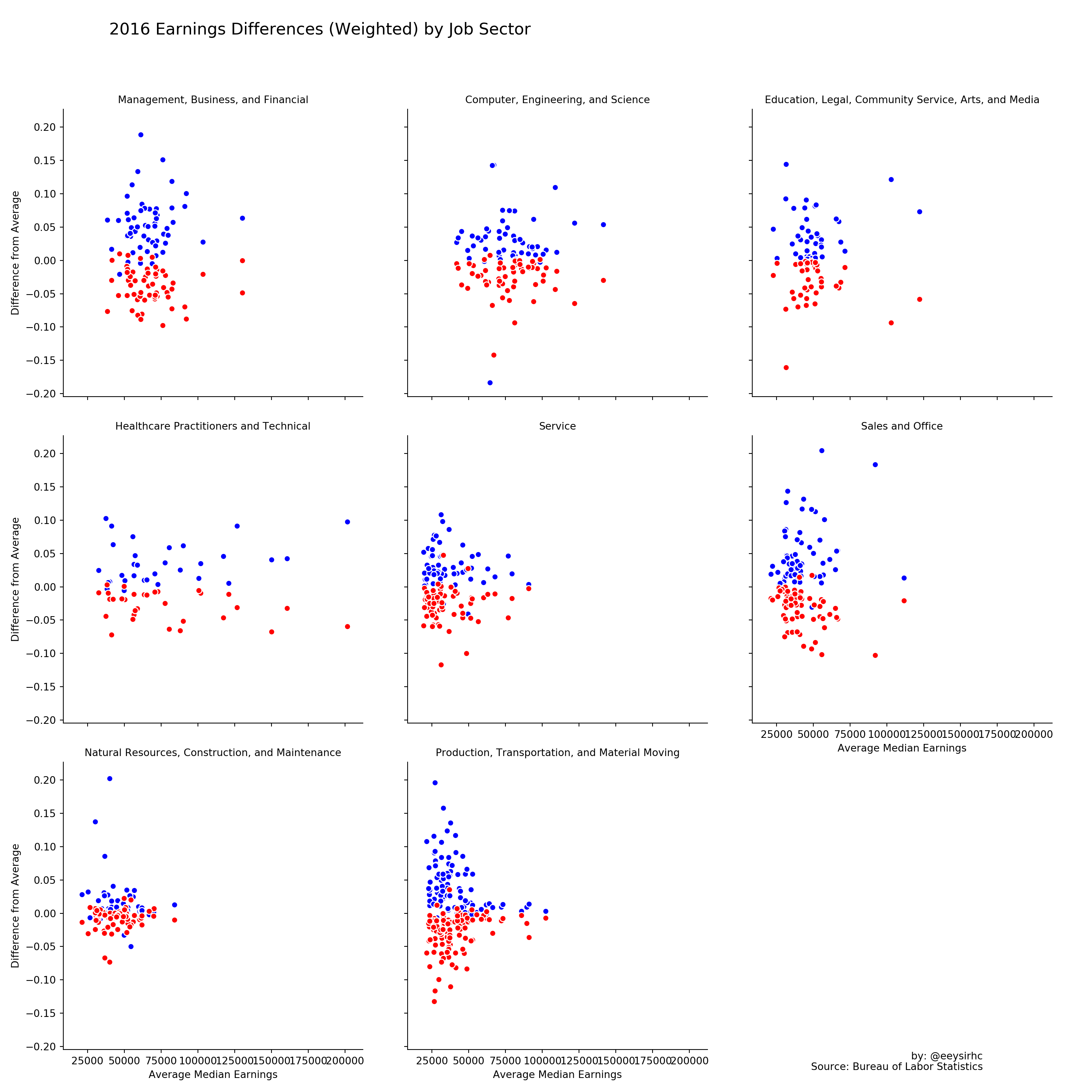
df_final = df[['major_category', 'total_earnings', 'male_diff', 'female_diff']]Visualize dataset
plt.figure(figsize=(20,15))

g = sns.FacetGrid(df_final, col='major_category', col_wrap=3, height=5)
g = g.map(plt.scatter, 'total_earnings', 'male_diff', color='blue', edgecolor='white')
g = g.map(plt.scatter, 'total_earnings', 'female_diff', color='red', edgecolor='white') .set_titles("{col_name}").set_xlabels("Average Median Earnings").set_ylabels("Difference from Average")

plt.subplots_adjust(top = 0.9)
plt.suptitle("2016 Earnings Differences (Weighted) by Job Sector",
      x=0.1, horizontalalignment="left", fontsize=16)
plt.figtext(0.9, 0.03, "by: @eeysirhc", horizontalalignment="right")
plt.figtext(0.9, 0.02, "Source: Bureau of Labor Statistics", horizontalalignment="right")

plt.show(g)