Once in awhile I find some great charts which make me stop and think.
Below is one example of this:
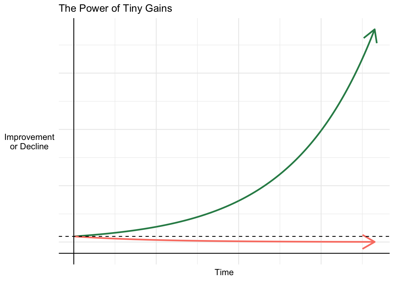
1% better every day is all it takes to completely change your life. pic.twitter.com/kYbgGOzzZv
— Santiago (@svpino) September 10, 2021
I really appreciate the inspirational message behind it: being deliberate about the change you wish to see in the world.
With that in mind, I want to recreate that chart below using the R programming language (regardless if the trajectory path is realistic or not).
Create data
library(tidyverse)

df <- seq(1, 365, 1) %>%
  as_tibble() %>%
  rename(time = value) %>%
  mutate(

    # 1% better every day
    better = 1.01^time,

    # 1% worse every day
    worse = 0.99^time

    ) %>%
  pivot_longer(cols = 2:3)
Visualize data
cpalette <- c("seagreen", "salmon")

df %>%
  ggplot(aes(time, value, color = name)) +
  geom_line(size = 1, arrow=arrow()) +

  # dotted line at 1
  geom_hline(yintercept = 1, lty = 2) +

  # side and bottom grid lines
  geom_vline(xintercept = 0) +
  geom_hline(yintercept = -2) +

  labs(x = "Time",
       y = str_wrap("Improvement or Decline", width = 10),
       title = "The Power of Tiny Gains") +
  scale_color_manual(values = cpalette) +
  theme_minimal() +
  theme(axis.text.x = element_blank(),
        axis.ticks.x = element_blank(),
        axis.text.y = element_blank(),
        axis.ticks.y = element_blank(),
        axis.title.y = element_text(angle = 0, vjust = 0.5),
        legend.position = 'none')