The coronavirus (a.k.a. COVID-19) is taking the world by storm with the World Health Organization officially characterizing the situation as a pandemic.
I’m not an infectious disease expert but I couldn’t resist and write a quick #rstats script to visualize the total number of cases by country.
Feel free to use and modify for your own needs:
# LOAD PACKAGES
library(tidyverse)
library(scales)
library(gghighlight)

# DOWNLOAD DATA
df <- read_csv("https://covid.ourworldindata.org/data/ecdc/full_data.csv")

# PARSE DATA
df_parsed <- df %>%
  filter(total_cases >= 100) %>% # MINIMUM 100 CASES
  group_by(location) %>%
  mutate(n = n(),
         day_index = row_number()) %>%
  ungroup() %>%
  filter(n >= 25, # MINIMUM 25 DAYS
         !location %in% c('World', 'International')) # EXCLUDE

# GRAPH
df_parsed %>%
  ggplot(aes(day_index, total_cases, color = location, fill = location)) +
  geom_point() +
  geom_smooth() +
  gghighlight() +
  scale_y_log10(labels = comma_format()) +
  labs(title = "COVID-19: cumulative daily new cases by country (log scale)",
     x = "Days since 100th reported case",
     y = NULL, fill = NULL, color = NULL,
     caption = "by: @eeysirhc\nSource: Our World in Data") +
  facet_wrap(~location, ncol = 4) +
  expand_limits(x = 70) +
  theme_minimal() +
  theme(legend.position = 'none')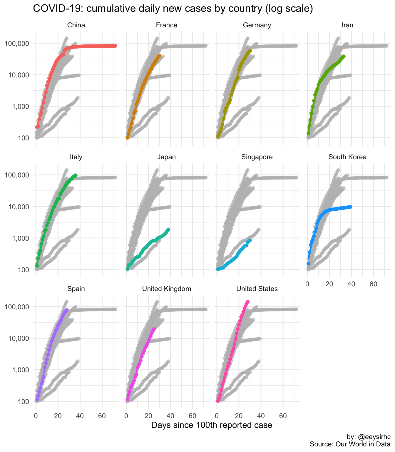
Moment of zen
same data, different view
— Christopher Yee (@Eeysirhc) March 10, 2020
anyways, please stay healthy and wash them hands! pic.twitter.com/Wx7Wa0gEkC