Analyzing data for #tidytuesday week of 1/22/2019 (source)
# LOAD PACKAGES AND PARSE DATA
library(tidyverse)
library(scales)
library(lubridate)
library(RColorBrewer)

prison_raw <- read_csv("https://raw.githubusercontent.com/rfordatascience/tidytuesday/master/data/2019/2019-01-22/prison_population.csv")

prison <- prison_raw
Process the raw data
total <- prison %>%
  filter(pop_category != 'Total' & pop_category != 'Male' & pop_category != 'Female') %>%
  select(county_name, urbanicity, pop_category, population, prison_population) %>%
  na.omit() %>%
  group_by(county_name, urbanicity, pop_category) %>%
  summarize(population = sum(population),
            prison_population = sum(prison_population)) %>%
  ungroup() %>%
  group_by(county_name, urbanicity) %>%
  mutate(pct_population = population / sum(population),
         pct_prisoner = prison_population / sum(prison_population))
What is the proportion of population:prisoners per demographic group ?
total %>%
  filter(pop_category != 'Other') %>%
  ggplot() +
  geom_point(aes(pct_population, pct_prisoner),
             alpha = 0.1, size = 2, color = 'grey') +
  geom_smooth(aes(pct_population, pct_prisoner, color = pop_category),
              size = 1.2,
             se = FALSE) +
  theme_light() +
  scale_y_continuous(labels = percent_format()) +
  scale_x_continuous(labels = percent_format()) +
  labs(x = "County Population",
       y = "Prisoner Population",
       color = "",
       title = "Comparison of county to prison population by ethnicity from 1970 to 2016",
       subtitle = "Specific groups are overrepresented in the prisoner population",
       caption = "Source: Vera Institute of Justice") +
  geom_abline(linetype = 'dashed') +
  scale_color_brewer(palette = 'Set1') +
  theme(panel.grid.major = element_blank(),
        panel.grid.minor = element_blank(),
        legend.position = 'top',
        panel.background = element_rect(fill = 'gray97',
                                        color = 'gray97',
                                        size = 0.5, linetype = 'solid'))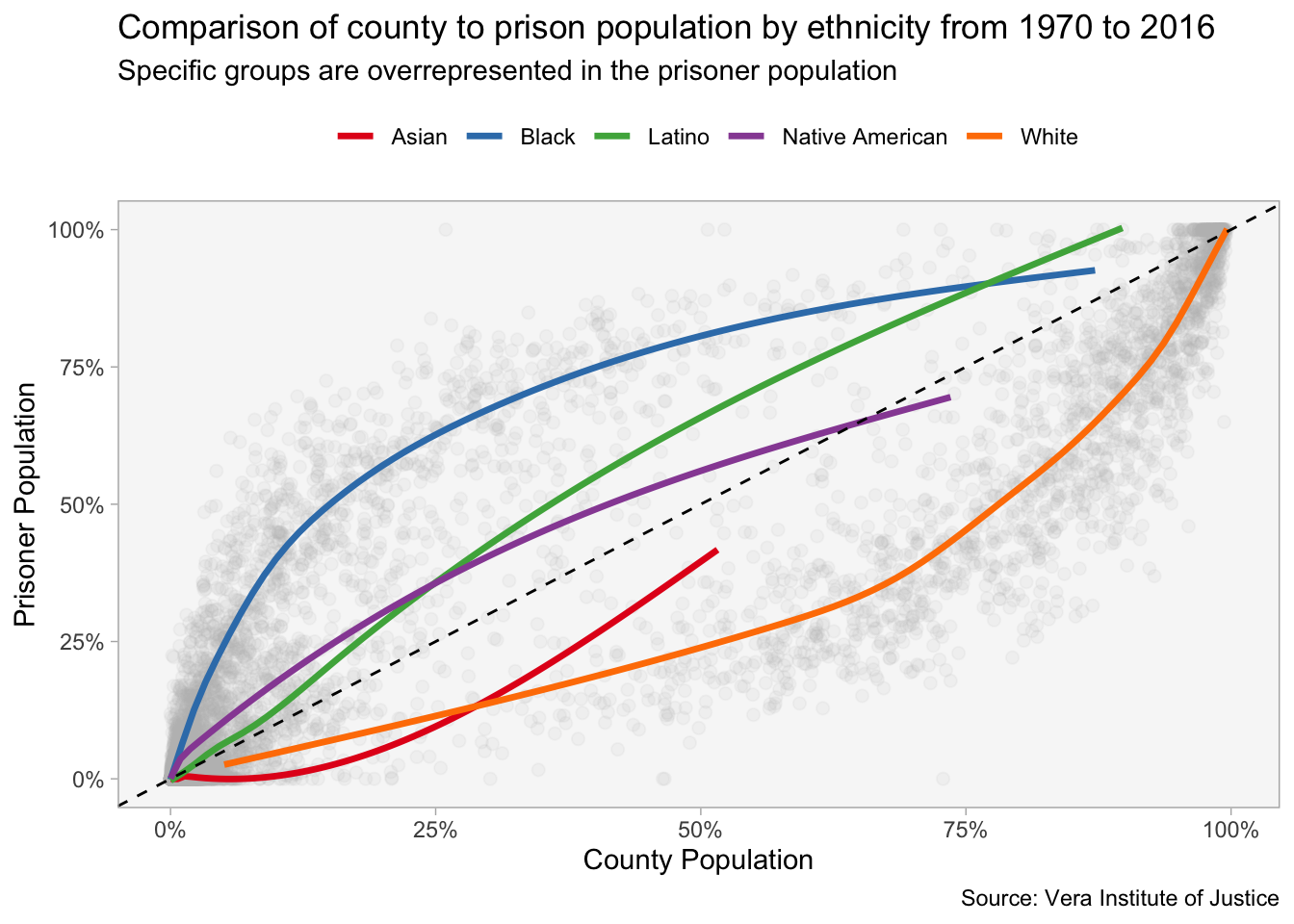
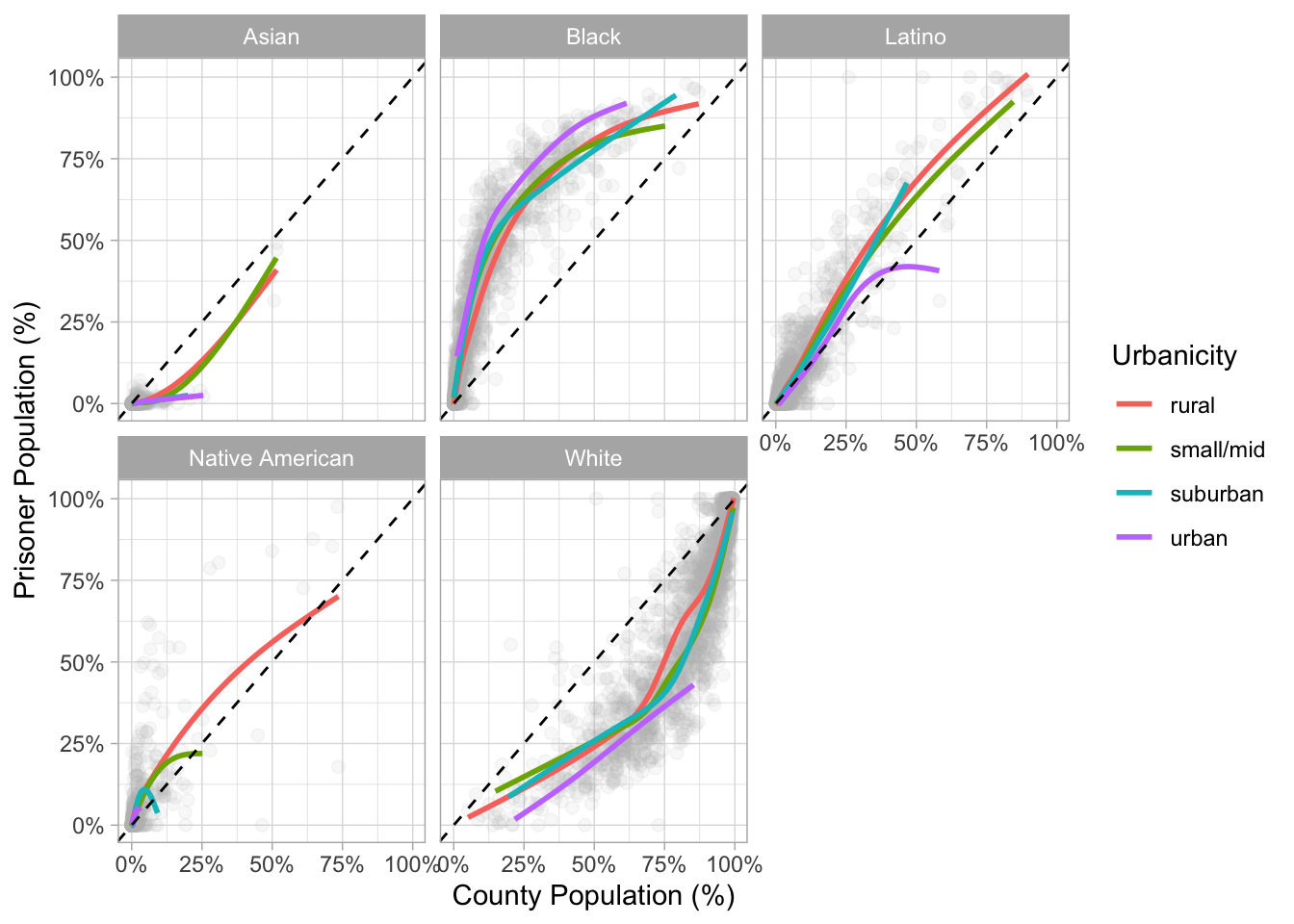
Does urbanicity play a role ?
Answer: variations between different races but long answer short…not really.
total %>%
  filter(pop_category != 'Other') %>%
  ggplot() +
  geom_point(aes(pct_population, pct_prisoner),
             alpha = 0.1, size = 2, color = 'grey') +
  geom_smooth(aes(pct_population, pct_prisoner, color = urbanicity),
              se = FALSE) +
  theme_light() +
  scale_y_continuous(labels = percent_format()) +
  scale_x_continuous(labels = percent_format()) +
  labs(x = "County Population (%)",
       y = "Prisoner Population (%)",
       color = "Urbanicity") +
  facet_wrap(~pop_category) +
  geom_abline(linetype = 'dashed')