The team at Bing were generous enough to release search query data with COVID-19 intent. The files are broken down by country and state level granularity so we can understand how the world is coping with the pandemic through search.
What follows is an exploratory analysis on how US Bing users are searching for COVID-19 (a.k.a. coronavirus) information.
tl;dr
COVID-19 search queries generally fall into five distinct categories:
1. Awareness
2. Consideration
3. Management
4. Unease
5. Advocacy (?)
About the data
- Bing search logs
- Desktop only
- Date ranges: 2020-01-01 to 2020-04-30
- Only searches that were issued many times by multiple users were included
- Dataset includes queries from all over the world that had an intent related to the Coronavirus or Covid-19
- In some cases this intent is explicit in the query itself, e.g. “Coronavirus updates Seattle” in other cases it is implicit , e.g. “Shelter in place”
- Implicit intent of search queries (e.g. Toilet paper) were extracted by using random walks on the click graph approach
- All personal data was removed
Download data
Here is a simple script I wrote to retrieve, parse and compile state level data into a CSV where we can execute it with the following #rstats command:
source("consolidate_bing_covid19_files.R")We can then read in the data and filter on searches based in the USA:
library(tidyverse)
library(lubridate)
library(scales)

covid_raw <- read_csv("coronavirus-queriesbystate.csv")

covid <- covid_raw %>%
  filter(Country == 'United States') %>%
  mutate(Month = floor_date(Date, "month"))
Data check
How many observations per month?
covid %>%
  count(Month) %>%
kableExtra::kable("markdown")| Month | n |
|---|---|
| 2020-01-01 | 17338 |
| 2020-02-01 | 51080 |
| 2020-03-01 | 436027 |
| 2020-04-01 | 384403 |
What about unique search queries per month?
covid %>%
  group_by(Month) %>%
  distinct(Query) %>%
  count() %>%
  ungroup() %>%
  ggplot(aes(Month, n)) +
  geom_point() +
  geom_line() +
  scale_y_continuous(labels = comma_format()) +
  theme_minimal() +
  labs(x = NULL, y = NULL,
       title = "Count of unique COVID-19 search queries per month",
       caption = "by: @eeysirhc\nSource: Bing Coronavirus Query Set")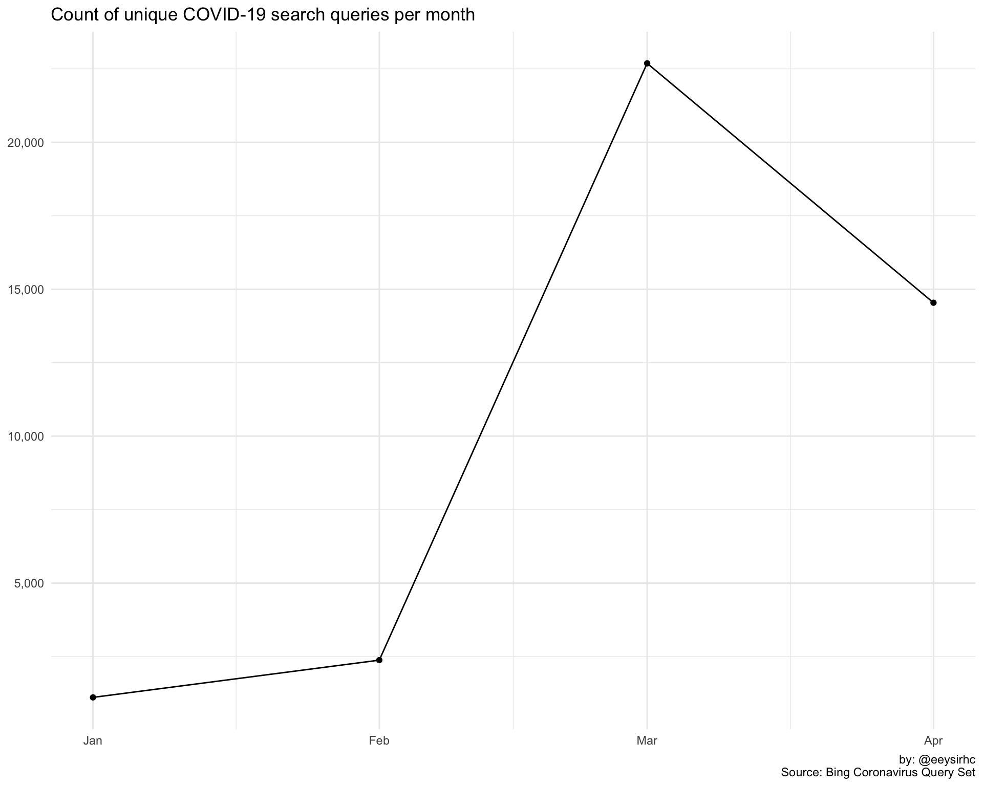
Distribution of popularity score?
covid %>%
  ggplot() +
  geom_histogram(aes(PopularityScore, fill = IsImplicitIntent), color = 'white') +
  scale_y_continuous(labels = comma_format()) +
  theme_minimal() +
  theme(legend.position = 'top') +
  labs(x = "Popularity Score", y = NULL,
       title = "Distribution of COVID-19 search queries by Bing's popularity score",
       caption = "by: @eeysirhc\nSource: Bing Coronavirus Query Set")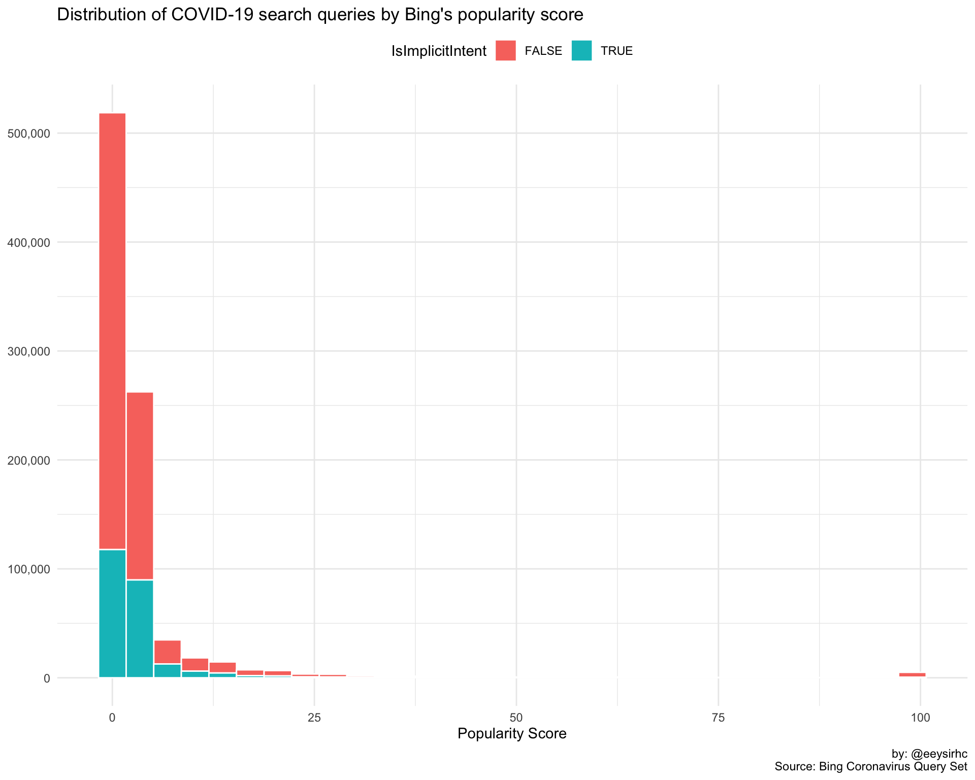
Distribution of search query length?
covid %>%
  distinct(Query, IsImplicitIntent) %>%
  mutate(qlength = str_count(Query, '\\w+')) %>%
  ggplot() +
  geom_histogram(aes(qlength, fill = IsImplicitIntent), color = 'white') +
  scale_y_continuous(labels = comma_format()) +
  theme_minimal() +
  theme(legend.position = 'top') +
  labs(x = "Search Query Length", y = NULL,
       title = "Distribution of COVID-19 search query length",
caption = "by: @eeysirhc\nSource: Bing Coronavirus Query Set") 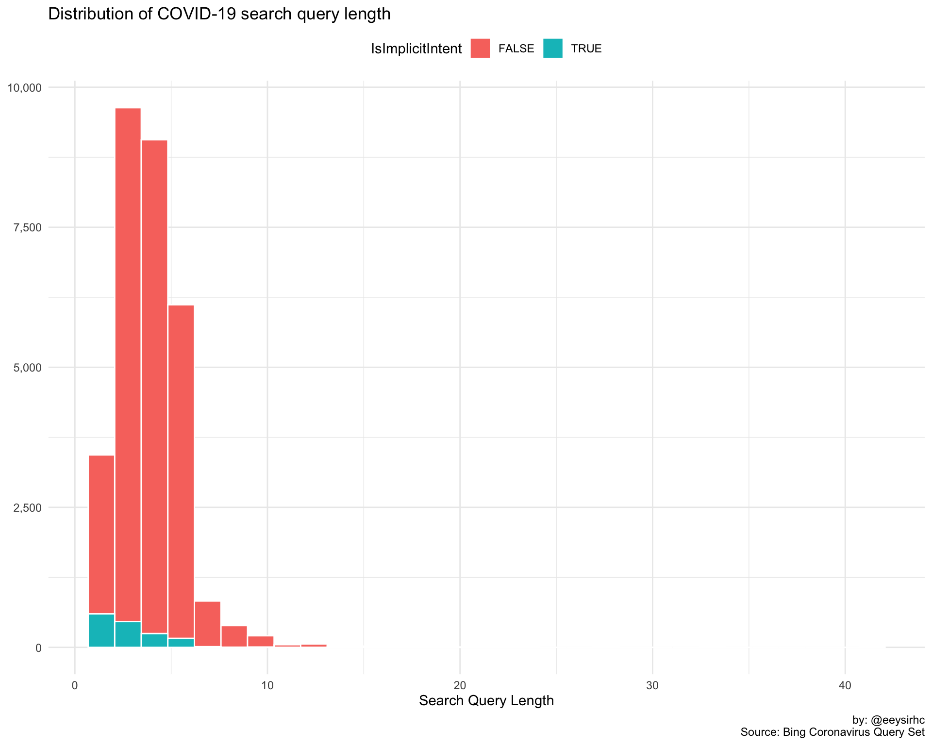
And a quick glimpse on what our dataset looks like:
set.seed(2103)

covid %>%
  sample_n(1) %>%
  glimpse()
## Rows: 1
## Columns: 7
## $ Date <date> 2020-03-30
## $ Query <chr> "homeland security coronavirus"
## $ IsImplicitIntent <lgl> FALSE
## $ State <chr> "New York"
## $ Country <chr> "United States"
## $ PopularityScore <dbl> 1
## $ Month <date> 2020-03-01With our (hand) sanity check out of the way, let’s start with something simple.
What are the top queries by month based on popularity?
covid_popularity <- covid %>%
  group_by(Query, Month, IsImplicitIntent) %>%
  summarize(score = mean(PopularityScore)) %>%
  group_by(Month) %>%
  top_n(10, score) %>%
  ungroup() %>%
  mutate(Query = reorder(Query, score))

covid_popularity %>%
  ggplot(aes(Query, score, fill = IsImplicitIntent)) +
  geom_col(alpha = 0.7) +
  coord_flip() +
  facet_wrap(~Month, scales = "free") +
  scale_fill_manual(values = c("#D55E00", "#0072B2")) +
  theme_bw() +
  theme(legend.position = 'top') +
  labs(title = "Top COVID-19 search queries by month based on popularity score",
       caption = "by: @eeysirhc\nSource: Bing Coronavirus Query Set",
       x = NULL, y = "Popularity Score")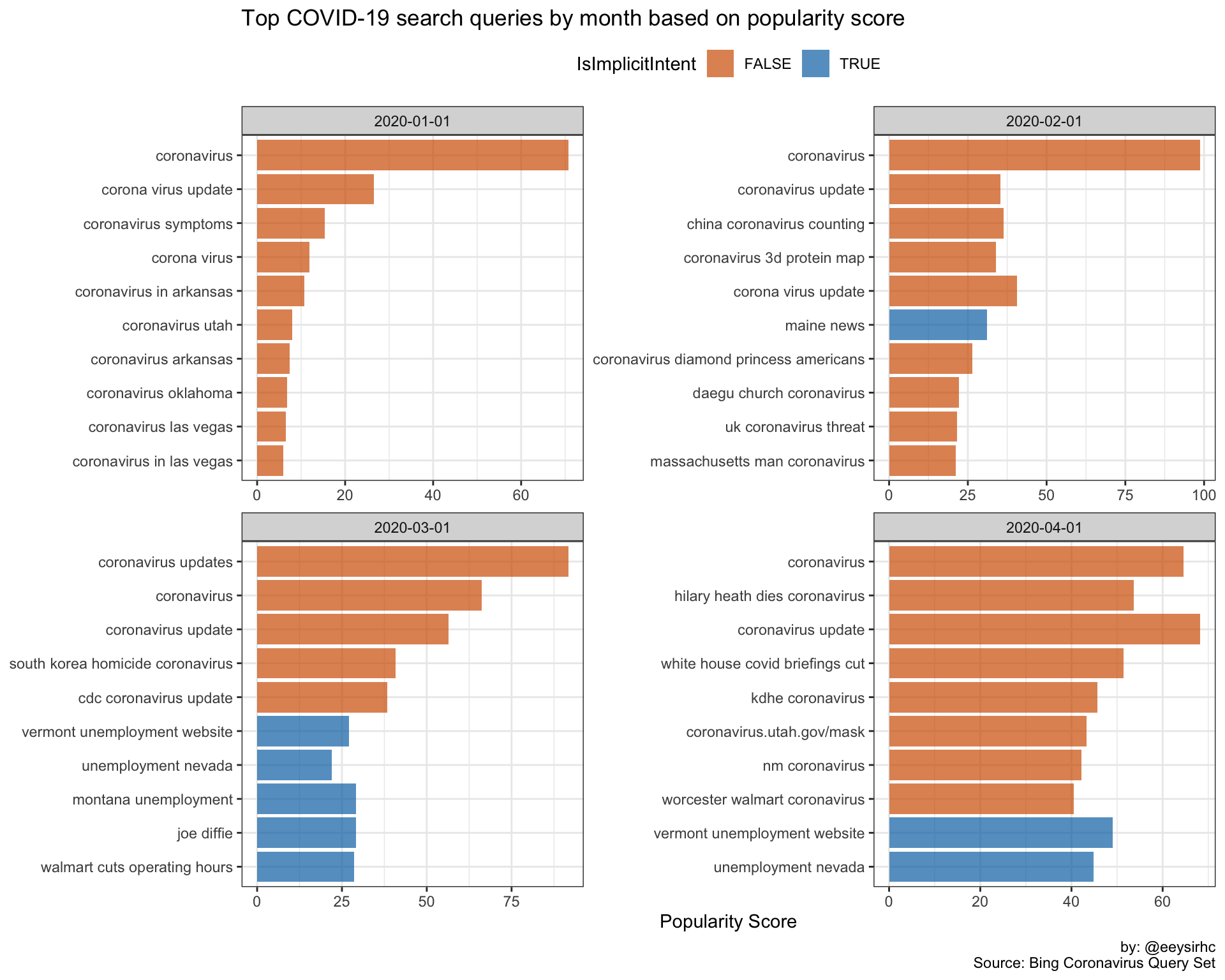
As expected, search queries in January and February are primarily focused on the latest updates by location, potential symptoms, and international responses to the virus (China, UK, South Korea).
Search intent changes in March and April as the pandemic spreads to the US where queries revolve around coping with the new normal: store operating hours, unemployment, and information about celebrities who have died from the virus (Joe Diffie, Hilary Heath).
Bing’s popularity score works well enough but the results might skew towards queries that were searched the most - let’s try something different.
What are the defining terms for each month?
We’ll use weighted log odds (it’s similar to TF-IDF but much better) to underscore some of the more nuanced search terms and help us describe the collective mindset for each month.
library(tidylo)
library(ggrepel)

covid_logodds <- covid %>%
  group_by(Month, IsImplicitIntent) %>%
  count(Query, sort = TRUE) %>%
  ungroup() %>%
  bind_log_odds(Month, Query, n) %>%
  arrange(-log_odds_weighted)

covid_logodds %>%
  group_by(Month) %>%
  top_n(10, log_odds_weighted) %>%
  ungroup() %>%
  mutate(Month = factor(Month),
         Query = fct_reorder(Query, log_odds_weighted)) %>%
  ggplot(aes(Query, log_odds_weighted, fill = IsImplicitIntent)) +
  geom_col(alpha = 0.7) +
  coord_flip() +
  facet_wrap(~Month, scales = 'free_y') +
  scale_fill_manual(values = c("#D55E00", "#0072B2")) +
  theme_bw() +
  theme(legend.position = 'top') +
  labs(title = 'Top COVID-19 search queries by month based on weighted log odds',
       caption = "by: @eeysirhc\nSource: Bing Coronavirus Query Set",
       x = NULL, y = "Weighted Log Odds")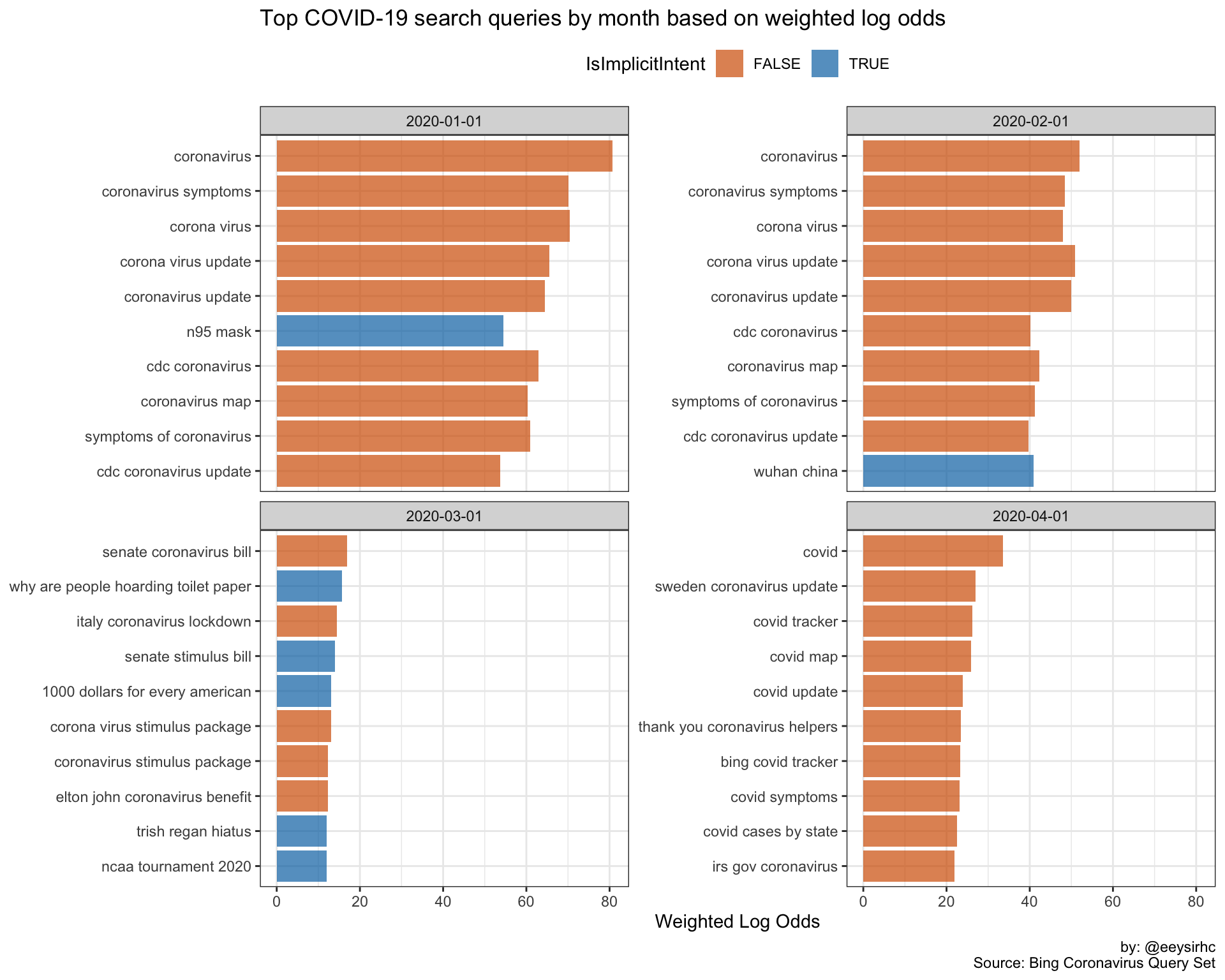
We might be on to something here…
- January: users want information about the origins of COVID-19
- February: searches focused on international and domestic developments for the fight against coronavirus
- March: queries shift to viral prevention and deterrence as the US heads into psuedo-lockdown
- April: user attention is on national COVID-19 updates and case numbers
How do queries differ between January and April?
Let’s step back a bit and visualize how we might characterize user searches in January vs April.
covid_logodds %>%
  filter(Month == '2020-01-01' | Month == '2020-04-01') %>%
  group_by(Month) %>%
  top_n(30, n) %>%
  ungroup() %>%
  ggplot(aes(n, log_odds_weighted, label = Query, color = IsImplicitIntent)) +
  geom_point() +
  geom_text_repel() +
  geom_hline(yintercept = 0, lty = 2) +
  scale_color_manual(values = c("#D55E00", "#0072B2")) +
  facet_grid(Month ~ .) +
  expand_limits(x = 0) +
  theme_bw() +
  theme(legend.position = 'top') +
  labs(title = 'Top COVID-19 search queries based on weighted log odds',
       caption = "by: @eeysirhc\nSource: Bing Coronavirus Query Set",
       x = "Frequency", y = "Weighted Log Odds")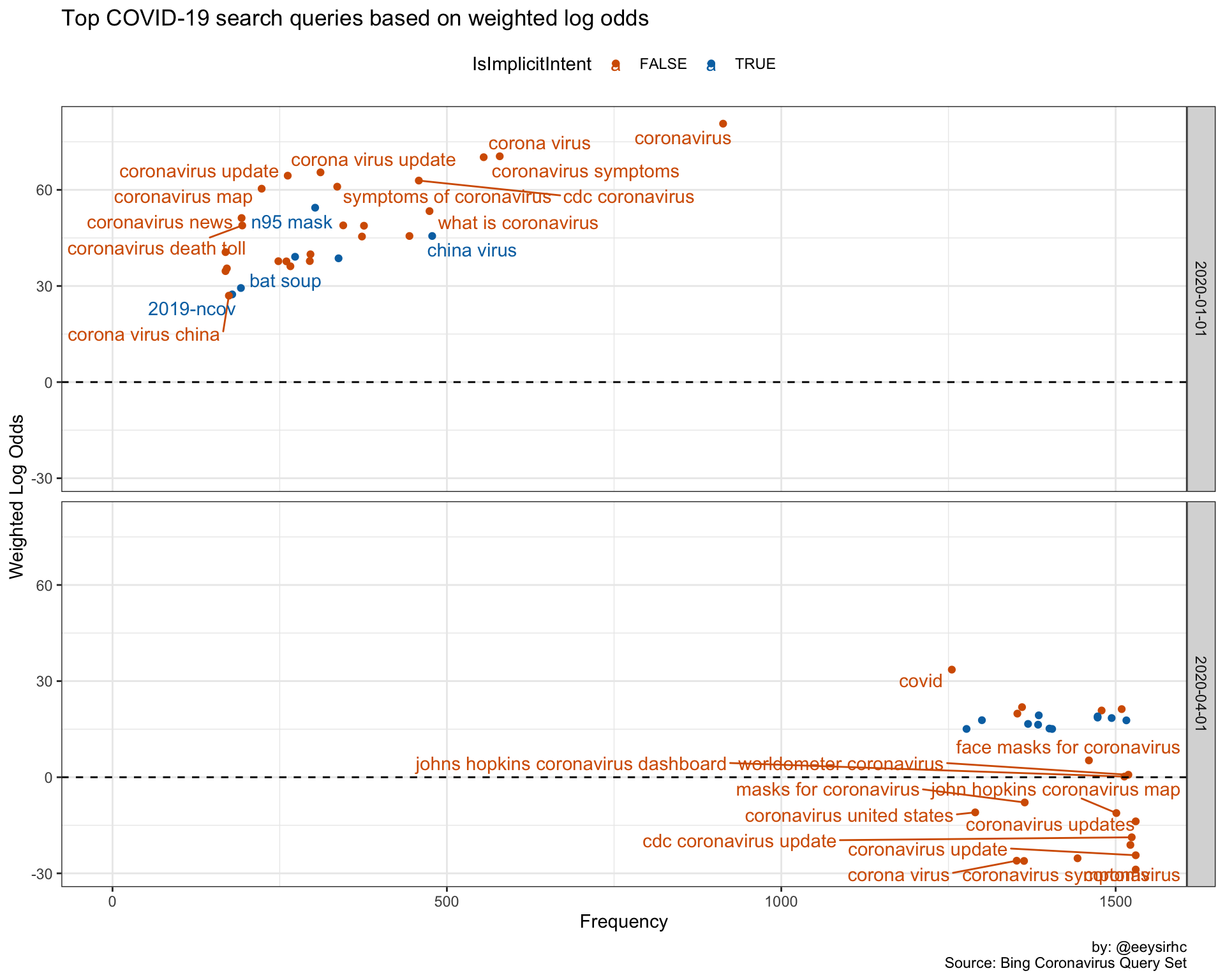
Different view but the same takeaway as before.
One thing to note about this chart: coronavirus was the most searched query in January but its importance is dampened on the weighted log odds scale. In April, coronavirus is still a high frequency term but its prominence is placed well below all other new queries during the same time frame.
COVID-19 search stages
Based on the above, it appears our search queries loosely follow a typical marketing funnel but we’ll modify the framework to our use case:
1. Awareness
2. Consideration
3. Management
4. Unease
5. Advocacy (?)
A quick blurb about each…
Awareness: high level and broad informational queries where our users just started learning about the virus.
- coronavirus symptoms
- what is the coronavirus
- coronavirus fatality rate
- coronavirus first symptoms
- where did the coronavirus come from
Consideration: search terms in this category are focused on what cohorts will be affected by the virus and how best to prepare as news about the pandemic goes mainstream.
- how to prepare for coronavirus
- is coronavirus in [city/state]
- how old is california coronavirus patient
- are face masks effective for coronavirus
- who is dying from coronavirus
Management: this stage of our users seek information on how to live through the pandemic.
- [state] unemployment website/claim/portal/assistance
- [city/state] lockdown/curfew/quarantine/stay at home
- stimulus checks for 2020
- working from home coronavirus
- covid19 positive messages for high school graduates
Unease: with people stuck inside they are getting anxious and want specific information about what’s going on outside of their homes or to have this all be over with.
- [state] covid 19 news/map/updates/cases/curve/deaths
- when will coronavirus end/peak in [state]
- 2nd wave of coronavirus
- [state] coronavirus reopening
- does alcohol/lysol/bleach/ozone/hot water/heat/freezing/microwave/windex kill coronavirus
Advocacy (?): we haven’t reached this phase yet but I suspect in May we will see more enforcement-based queries such as how to convince my parents to stay home (lol).
The 5 W’s & 1 H
For the next section, let’s keep the framework in mind as we churn out a few charts and emphasize how intent has changed over time.
Prepare data frame
covid_mentions <- covid %>%
  mutate(segment = case_when(str_detect(Query, "who") ~ "who",
                             str_detect(Query, "what") ~ "what",
                             str_detect(Query, "where") ~ "where",
                             str_detect(Query, "when") ~ "when",
                             str_detect(Query, "why") ~ "why",
                             str_detect(Query, "how") ~ "how",
                             TRUE ~ "-")) %>%
  filter(segment != '-') %>%
  group_by(segment, Month, IsImplicitIntent) %>%
  count(Query, sort = TRUE) %>%
  ungroup()
Simplified plotting function
wwwwwh_plot <- function(keyword){
  covid_mentions %>%
    filter(segment == keyword) %>%
    bind_log_odds(Month, Query, n) %>%
    arrange(-log_odds_weighted) %>%
    group_by(Month) %>%
    top_n(10, log_odds_weighted) %>%
    ungroup() %>%
    mutate(Month = factor(Month),
           Query = fct_reorder(Query, log_odds_weighted)) %>%
    ggplot(aes(Query, log_odds_weighted, fill = IsImplicitIntent)) +
    geom_col(alpha = 0.8) +
    coord_flip() +
    facet_wrap(~Month, scales = 'free_y') +
    scale_fill_manual(values = c("#56B4E9", "#009E73")) +
    scale_x_discrete(labels = wrap_format(40)) +
    theme_bw() +
    theme(legend.position = 'top') +
    labs(title = 'Top COVID-19 search queries by month based on weighted log odds',
         subtitle = paste0("Segment by '", keyword, "' query modifiers"),
         caption = "by: @eeysirhc\nSource: Bing Coronavirus Query Set",
         x = NULL, y = "Weighted Log Odds")
}
“Who” queries
wwwwwh_plot("who")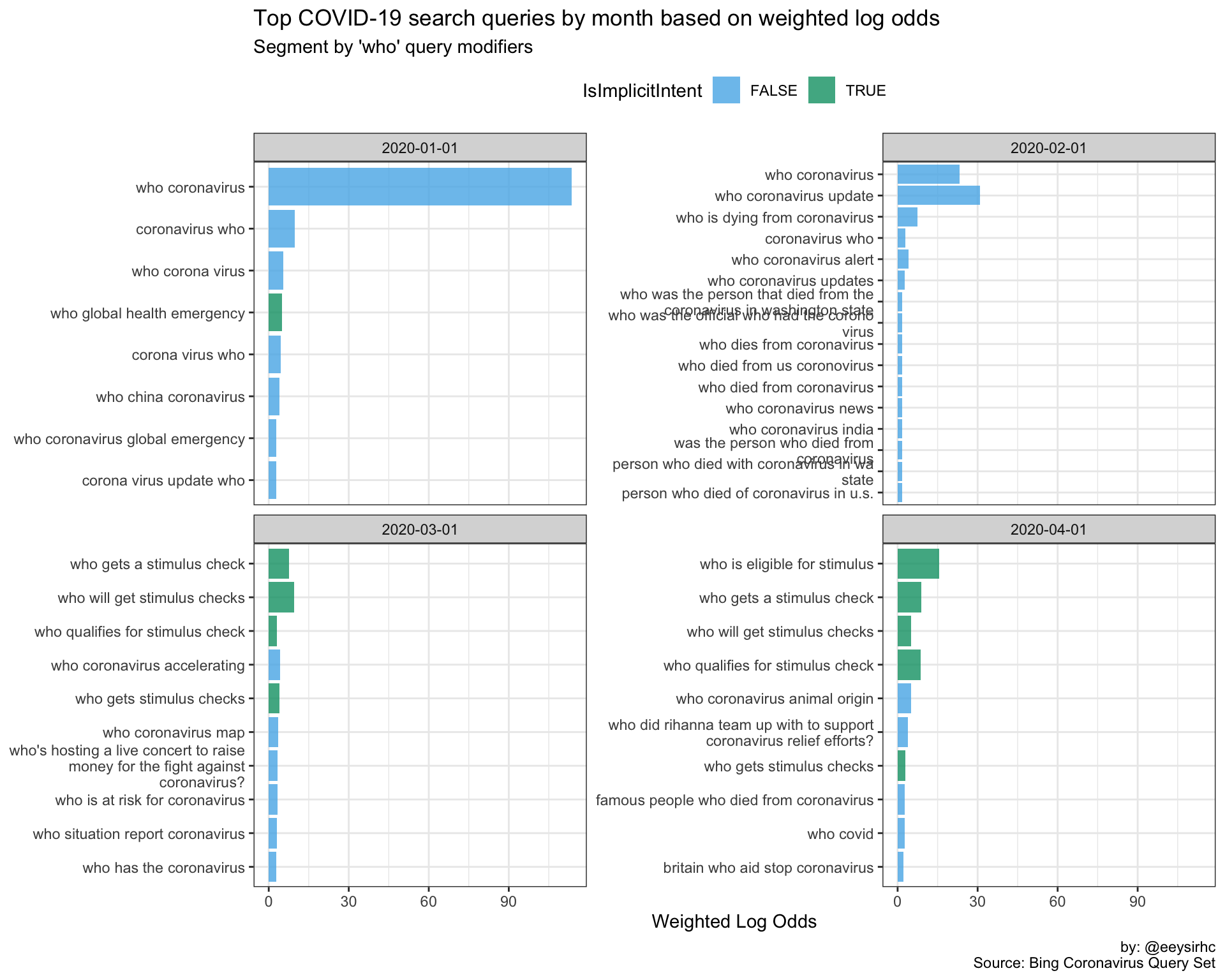
“What” queries
wwwwwh_plot("what")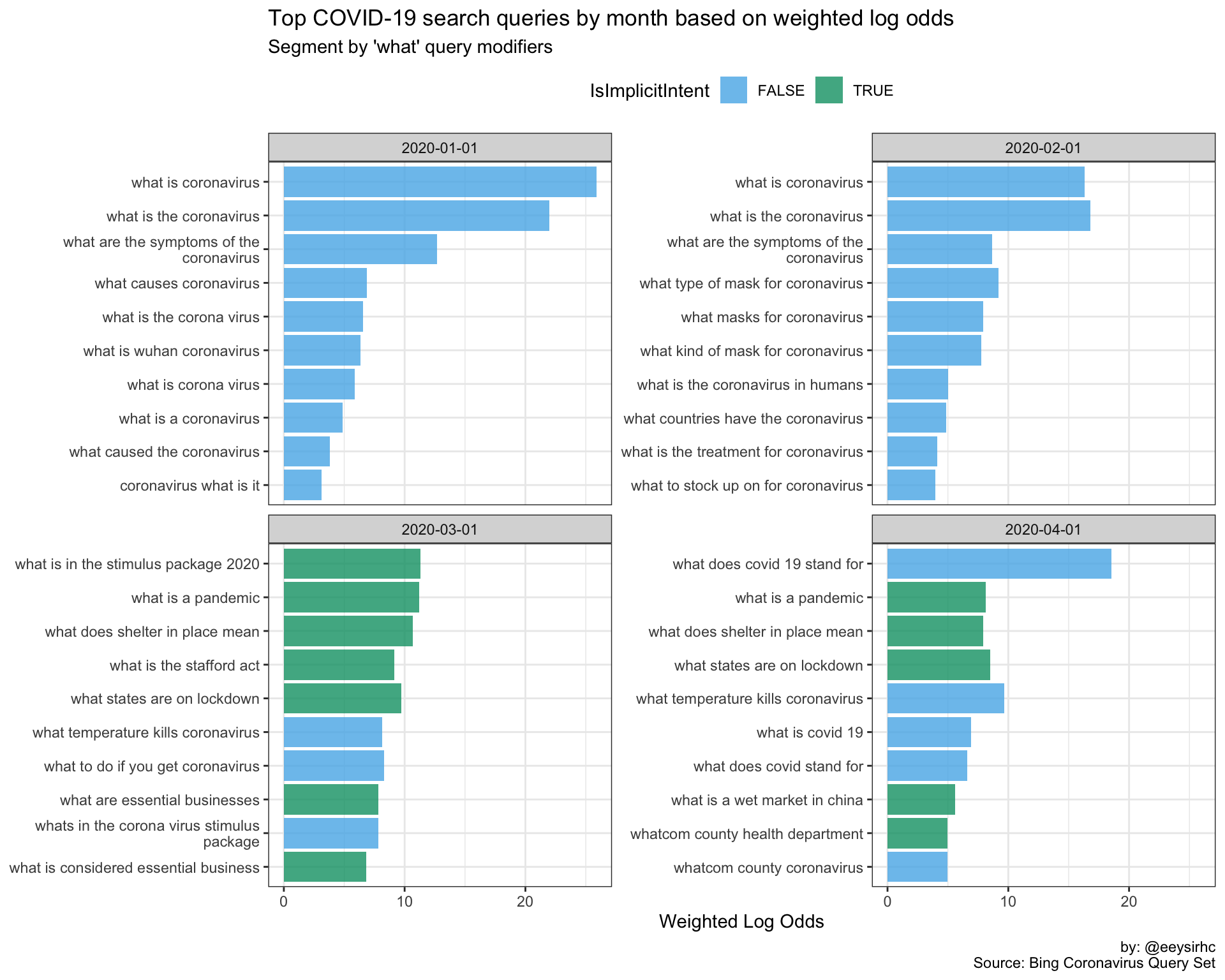
“Where” queries
wwwwwh_plot("where")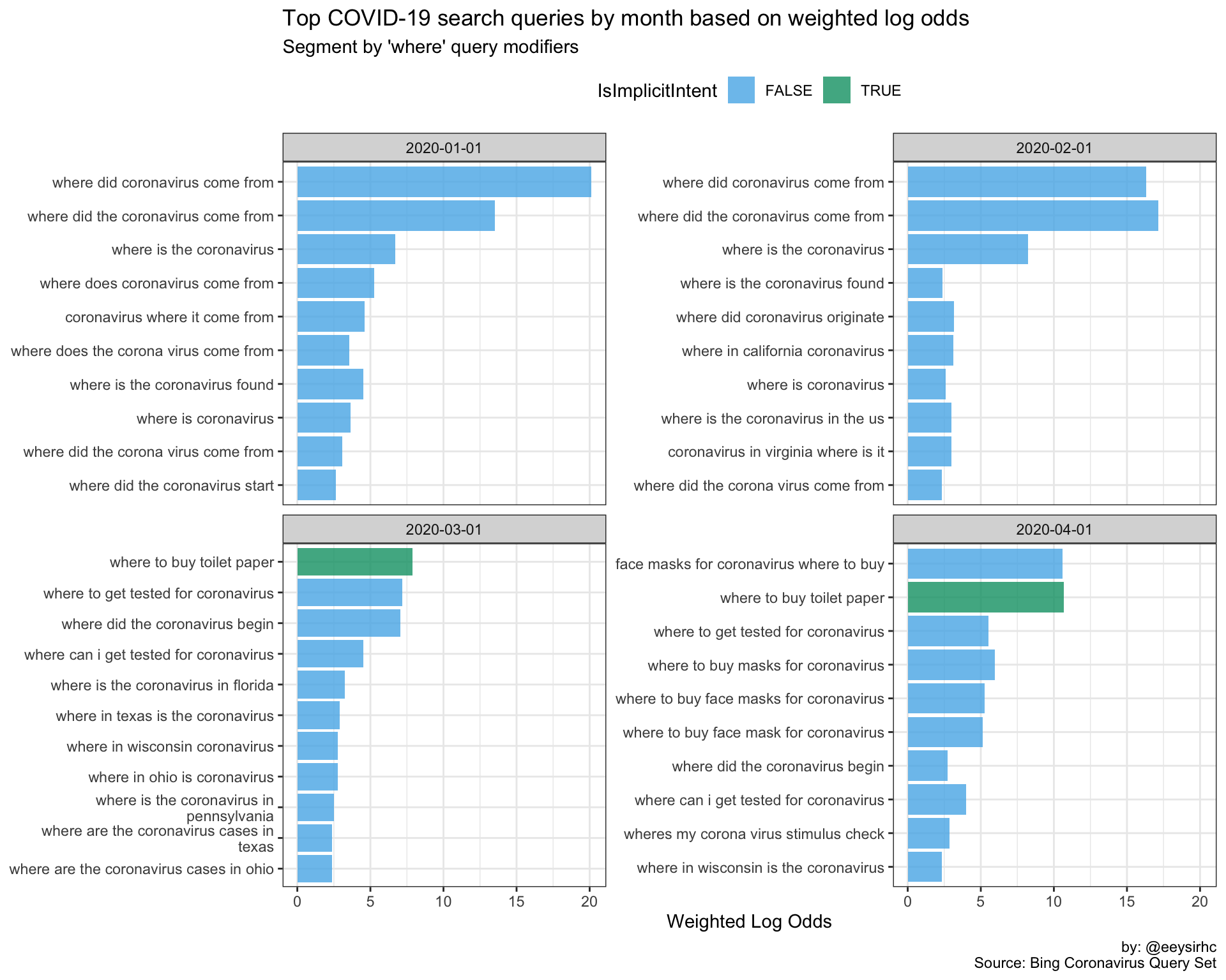
“When” queries
wwwwwh_plot("when")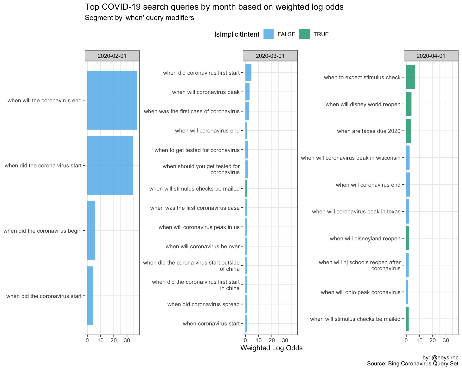
“Why” queries
wwwwwh_plot("why")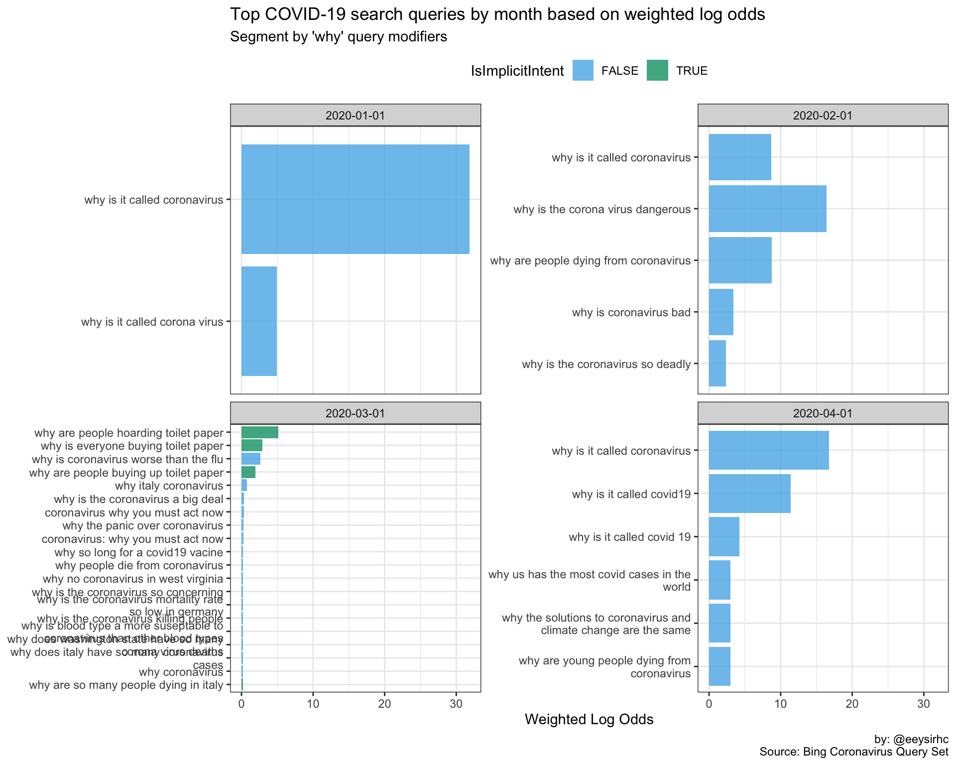
“How” queries
wwwwwh_plot("how")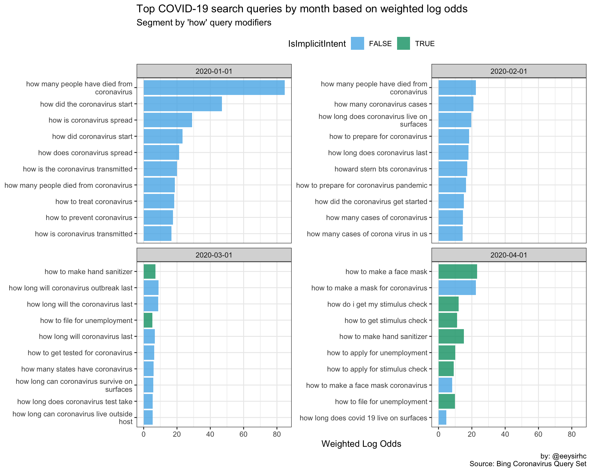
Discovering semantic relationships
Let’s add another data point by creating word embeddings to capture and retain the linguistic context between each term.
GloVe word embeddings
library(tidytext)
library(tm)
library(text2vec)

covid_words <- covid %>%
  select(Query) %>%
  unnest_tokens(word, Query) %>%
  filter(!str_detect(word, "[^[:alpha:]]")) %>%
  anti_join(stop_words)

tokens <- list(covid_words$word)

it <- itoken(tokens, progressbar = TRUE)

vocab <- create_vocabulary(it)
vocab <- prune_vocabulary(vocab, term_count_min = 150)

vectorizer <- vocab_vectorizer(vocab)

tcm <- create_tcm(it, vectorizer, skip_grams_window = 3)

glove <- GlobalVectors$new(rank = 150, x_max = 20)

wv_main <- glove$fit_transform(tcm, n_iter = 5000, convergence_tol = 0.0001)
wv_context <- glove$components
word_vectors <- wv_main + t(wv_context)
t-SNE: visualizing high dimensionality
library(Rtsne)

tsne <- Rtsne(word_vectors[, -1], dims = 2, perplexity = 200,
              max_iter = 1000, pca = TRUE, n_threads = 10)

tsne$Y %>%
  as.data.frame() %>%
  mutate(word = row.names(word_vectors)) %>%
  ggplot(aes(x = V1, y = V2, label = word)) +
  geom_text(size = 4, show.legend = FALSE) +
  theme_minimal() +
   theme(axis.text.x = element_blank(),
        axis.text.y = element_blank()) +
    labs(title = "COVID-19 search query word embeddings",
         caption = "by: @eeysirhc\nSource: Bing Coronavirus Query Set")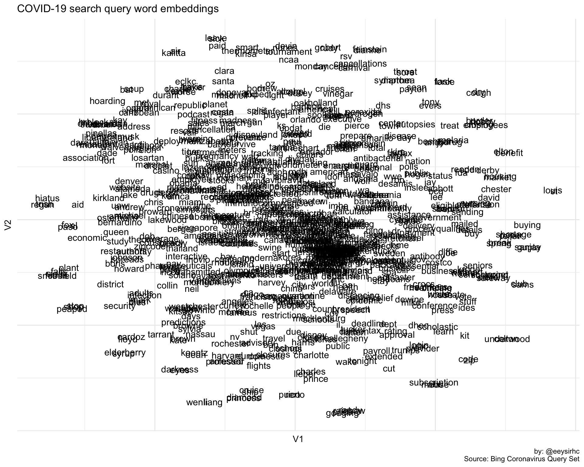
The above visualization is a 2D representation of all words associated with COVID-19 search queries from US Bing users.
So, how did we do overall? Let’s test out the word stimulus:
# FUNCTION TO RETRIEVE TOP 10 MOST SIMILAR WORDS WITH COSINE > 0.50
find_similar_words <- function(word, n = 10) {
  similarities <- word_vectors[word, , drop = FALSE] %>%
    sim2(word_vectors, y = ., method = "cosine")

  similarities[,1] %>% sort(decreasing = TRUE) %>%
    head(n) %>%
    bind_rows() %>%
    gather(word, cosine) %>%
    filter(cosine > 0.50)
}

stimulus <- find_similar_words("stimulus")

stimulus %>% kableExtra::kable("markdown")| word | cosine |
|---|---|
| stimulus | 1.0000000 |
| check | 0.8509592 |
| checks | 0.8449955 |
| package | 0.8441638 |
| business | 0.6047240 |
| stats | 0.5274038 |
| calculator | 0.5260959 |
| worldometer | 0.5256503 |
| update | 0.5235919 |
| bill | 0.5187948 |
Not too bad - we were able to identify related terms for the IRS stimulus plan.
We can also visualize and inspect how they sit in our 2D vector space.
tsne$Y %>%
  as.data.frame() %>%
  mutate(word = row.names(word_vectors),
         highlight = case_when(word %in% stimulus$word ~ 'highlight',
                               TRUE ~ '-')) %>%
  ggplot(aes(x = V1, y = V2, label = word, color = highlight)) +
  geom_text(size = 4, show.legend = FALSE) +
  scale_color_manual(values = c("grey80", "red")) +
  theme_minimal() +
   theme(axis.text.x = element_blank(),
        axis.text.y = element_blank()) +
    labs(title = "COVID-19 search query word embeddings",
         subtitle = "with cosine similarity > 0.50",
         caption = "by: @eeysirhc\nSource: Bing Coronavirus Query Set")
Let’s try a few more just for fun:
df1 <- find_similar_words("age")
df2 <- find_similar_words("toilet")
df3 <- find_similar_words("hand")

wv_final <- tsne$Y %>%
  as.data.frame() %>%
  mutate(word = row.names(word_vectors),
         highlight = case_when(word %in% df1$word ~ 'df1',
                               word %in% df2$word ~ 'df2',
                               word %in% df3$word ~ 'df3',
                               TRUE ~ '-'))

p <- wv_final %>%
  ggplot(aes(x = V1, y = V2, label = word, color = highlight)) +
  geom_text(size = 4, show.legend = FALSE) +
  scale_color_manual(values = c("grey80", "midnightblue", "#009E73", "#CC79A7")) +
  theme_minimal() +
  theme(axis.text.x = element_blank(),
        axis.text.y = element_blank()) +
  labs(title = "COVID-19 search query word embeddings",
       subtitle = "with cosine similarity > 0.50",
       caption = "by: @eeysirhc\nSource: Bing Coronavirus Query Set")

p
This looks pretty good to me!
Toilet is (unsprisingly) related to paper with shortage and hoarding following right behind it.
df2 %>% kableExtra::kable("markdown")| word | cosine |
|---|---|
| toilet | 1.0000000 |
| paper | 0.9362227 |
| buy | 0.6669480 |
| shortage | 0.6077611 |
| people | 0.5298464 |
Hand has sanitizer in its back pocket and we can infer the search query intent is focused around making your own disinfectant.
df3 %>% kableExtra::kable("markdown")| word | cosine |
|---|---|
| hand | 1.0000000 |
| sanitizer | 0.9892406 |
| homemade | 0.8175468 |
| recipe | 0.7023749 |
| masks | 0.5500787 |
| mask | 0.5204016 |
| diy | 0.5165350 |
| update | 0.5037100 |
Bonus
And if we only want to highlight the distances for the words we care about…
wv_final %>%
  filter(word %in% c(df1$word, df2$word, df3$word)) %>%
  ggplot(aes(x = V1, y = V2, label = word, color = highlight)) +
  geom_point() +
  geom_text_repel(size = 4, show.legend = FALSE) +
  theme_minimal() +
  theme(legend.position = 'none',
        axis.text.x = element_blank(),
        axis.text.y = element_blank()) +
  scale_color_manual(values = c("midnightblue", "#009E73", "#CC79A7")) +
  scale_x_continuous(limits = c(-4, 4)) +
  scale_y_continuous(limits = c(-4, 4)) +
  labs(title = "COVID-19 search query word embeddings",
       subtitle = "with cosine similarity > 0.50",
       caption = "by: @eeysirhc\nSource: Bing Coronavirus Query Set")
Honorable mention
# TOP 10 WITH COSINE > 0.40
find_sim_words <- function(word, n = 10) {
  similarities <- word_vectors[word, , drop = FALSE] %>%
    sim2(word_vectors, y = ., method = "cosine")

  similarities[,1] %>% sort(decreasing = TRUE) %>%
    head(n) %>%
    bind_rows() %>%
    gather(word, cosine) %>%
    filter(cosine > 0.40)
}

hm <- find_sim_words("kill")

p_hm <- tsne$Y %>%
  as.data.frame() %>%
  mutate(word = row.names(word_vectors),
         highlight = case_when(word %in% hm$word ~ 'highlight')) %>%
  filter(!is.na(highlight)) %>%
  mutate(highlight = case_when(word == 'kill' ~ 'kill',
                               TRUE ~ highlight)) %>%
  ggplot(aes(x = V1, y = V2, label = word, color = highlight)) +
  geom_point() +
  geom_text_repel(size = 4, show.legend = FALSE) +
  theme_minimal() +
  theme(legend.position = 'none',
        axis.text.x = element_blank(),
        axis.text.y = element_blank()) +
  scale_color_manual(values = c("steelblue", 'red')) +
  scale_x_continuous(limits = c(-4, 4)) +
  scale_y_continuous(limits = c(-4, 4)) +
  labs(title = "COVID-19 search query word embeddings",
       subtitle = "Words with cosine similarity > 0.40 to: kill",
       caption = "by: @eeysirhc\nSource: Bing Coronavirus Query Set")

p_hm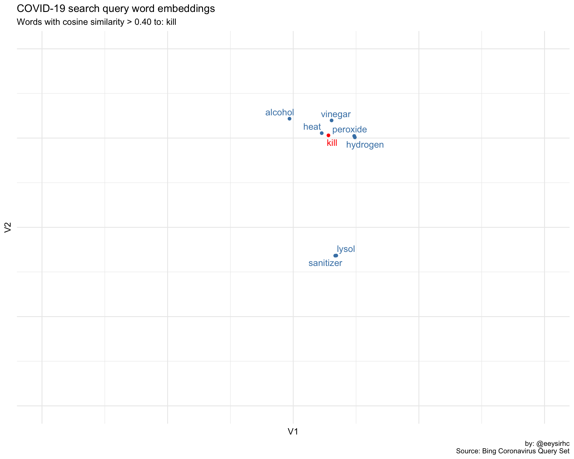
Application
The following is out of scope but conceptually we can chain together a simple machine learning pipeline with what we have thus far:
- Label subset of the data according to our COVID-19 search framework
- Develop word embeddings for our keyword universe
- Run model to assign labels for new searh queries that come in
From here how you utilize and act on the data would depend on the industry. A few examples:
- Health org: anticipate new cases by state based on search query data
- Government: recognize public sentiment and use as one (of many) data points to drive policy
- News site: surface relevant content and related articles to nudge user engagement
Potential directions
- Compare NY/NJ search data against other US states
- Incoroprate sentiment analysis as an additional metric to understand how intent changes over time
- Include word vectors for rest of world to identify unknown topics in the US (and vice versa)
Acknowledgements
- The amazing {tidylo} package from Julia Silge
- GloVe Word Embeddings
- Text analysis in R
- Just R Things