In my previous article about simulating page speed data, I broke one of the cardinal rules in programming: don’t repeat yourself.
There was a reason for this: I wanted to show what is going on under the hood and the theoretical concepts associated with them before using other functions in R.
For this follow-up, I’ll highlight a few #rstats shortcuts that will make your life easier when generating and exploring simulated data.
Background
We’ll use the same dataset from last time with Best Buy and Home Depot as our initial test subjects.
library(tidyverse)

df <- read_csv("https://raw.githubusercontent.com/Eeysirhc/random_datasets/master/page_speed_benchmark.csv") %>%
  filter(page_type != 'Home')

df %>%
  filter(website %in% c("BestBuy", "Home Depot")) %>%
  group_by(website) %>%
  summarize(avg_time_interactive = mean(time_to_interactive),
            sd_time_interactive = sd(time_to_interactive))
## # A tibble: 2 x 3
## website avg_time_interactive sd_time_interactive
## * <chr> <dbl> <dbl>
## 1 BestBuy 31.2 2.60
## 2 Home Depot 25.2 1.41Simulating data
The code from the previous article is prone to error in the long run when we have multiple datasets to manage.
bestbuy <- rnorm(1e4, 31.2, 2.60) %>%
  as_tibble() %>%
  mutate(website = paste0("bestbuy"))

homedepot <- rnorm(1e4, 25.2, 1.41) %>%
  as_tibble() %>%
  mutate(website = paste0("homedepot"))
Instead we can simplify things by writing a custom function to do all of the above.
# FUNCTION TO SIMULATE 10K
sim_10k <- function(mean, sd, website){

  values <- rnorm(1e4, mean, sd) %>%
    as_tibble() %>%
    mutate(website = paste0(website))
}
Now with a single call we can simulate 10K data points for our normal distribution based on a set of parameters:
- Average mean
- Standard deviation
- Name of the website
bestbuy <- sim_10k(31.2, 2.60, "bestbuy")
homedepot <- sim_10k(25.2, 1.41, "homedepot")

# VALIDATE OUR DATA
rbind(bestbuy, homedepot) %>%
  group_by(website) %>%
  summarize(mean = mean(value),
            sd = sd(value))
## # A tibble: 2 x 3
## website mean sd
## * <chr> <dbl> <dbl>
## 1 bestbuy 31.2 2.64
## 2 homedepot 25.2 1.42Plotting simulated data
There may be cases where we need to juggle around numerous datasets and quickly visualize the distribution.
Rather than writing (and rewriting) our data frames or plots we can create a custom function to do just that.
# FUNCTION FOR HISTOGRAM
hist_plot <- function(df){

  multihist <- ggplot(data = df, aes(value, fill = website)) +
    geom_histogram(binwidth = 0.05, position = 'identity', alpha = 0.8) +
    scale_fill_brewer(palette = 'Dark2') +
    labs(x = "Time to Interactive (seconds)") +
    theme_light()

  return(multihist)
}

# PLOT BEST BUY AND HOME DEPOT DATA
hist_plot(rbind(bestbuy, homedepot))
Let’s add Walmart to the mix to illustrate how easy it can be to visualize new datasets.
# WALMART SUMMARY STATISTICS
df %>%
  group_by(website) %>%
  filter(website == 'Walmart') %>%
  summarize(avg_time_interactive = mean(time_to_interactive),
            sd_time_interactive = sd(time_to_interactive))
## # A tibble: 1 x 3
## website avg_time_interactive sd_time_interactive
## <chr> <dbl> <dbl>
## 1 Walmart 16.6 0.830And let’s plot everything together with our new functions:
# SIMULATE WALMART DATA
walmart <- sim_10k(16.6, 0.830, "walmart")

# PLOT WALMART DATA
hist_plot(rbind(bestbuy, homedepot, walmart))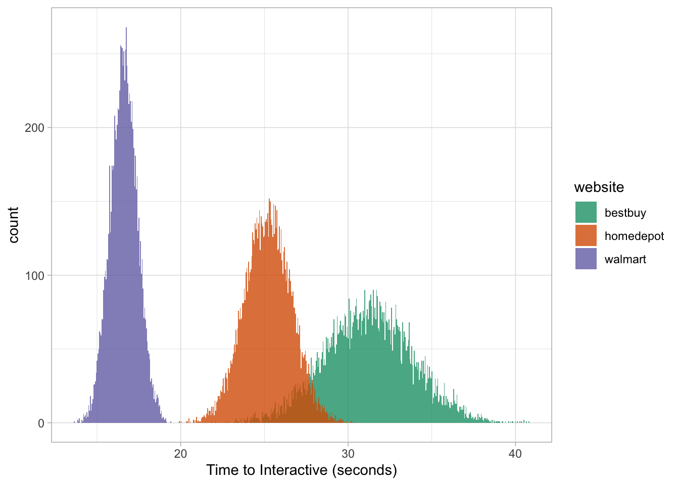
Or we can focus on a single group:
hist_plot(bestbuy)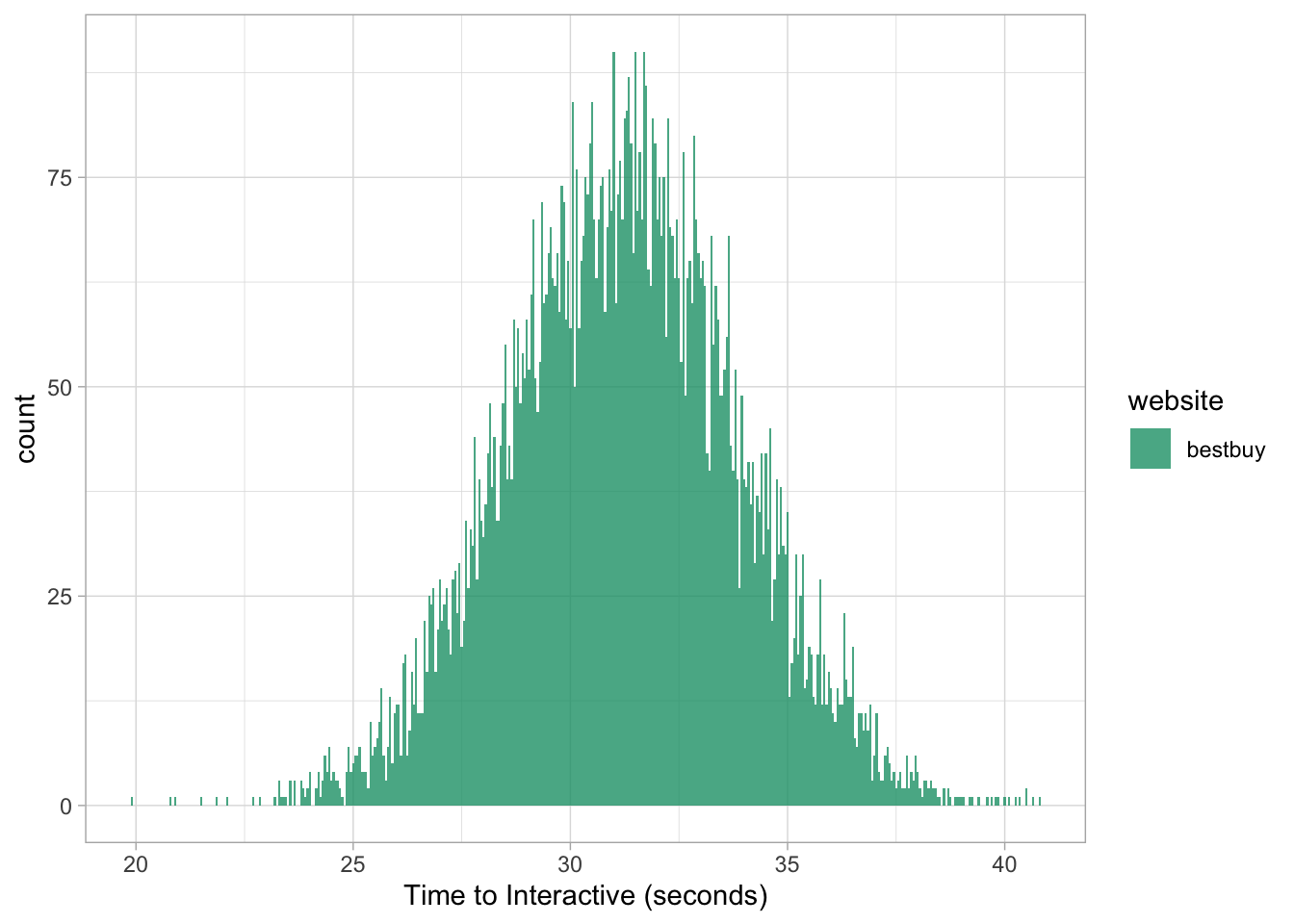
Just give me the answers!
Here’s a non-secret: based on their mathematical properties, we can skip the entire data simulation process and spit out the results.
For the following section we’ll use Target as our example.
# TARGET SUMMARY STATISTICS
df %>%
  filter(website == 'Target') %>%
  group_by(website) %>%
  summarize(mean_time_interactive = mean(time_to_interactive),
            sd_time_interactive = sd(time_to_interactive))
## # A tibble: 1 x 3
## website mean_time_interactive sd_time_interactive
## * <chr> <dbl> <dbl>
## 1 Target 21.4 2.02Calculating probabilities
dnorm
This function returns the probability density for a specific value given its shape.
For Target, we can use it to answer the question: what is the probability we will measure a time_to_interactive page speed score of exactly 20s?
In this case it would be as simple as this single line of code:
dnorm(20, 21.4, 2.02) * 100## [1] 15.53292And to validate that:
# SIMULATE TARGET DATA
target <- sim_10k(21.4, 2.02, "target")

target %>%
  ggplot(aes(value)) +
  geom_density() +
  geom_vline(xintercept = 20, lty = 2, color = 'salmon') +
  geom_hline(yintercept = 0.1553292, lty = 2, color = 'salmon') +
  geom_point(aes(x = 20, y = 0.1553292), size = 3, color = 'grey40') +
  labs(x = "Time to Interative (seconds)", y = "Probability Density") +
  scale_y_continuous(labels = scales::percent_format(round(1))) +
  theme_light() +
  theme(panel.grid.major = element_blank(),
        panel.grid.minor = element_blank())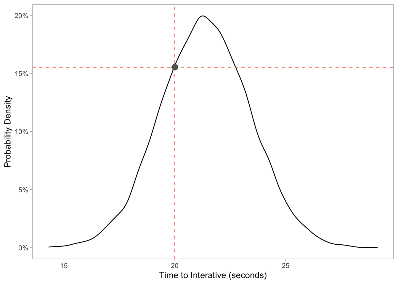
pnorm
We can use this function if we want to know what the probability distribution is for certain values that fall below a certain threshold - we have already been doing this!
For example: what is the probability a random page on Target will be less than 20 seconds?
sum(target$value < 20) / length(target$value) * 100## [1] 24.65And if we use the pnorm function without generating any data:
pnorm(20, 21.4, 2.02) * 100## [1] 24.4133Visualizing our data can also confirm this output.
target %>%
  mutate(segment = ifelse(value < 20, "below", "above")) %>%
  ggplot(aes(value, fill = segment)) +
  geom_histogram(binwidth = 0.05, alpha = 0.8) +
  scale_fill_brewer(palette = 'Set1') +
  labs(x = "Time to Interactive (seconds)") +
  theme_light()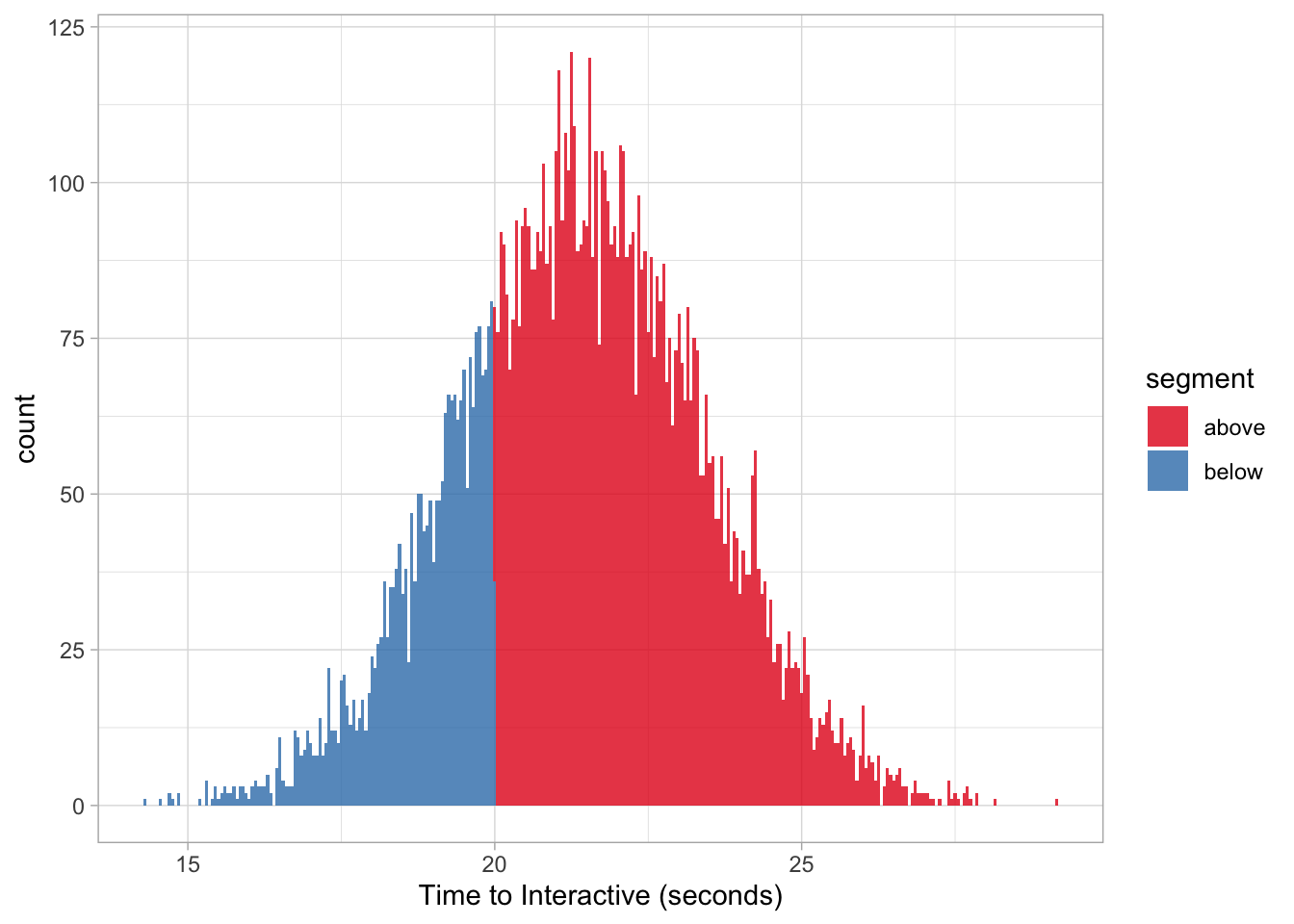
This same function can also be used to find the probability distribution above a given threshold by adding a minor change with lower.tail = FALSE (we’ll use 25 seconds):
pnorm(25, 21.4, 2.02, lower.tail = FALSE) * 100## [1] 3.736009Which is the same as:
sum(target$value > 25) / length(target$value) * 100## [1] 3.66Note: we are generating 10K random numbers from a given parameter space so the values will match 1:1 as our n gets closer to infinity. To test this, try increasing your simulation from 10K (1e4) to 100K (1e5) or even 1M (1e6).
qnorm
We can leverage this function, given a desired quantile, to ask a question like: above what time_to_interactive threshold is considered the slowest 10th percentile on Target?
qnorm(.90, 21.4, 2.02) ## [1] 23.98873This is essentially the inverse of our pnorm function:
pnorm(23.98873, 21.4, 2.02, lower.tail = FALSE) * 100## [1] 10.00004Thus, everything above ~24 seconds is considered the slowest 10% for Target.
target %>%
  mutate(percentile = ifelse(value > 23.98873, "10th", "90th")) %>%
  ggplot(aes(value, fill = percentile)) +
  geom_histogram(binwidth = 0.05) +
  scale_fill_brewer(palette = 'Greens', direction = -1) +
  labs(x = "Time to Interactive (seconds)") +
  theme_light()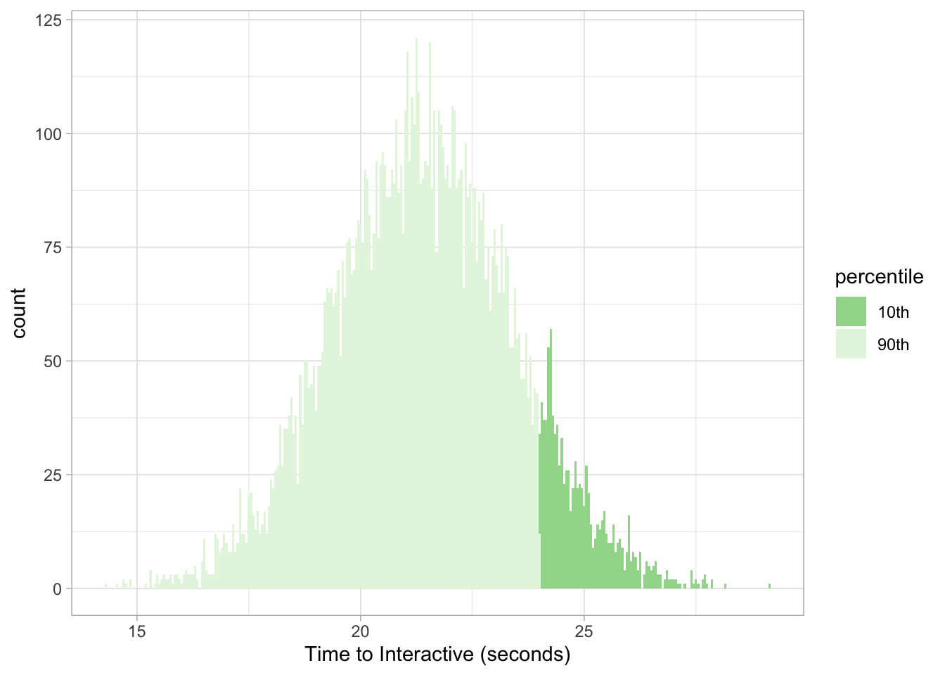
And to get our answer in the opposite direction for the fastest 2-percentile we make a slight adjustment again with lower.tail = FALSE:
qnorm(.98, 21.4, 2.02, lower.tail = FALSE)## [1] 17.25143Now we know that ~17.25 seconds in time_to_interactive is considered the maximum value to be considered the fastest 2% on Target’s website.
We can then validate our assumptions with the pnorm function:
pnorm(17.25143, 21.4, 2.02) * 100## [1] 2.000007And visualize our results as needed:
target %>%
  mutate(percentile = ifelse(value < 17.25143, "2nd", "98th")) %>%
  ggplot(aes(value, fill = percentile)) +
  geom_histogram(binwidth = 0.05) +
  scale_fill_brewer(palette = 'Blues') +
  labs(x = "Time to Interactive (seconds)") +
  theme_light()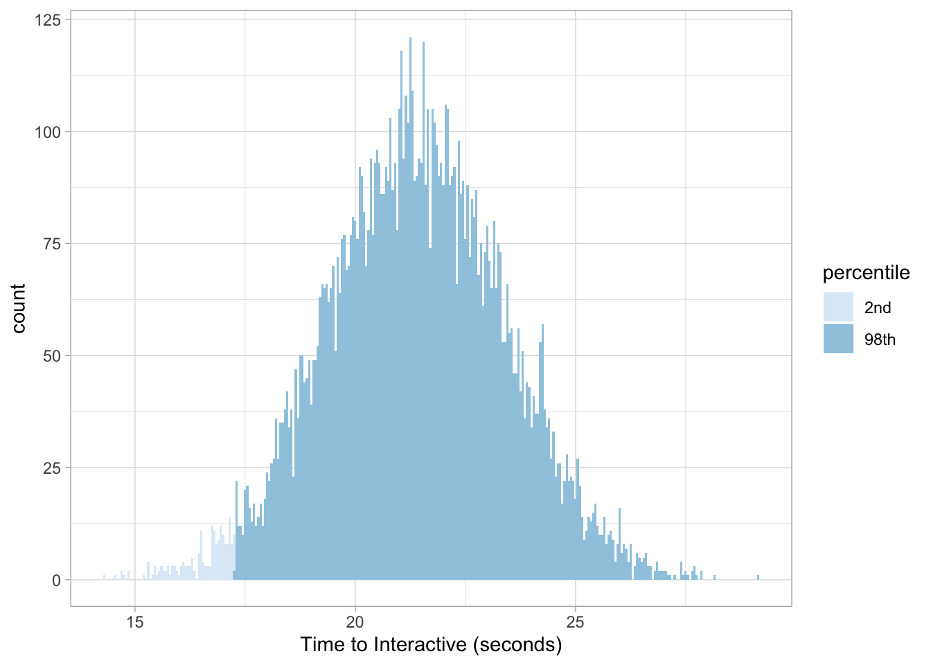
Visualizing probabilities
Since we don’t necessarily need to simulate our data we also don’t need it to plot our distributions!
Taking our example from earlier, if we wanted to know Target’s probability density at exactly 20 seconds we can run this command:
dnorm(20, 21.4, 2.02) * 100## [1] 15.53292Which can also be visualized with the stat_function:
ggplot(data.frame(x = c(0, 40)), aes(x)) +
  stat_function(args = c(mean = 21.4, sd = 2.02),
                color = 'grey30',
                fun = dnorm,
                n = 1e4) +
  geom_vline(xintercept = 20, lty = 2, color = 'red') +
  geom_hline(yintercept = 0.1553292, lty = 2, color = 'red') +
  labs(x = "Time to Interactive (seconds)", y = "Probability Density") +
  scale_y_continuous(labels = scales::percent_format(round(1))) +
  theme_light() +
  theme(panel.grid.major = element_blank(),
        panel.grid.minor = element_blank())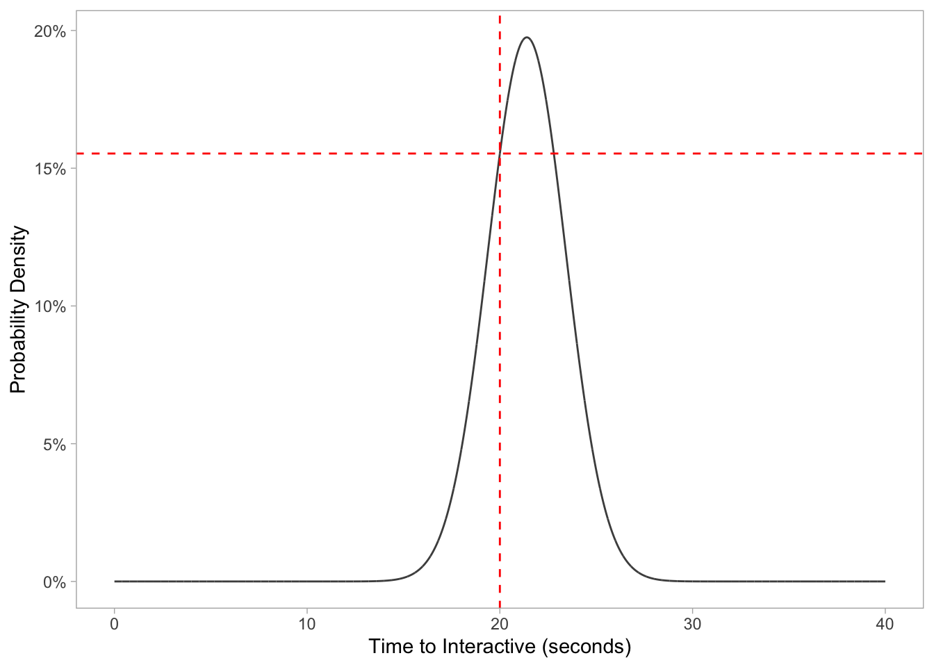
For the aforementioned pnorm function, we can calculate the probability a random Target page will be under 20 seconds with the following:
pnorm(20, 21.4, 2.02)## [1] 0.244133But also visualize the probability distribution by changing the fun argument like so:
ggplot(data.frame(x = c(0, 40)), aes(x)) +
  stat_function(args = c(mean = 21.4, sd = 2.02),
                color = 'grey30',
                fun = pnorm,
                n = 1e4) +
  geom_vline(xintercept = 20, lty = 2, color = 'red') +
  geom_hline(yintercept = 0.244133, lty = 2, color = 'red') +
  labs(x = "Time to Interactive (seconds)", y = "Probability Distribution") +
  scale_y_continuous(labels = scales::percent_format(round(1))) +
  theme_light() +
  theme(panel.grid.major = element_blank(),
        panel.grid.minor = element_blank())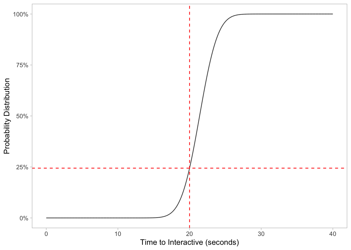
Last but not least, we can visualize our qnorm data as well to find the 90th percentfile cutoff point:
ggplot(data.frame(x = c(0, 1)), aes(x)) +
  stat_function(args = c(mean = 21.4, sd = 2.02),
                color = 'grey30',
                fun = qnorm,
                n = 1e4) +
  geom_vline(xintercept = 0.90, lty = 2, color = 'red') +
  geom_hline(yintercept = 23.98873, lty = 2, color = 'red') +
  labs(y = "Time to Interactive (seconds)", x = "Percent Quantile") +
  theme_light() +
  theme(panel.grid.major = element_blank(),
        panel.grid.minor = element_blank())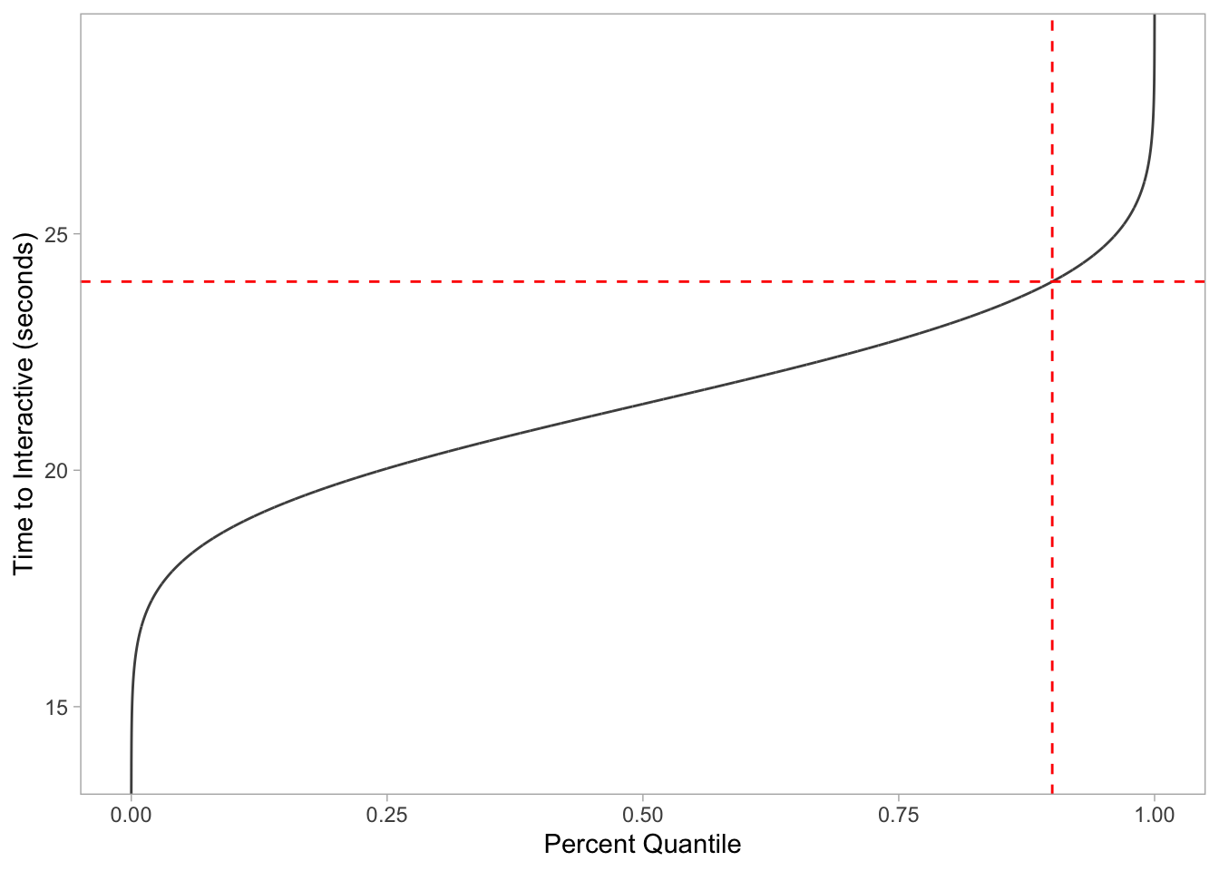
And to confirm everything we run the respective function:
qnorm(.90, 21.4, 2.02) ## [1] 23.98873Bonus
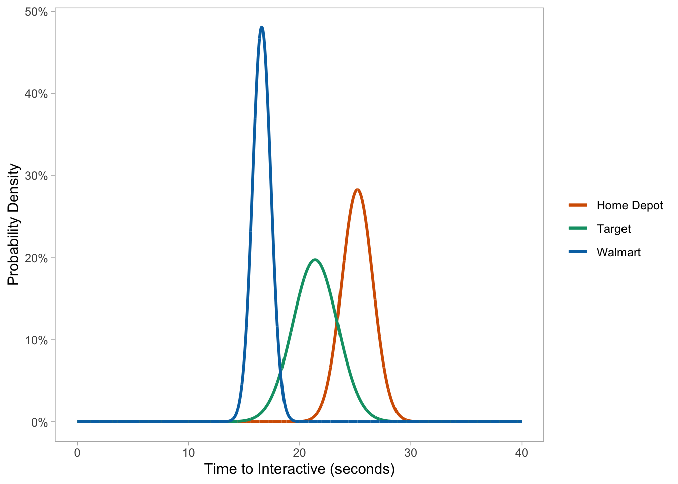
Charting multiple page speed probability densities in one go:
ggplot(data.frame(x = c(0, 40)), aes(x)) +

  # HOME DEPOT
    stat_function(args = c(mean = 25.2, sd = 1.41),
                  aes(color = 'Home Depot'),
                  fun = dnorm,
                  n = 1e4,
                  size = 1) +

  # TARGET
  stat_function(args = c(mean = 21.4, sd = 2.02),
                aes(color = 'Target'),
                fun = dnorm,
                n = 1e4,
                size = 1) +

  # WALMART
    stat_function(args = c(mean = 16.6, sd = 0.830),
                  aes(color = 'Walmart'),
                  fun = dnorm,
                  n = 1e4,
                  size = 1) +

  labs(x = "Time to Interactive (seconds)", y = "Probability Density", color = NULL) +
  scale_color_manual(values = c("#D55E00", "#009E73", "#0072B2")) +
  scale_y_continuous(labels = scales::percent_format(round(1))) +
  theme_light() +
  theme(panel.grid.major = element_blank(),
        panel.grid.minor = element_blank())