Data from #tidytuesday week of 2020-05-12 (source) but plotting in python.
Load modules
import pandas as pd
import matplotlib.pyplot as plt
import seaborn as sns
Download and parse data
volcano_raw = pd.read_csv("https://raw.githubusercontent.com/rfordatascience/tidytuesday/master/data/2020/2020-05-12/volcano.csv")

volcano = volcano_raw[['primary_volcano_type', 'elevation']].sort_values(by='elevation', ascending=False)
Visualize dataset
sns.set(style="darkgrid")
plt.figure(figsize=(20,15))

p = sns.boxplot(x=volcano.elevation, y=volcano.primary_volcano_type)
p = sns.swarmplot(x=volcano.elevation, y=volcano.primary_volcano_type, color=".35")

plt.xlabel("Elevation")
plt.ylabel("")
plt.title("What is the average elevation by volcano type?",
          x=0.01, horizontalalignment="left", fontsize=20)
plt.figtext(0.9, 0.08, "by: @eeysirhc", horizontalalignment="right")
plt.figtext(0.9, 0.07, "Source: The Smithsonian Institute", horizontalalignment="right")

plt.show()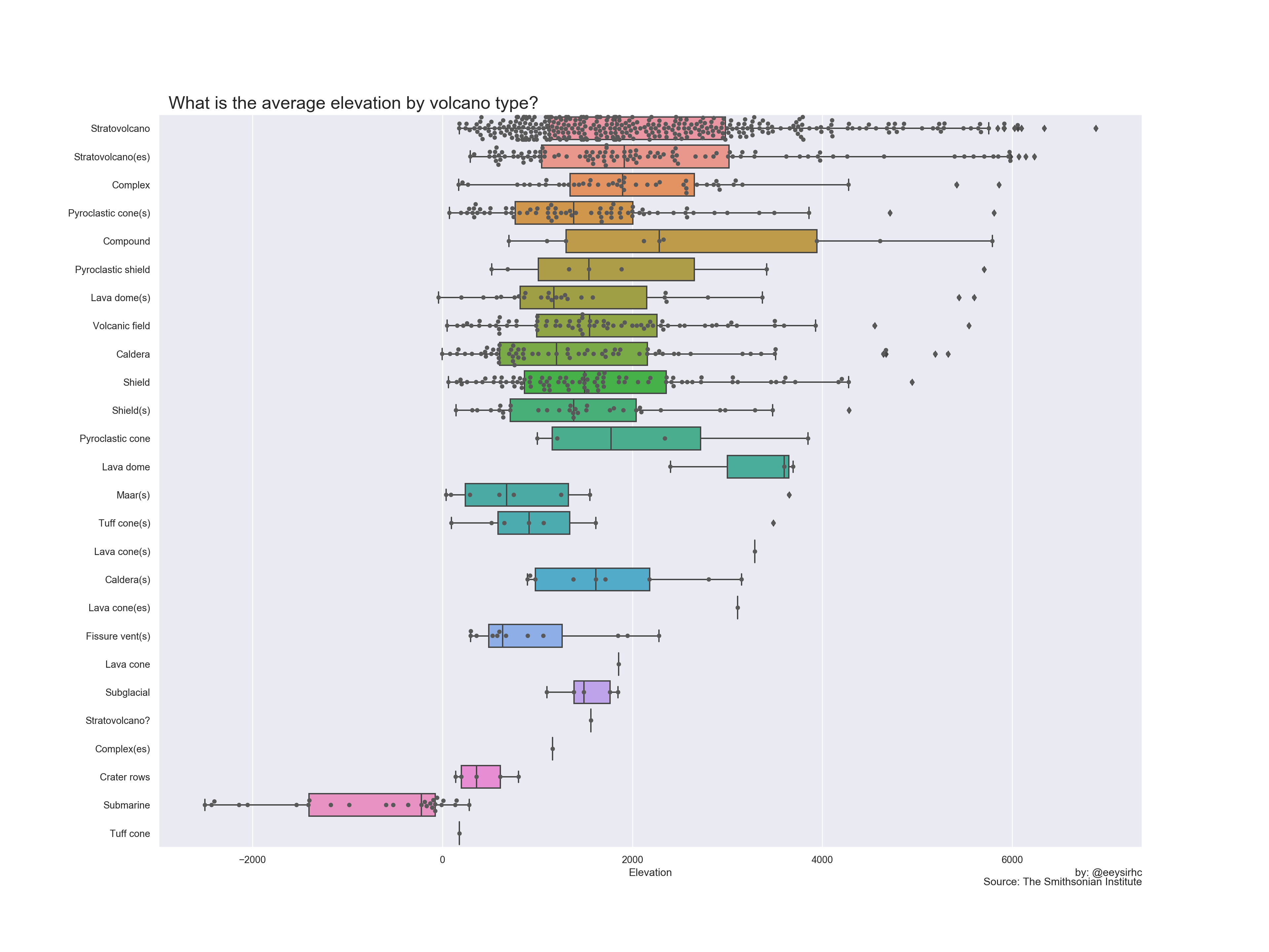
Improvements
- Find and replace similar volcano categories such as stratovolcano which is the same as stratovolcano(es)